


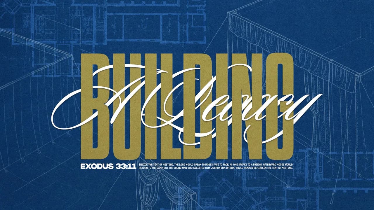
December is when the people your church has been praying for all year finally walk in. Every year, church staff tell us some version of the same story: they knew Christmas was coming, and they still ran out of time.
Those misses add up. The invite video never got filmed, so a hundred personal invitations never got sent. The landing page went live on December 20th, after most guests had already decided where they were going. And the person who did get it all done started January with nothing left.
The problem is almost never effort, and it’s rarely design skill. Christmas media is a season-long project, and most churches manage it like a series of weekly surprises. The graphics still get made. They just get made at 11pm, two days before they’re needed, by the same person who’s also running Sunday.
The decision that usually goes missing is the simplest one, which is what the season actually looks like. Without it, every piece decides for itself, and by the third week your bulletin, your slides, and your yard sign don’t look like they came from the same church.
So here are six directions our designers build most often for churches at Christmas. All six of them work, and none of them are harder than the others in a vacuum. What separates them is what they ask of your team in October, which is why each one below tells you how to get the look and what it’ll cost you to keep it going.
If the words aren’t settled yet, start with our guide to choosing a Christmas theme and come back here after.
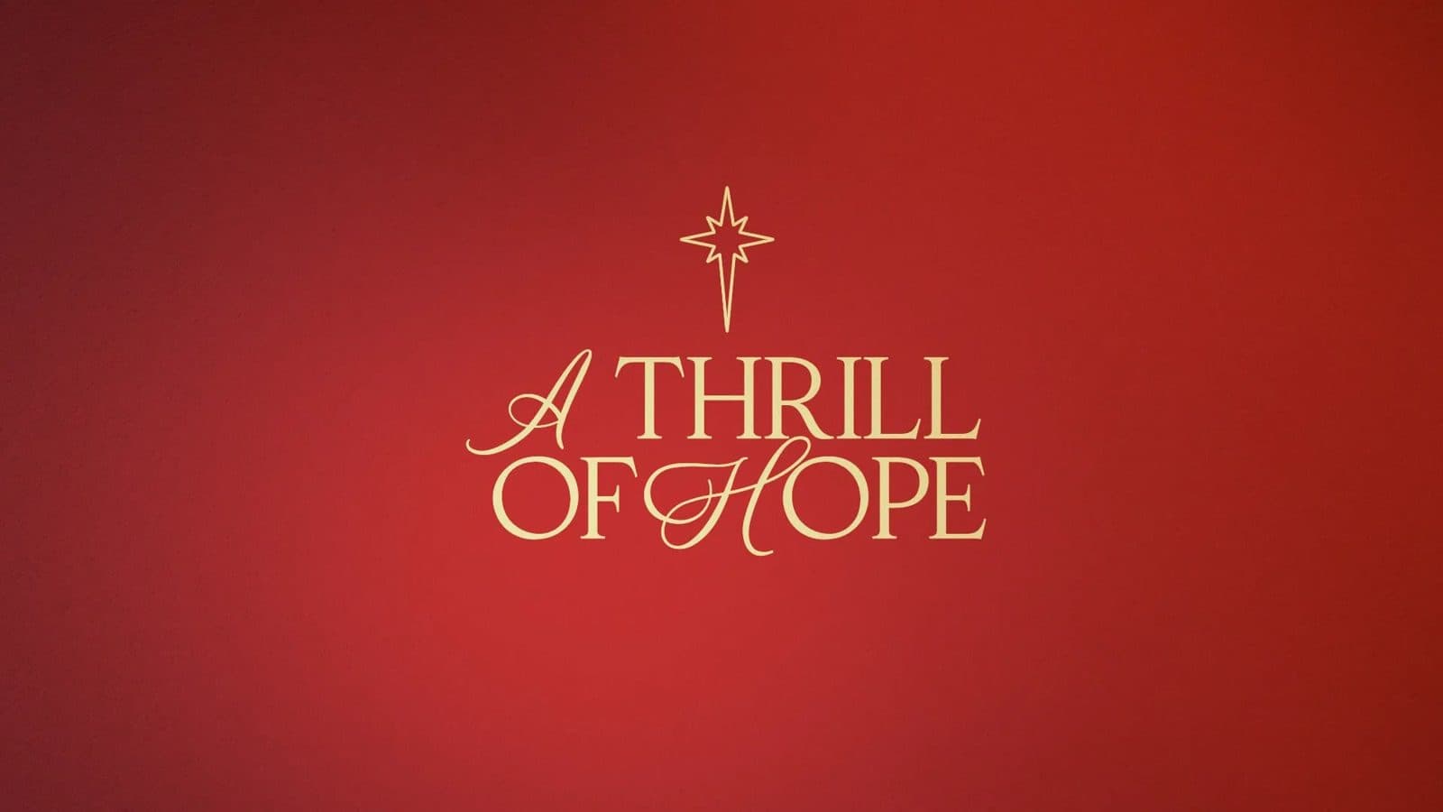
Candlelight & Gold
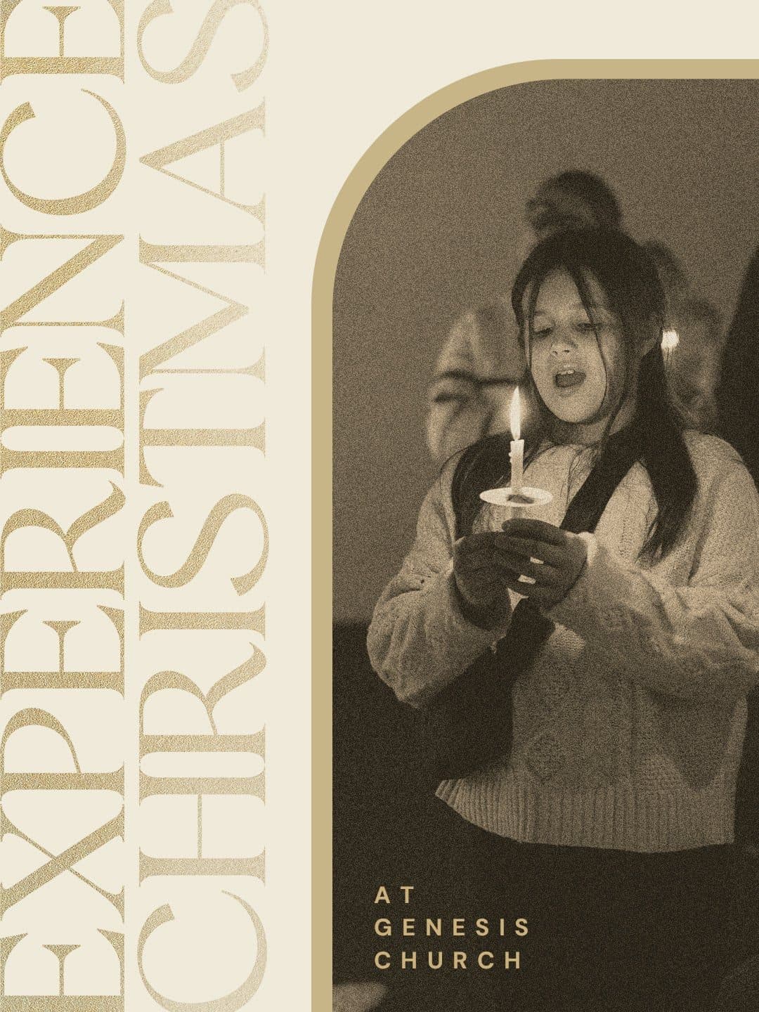
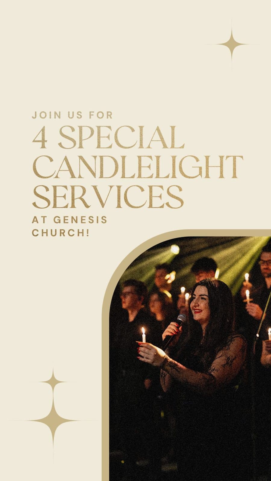
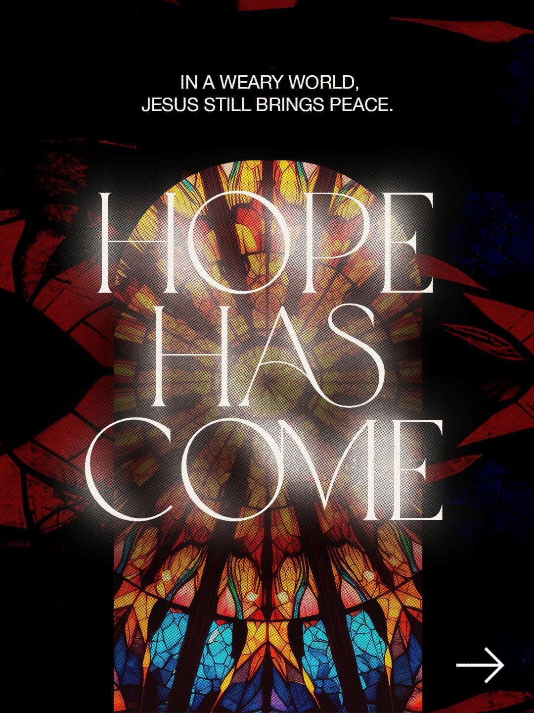
Cream, gold, and a serif with real weight behind it. This is the direction that matches the room your church already becomes an hour into a candlelight service, and it says sacred evening, dress warmly, bring your mom. It’s the one we build most, because a church with no design help can carry it across an entire season without a single piece stalling out.
How to get this look:
- Pick one serif and use it everywhere, at three sizes. The consistency is what makes it feel expensive.
- Keep the palette to cream, one deep neutral, and gold used as an accent instead of a fill.
- Use one symbol all season: a star, a single candle, or a simple arch.
- What it asks of you: almost nothing. It doesn’t need a photo shoot or an illustrator, and nothing has to go to a specialty printer. If your team is thin this year, this is your direction.
Deep Green & Brass
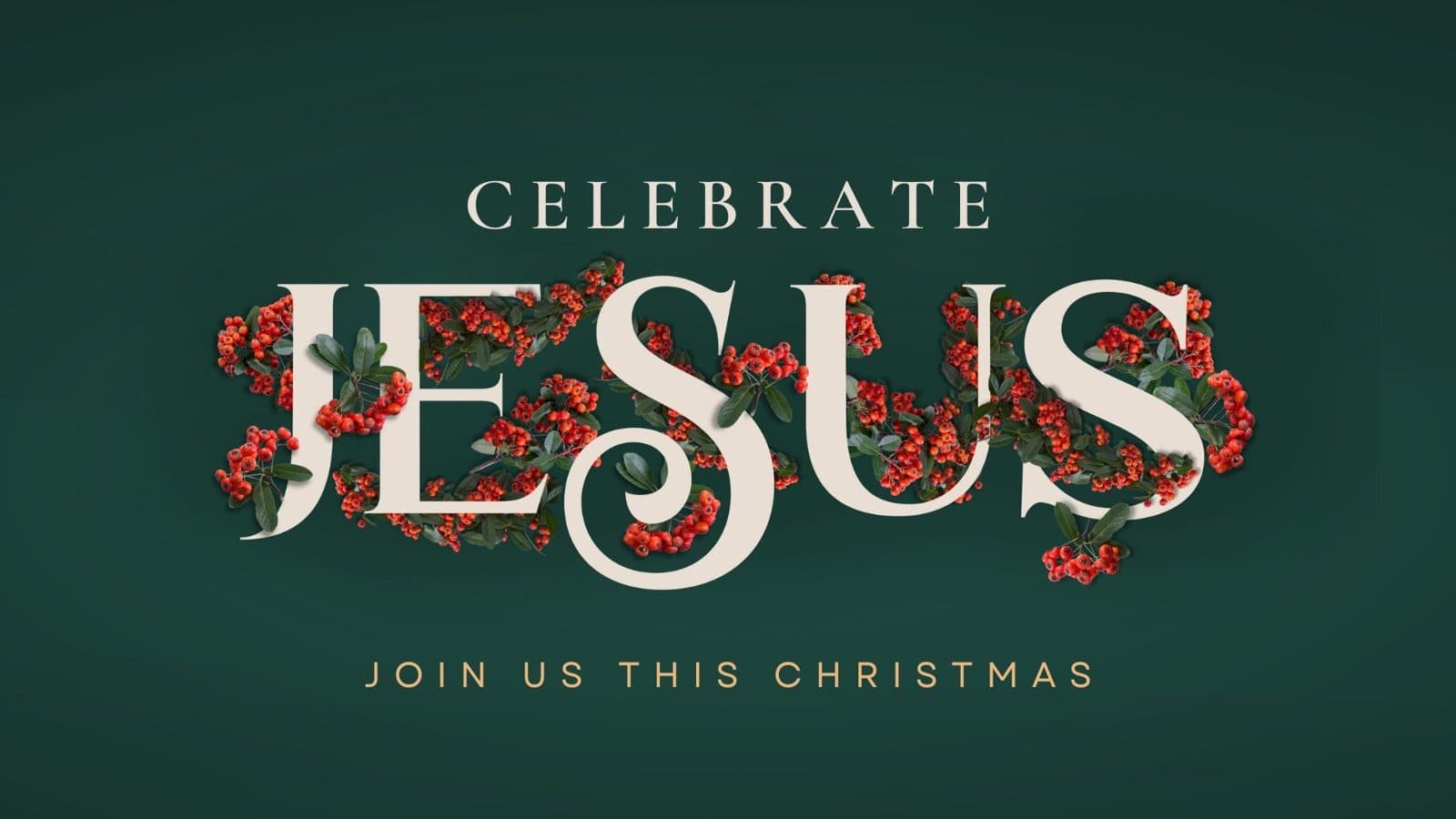
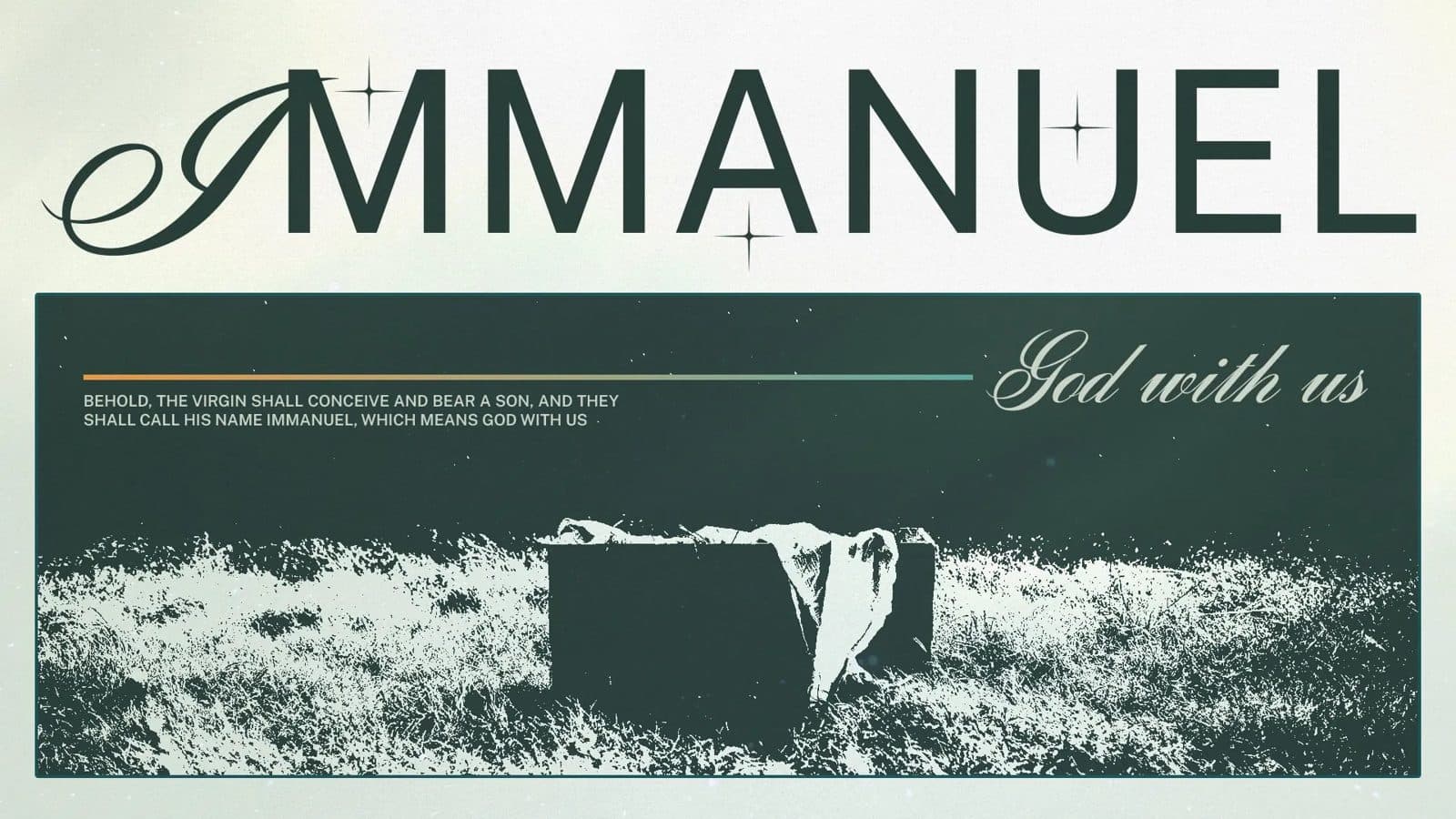
If your season leans on printed pieces, this is the one to reach for. Deep green reads formal without tipping into department-store Christmas, and it holds its color under lobby lighting, where a lot of dark palettes go muddy. It’s the direction that makes an invite card feel like something a member is proud to hand a neighbor.
It also comes with the one deadline in this whole season that genuinely cannot move, so put it on the calendar in September.
How to get this look:
- Build it around one dark green, brass or gold for accents, and cream for breathing room.
- Let the type sit inside a frame: a border, an arch, or a thin rule under the title.
- Design the printed pieces first, then pull the digital versions out of them. Print is the harder constraint, so it should lead.
- What it asks of you: everything physical goes to the print shop the week before Thanksgiving, because December print queues are brutal. That means October approvals and a September decision. Miss that chain by two weeks and your invite cards show up on December 22nd.
Loud Retro Type
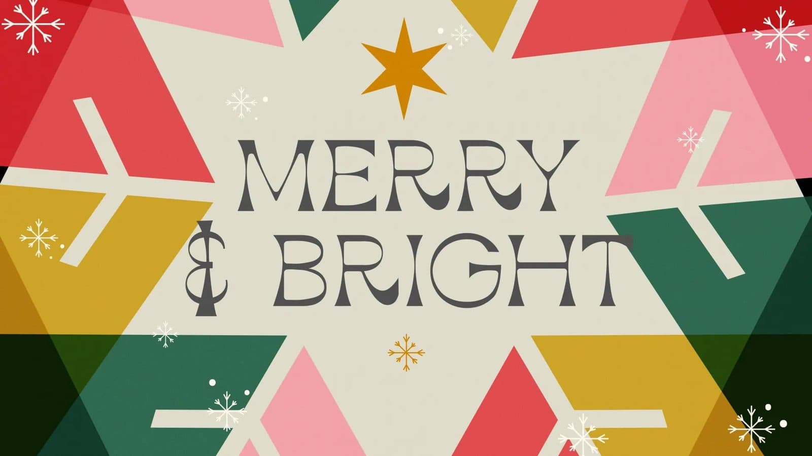
Seventies letterforms, hot color, and letters leaning on each other like they’re having a good time. This one says bring your friends, this is going to be fun, and nobody’s going to make you sing alone. For a student night or a church-wide Christmas party, it’s hard to beat.
It does ask leadership for a real decision about tone, though. This look reads as a party, and a party invitation is exactly right for a Christmas Jam and exactly wrong for the service where somebody is grieving their first Christmas without their dad. That’s a conversation worth having in September, not in November.
How to get this look:
- Start with the type and let it get big. Retro looks work when the letterforms are the whole design.
- Pick two colors that shouldn’t work together and commit, then keep everything else out of the way.
- Add one texture: grain, a starburst, or a halftone. One, not three.
- What it asks of you: a second, quieter look for Christmas Eve, which means budgeting two sets of event graphics instead of one.
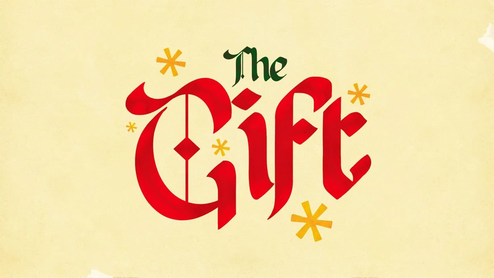
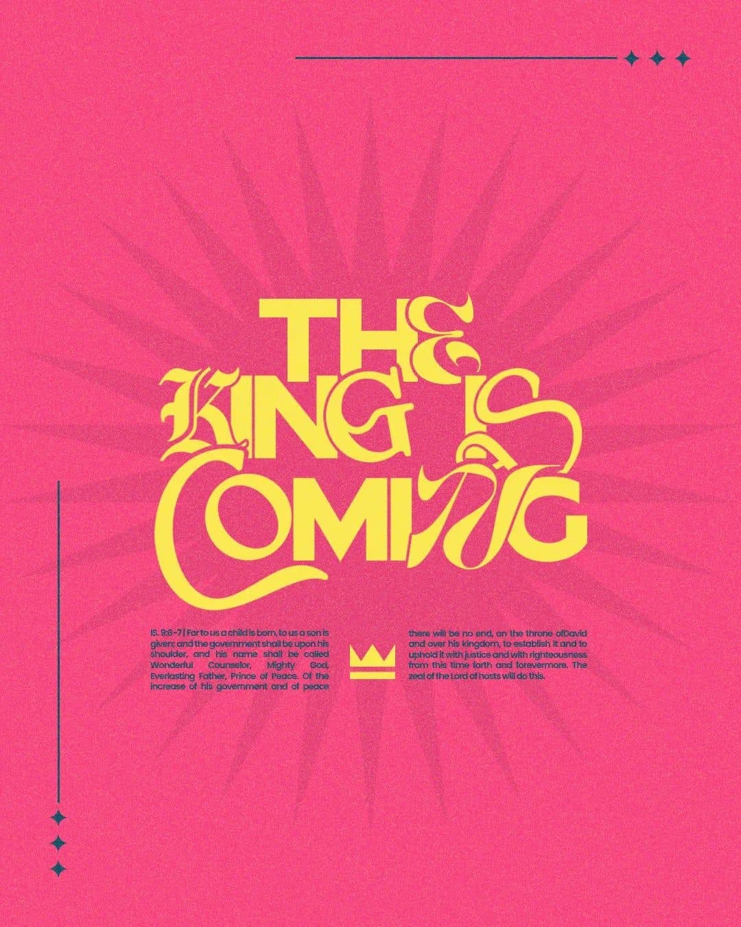
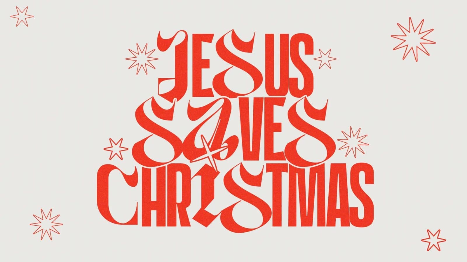
Hand-Drawn Traditional Red
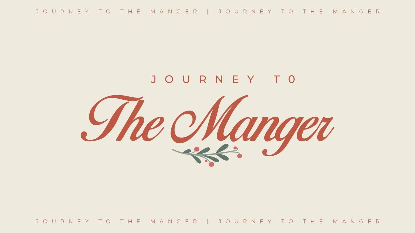
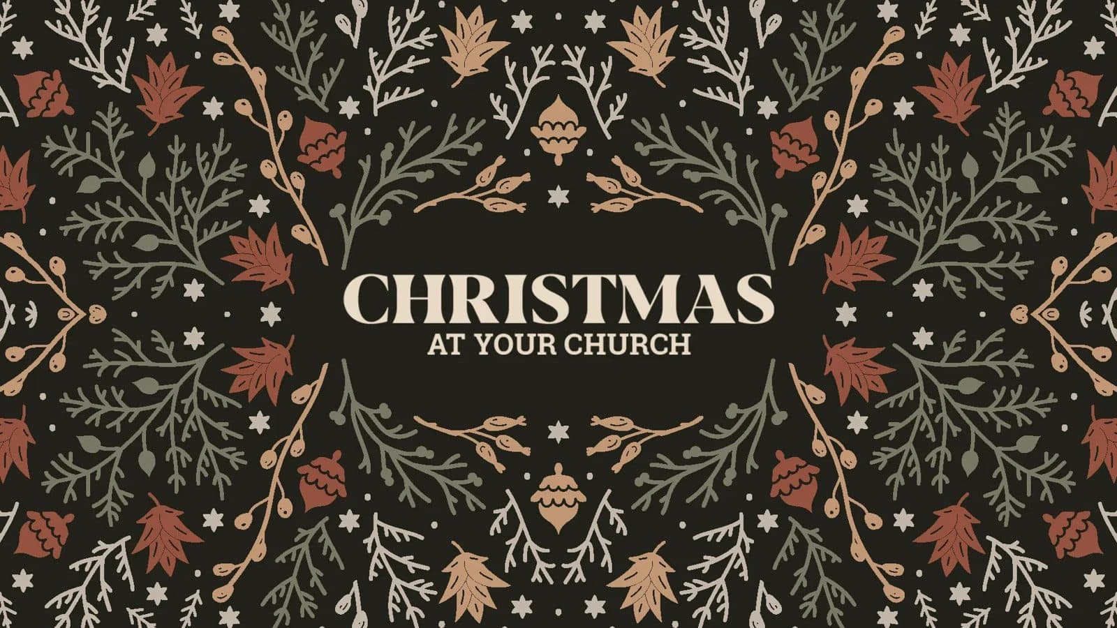
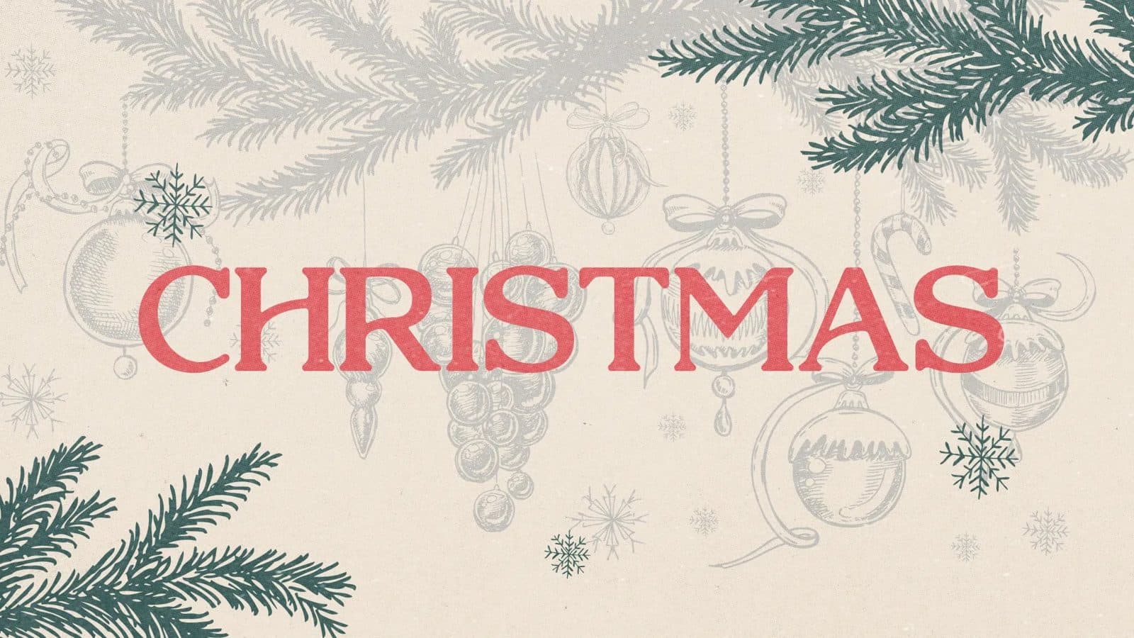
Warm red, drawn holly, ornament borders, and a little paper grain. This is the Christmas most of your congregation is already picturing when they invite someone, and in an older building it agrees with the room instead of arguing with it. When people say they want Christmas to feel like Christmas, this is usually what they mean.
The catch is that drawn elements are judgment calls rather than a template. Three people drawing holly three different ways is how your slides quietly stop matching your invite card.
How to get this look:
- Choose your illustration set before you design anything, and reuse it. Don’t add new drawings mid-season.
- Let red carry the weight and keep the type simple. The illustration is already doing the talking.
- Add paper texture at a low opacity so it reads as warmth rather than as a filter.
- What it asks of you: one named person holding the style from September through December. If nobody can own that, pick a direction built from type and color instead.
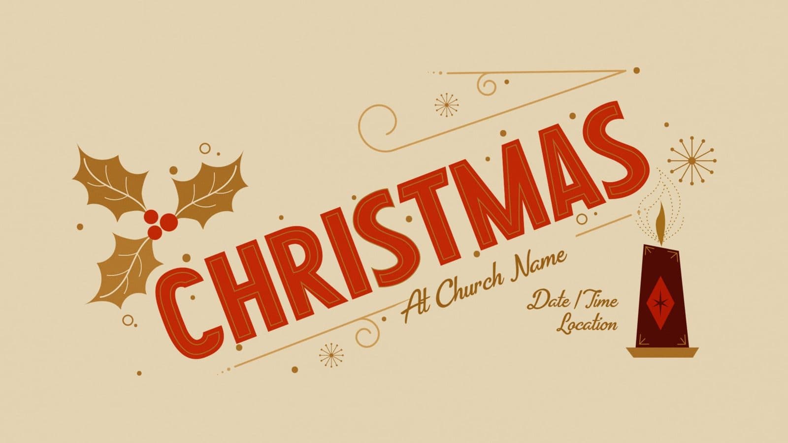

Mid-Century Geometry
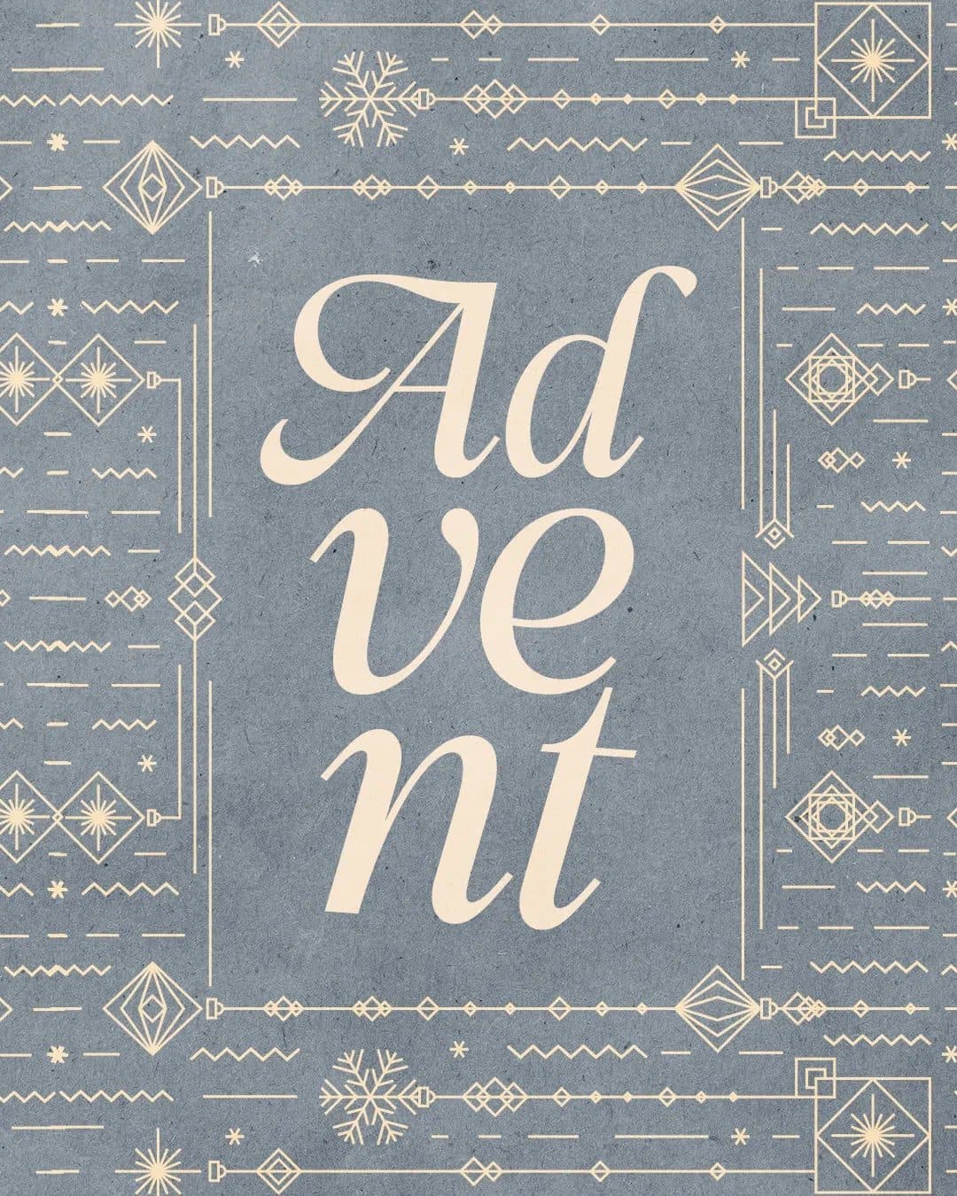
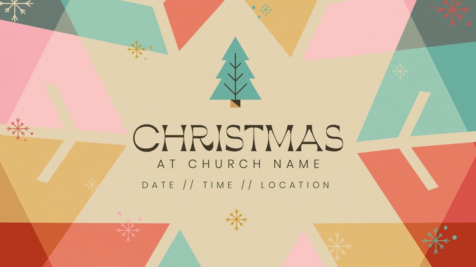
Flat shapes, blocked color, triangle trees, and no photography anywhere in it. That last part is the point: every new piece comes out of shapes that are already sitting in the file, so the eleventh request in December costs about what the first one did. If your photographer is a volunteer with a phone and your December is already full, this is the most forgiving direction on the list.
How to get this look:
- Build a small kit of shapes first, then assemble everything from it.
- Use three or four flat colors with no gradients, and let the shapes overlap.
- Test one piece at yard-sign size early. This style holds up when it scales, which is exactly why signage stops getting dropped.
- What it asks of you: nothing you don’t already have, which is the reason we recommend it to churches heading into a thin season.

One Photograph Doing the Work
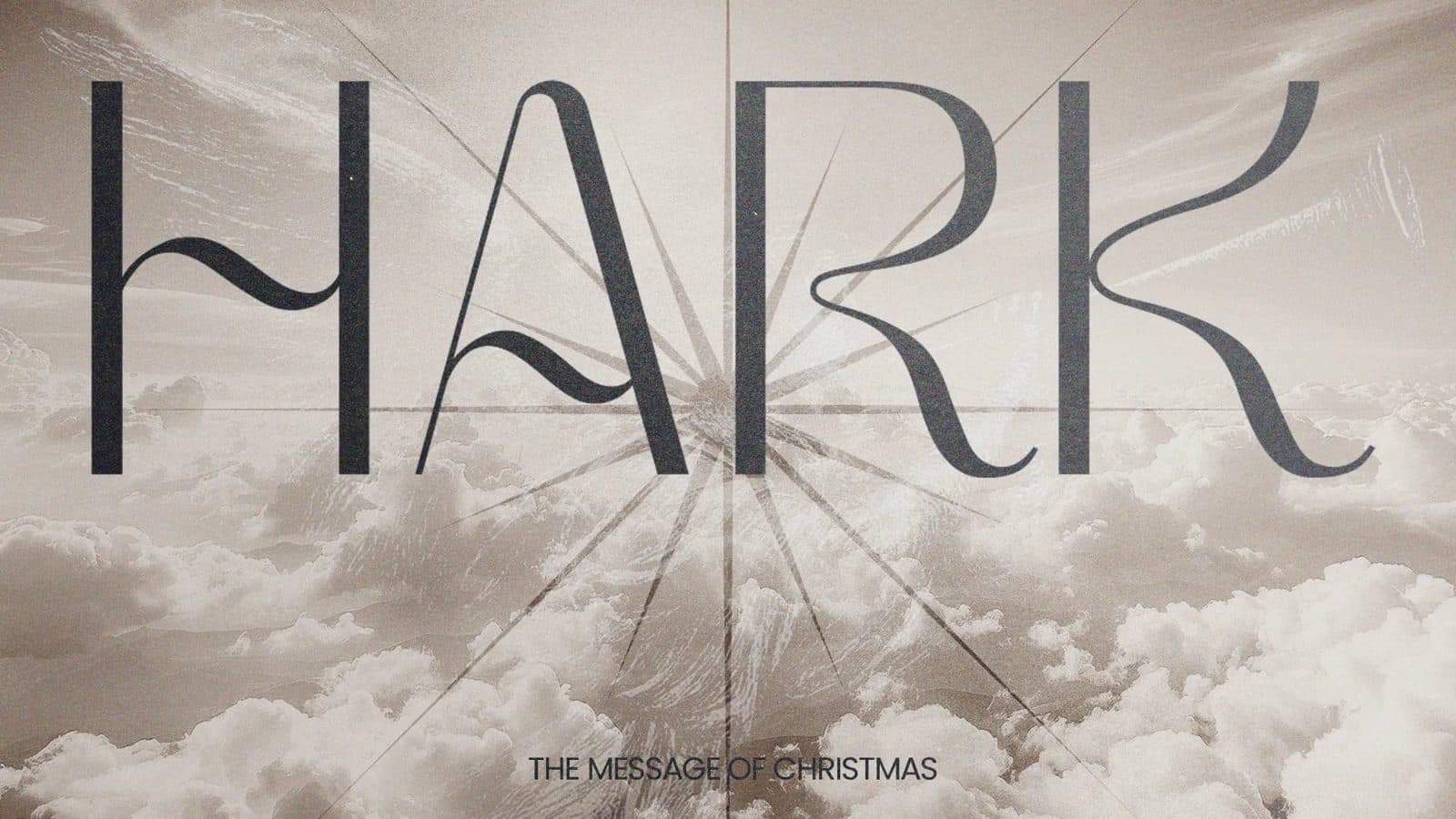
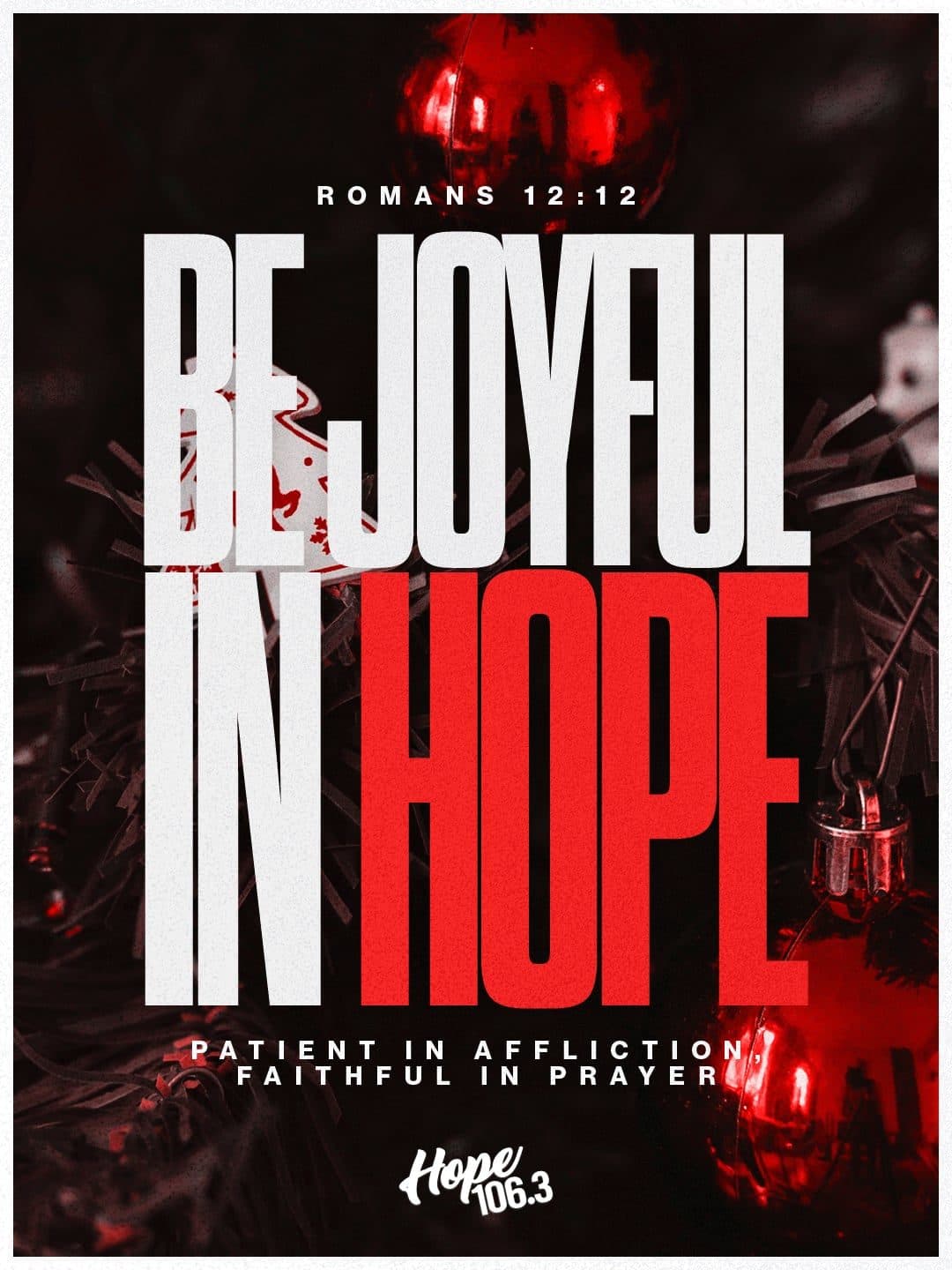
One strong image with type set over it, and not much else. Of these six church Christmas graphics directions, this is the one that looks least like church design, and it’s the one your own people are most likely to share, because it looks like something they’d post themselves.
It also puts a task on your September calendar that none of the others require. December calendars fill up by October, so a photographer you try to book in November usually isn’t available, and the direction dies with them. That’s how a church ends up running a stock photo of a candle it’s already seen on three other church signs.
How to get this look:
- Book the shoot in September for October, or recruit the volunteer with the good phone camera and a real eye.
- Shoot for negative space on purpose so the type has somewhere to live.
- Use one photo per piece and resist collaging. The whole strength here is restraint.
- What it asks of you: a booking, a shoot day, and someone who’ll actually show up with a camera.
Build Scripture Cards No Matter Which Direction Wins
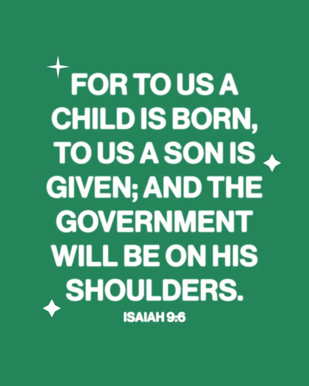
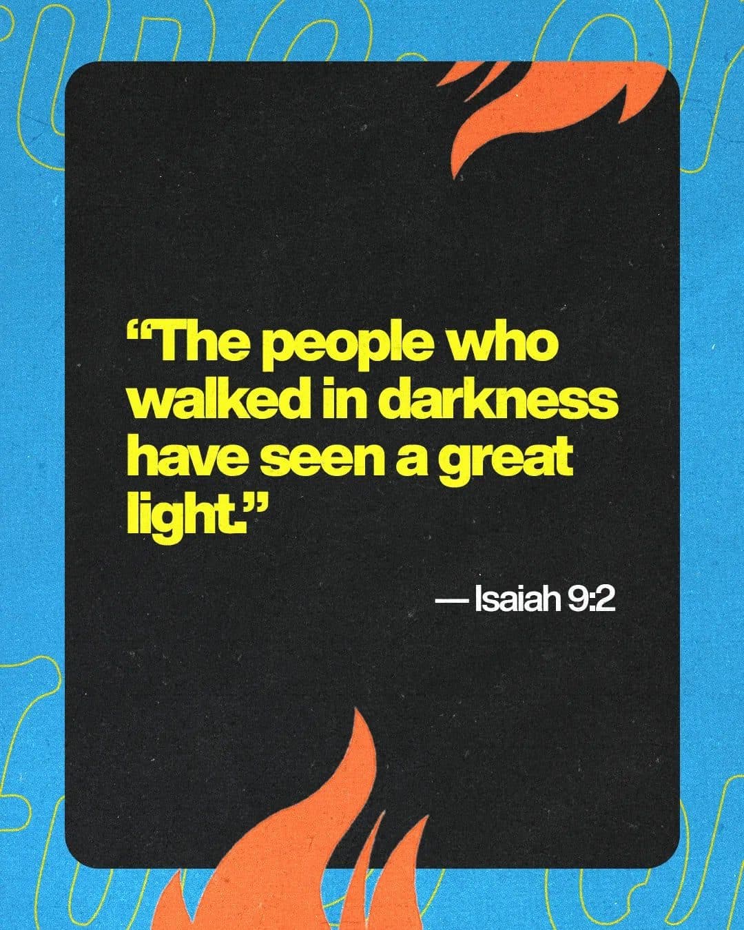
One verse, one field of color, nothing else. These are the only Christmas graphics your congregation reliably reposts to their own accounts, which makes them the cheapest reach your church will get all December. Make four or five in whichever typeface won the meeting, and they’ll run about fifteen minutes each once the first one exists.
How to Decide This in One Meeting
Bring the people who understand your church, and settle out loud, before you start, which two or three of them have the final call. One late opinion shouldn’t be able to reopen forty finished graphics in December. The view, voice, vote, and veto approach keeps that from happening without shutting anyone out of the conversation.
Three questions will get you there faster than a round of opinions:
- What does the room look like on December 24? Choose the direction that matches your building, not the one winning on Pinterest.
- Who is this invitation for? A neighbor who hasn’t been inside a church since last Christmas needs something different than the family who’s already in row three.
- What does this direction ask of us, and whose calendar does that land on by Friday?
Then lock the series name in the same meeting, because every graphic after it is waiting on that one decision.
What Deciding Early Actually Buys You
Once the look is settled, Christmas stops being a stack of design questions and turns into a schedule. Series graphics get requested first, since everything else inherits their look. Event graphics follow, one per service. Print gets designed in October so it can reach the shop the week before Thanksgiving.
Give your landing page more attention than most churches do, and get it live by the last week of October with service times, directions, and a simple way for a guest to respond.
The latest Unstuck Church Report puts online service views up 25% year over year, and the churches doing best online are seeing the strongest in-person gains.
Families settle their Christmas Eve plans early in December, often before the second Sunday. A push that starts the week of Christmas is reaching people whose plans are already made, which is why October and November matter more than the last seven days do.
And if you’re starting later than September, you’re not behind and you’re not bad at this. You’ve been running a season-long project on a week-long system. Compress the early phases into one honest working session, keep the print and video deadlines fixed, and let everything else move.
Then work through the Christmas graphics checklist to see which pieces to build and when.
All of this exists for one reason: so the person who cares most about December is standing in the lobby when those families walk in, instead of refreshing their email waiting on a proof.
Christmas playbook · 2026 edition
Want the whole season planned out?
We put the plan we use with churches into a twelve-page playbook, worked backward from Christmas Eve. You’ll get the four decisions to settle in September, one church’s complete deliverables list, and a worksheet for writing your own. It costs an email address and nothing else.


Published by Church Media Squad on August 27, 2026.