


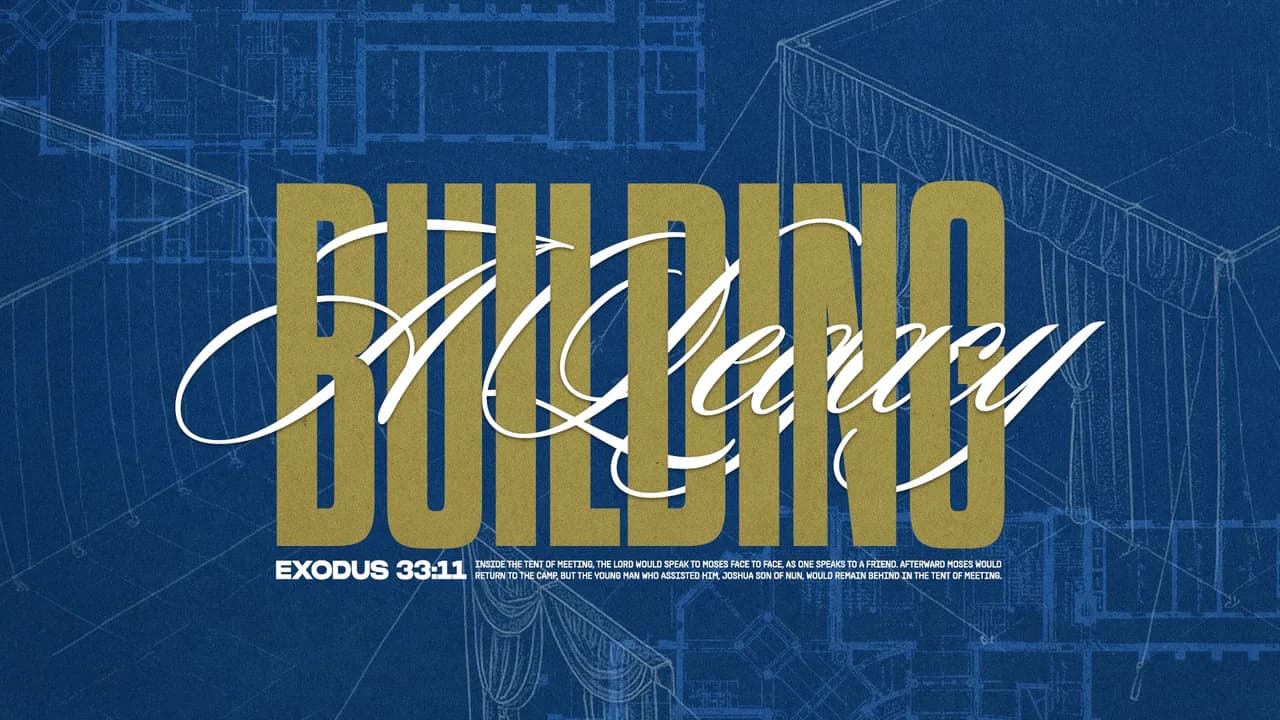
The strongest sermon series design ideas start from one clear visual move that carries the series title, and the ten below each come from a real series our Design Squad made for a church. Each one shows what the design does and how a church could use the same idea. You don't need to be a designer to follow along. If you're the person planning the next series, you'll see a technique you can describe to your team or hand to us.
Make Your Own City the Backdrop
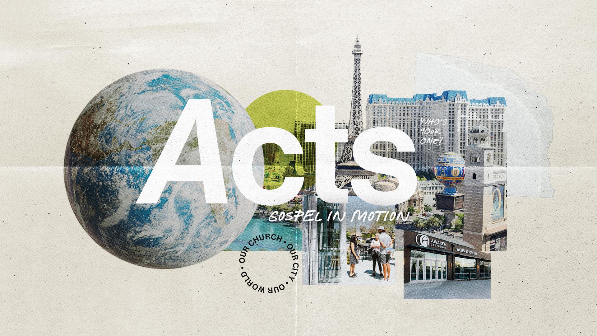
In our Acts series design, a big white title floats over a cut-paper collage of the church's own city: a globe, local landmarks and street photos, with a round stamp reading our church, our city, our world. It suits a church series because it tells your people the mission starts close to home and reaches outward. You don't need much to use the idea. Snap a few familiar corners of your town, layer them as a collage, and finish with a simple stamp of your own.
Swap One Letter for a Photo
In the Send Me series, tall, heavy letters fill the whole frame, and a photo of the earth sits where the O should be. It's a simple swap, and it tells people the title's whole idea before they read a word of the invite. That suits a series about going out, because the mission is right there in the lettering. A church could do the same with its own title: pick one letter that's round, and let a single image of your people or your place take its spot.

Let an Old Master Painting Carry the Background
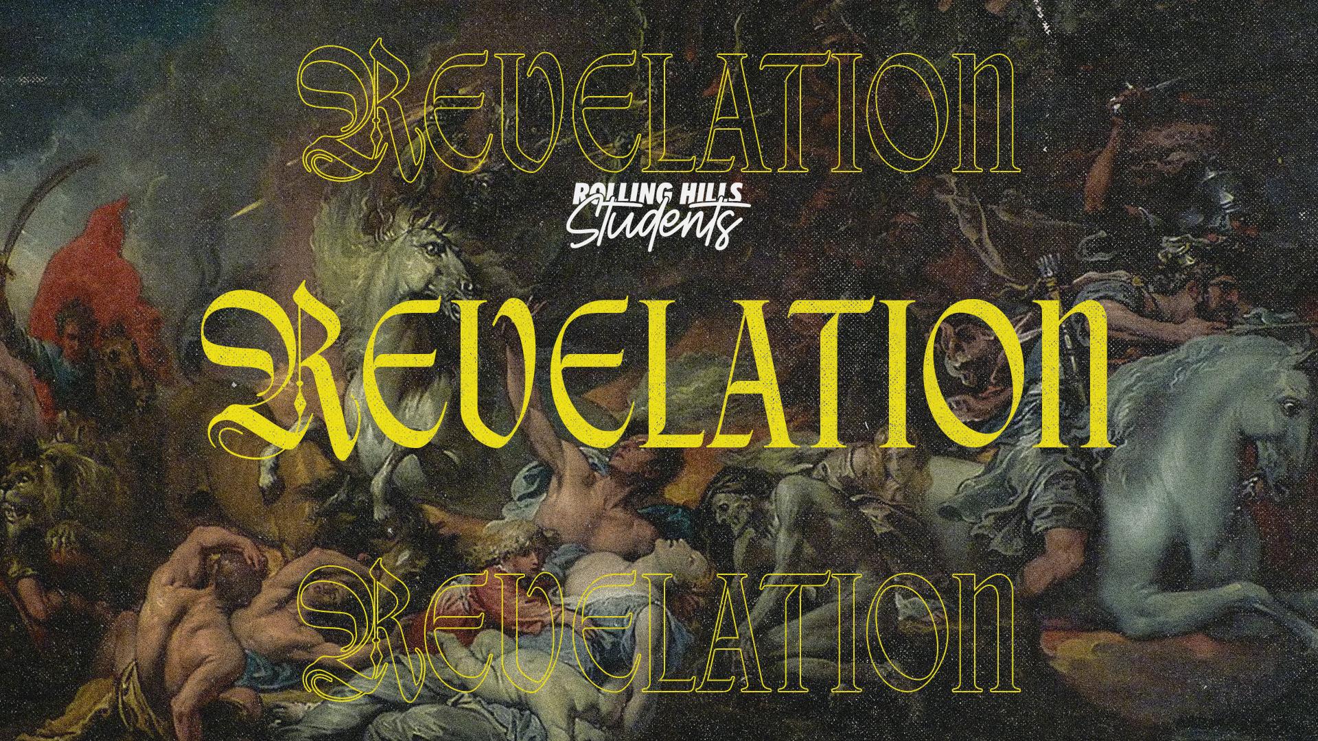
Our Revelation series was built for students, and the design doesn't water anything down. An old master painting fills the whole background, and the title is set in blackletter type, repeated three times down the frame. It works because Revelation is big, strange and old, and the design looks like it knows that. Teenagers tend to notice when something is trying too hard to be cool, and this isn't. A church could borrow the idea for any series with heavy, ancient material: pick one classic painting, then let one repeated title do the rest.
Let Flowing Script Carry the Story
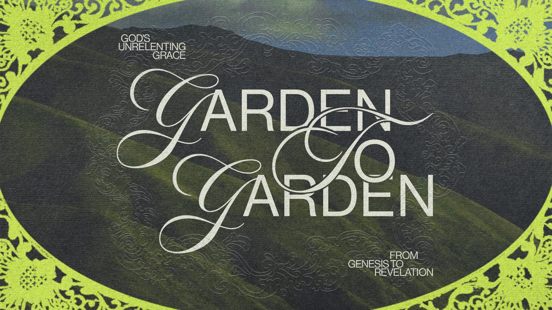
Garden to Garden carries the tagline from Genesis to Revelation, and the design doesn't need much help saying it. Flowing script lettering sits inside an ornate oval frame, over a photo of green hills. The frame makes the title read like the front of an old book, and the hills give it room to breathe. That suits a series that walks through the whole Bible. If you're planning something with a big arc, you could set one framed script title over a landscape photo and let it stand on its own.
Let One Small Figure Carry the Scene
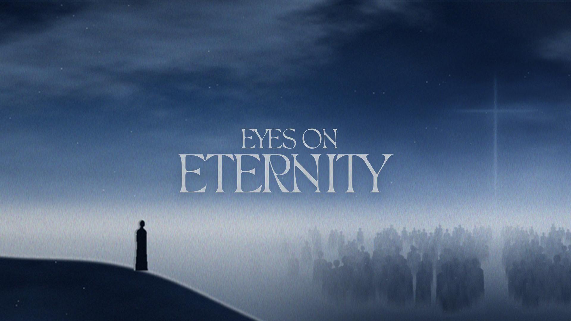
Eyes on Eternity is a quiet one. It's a foggy blue scene with a single figure standing on a ridge, and the title is small and light, set in a serif with lots of space around it. That space is the point: the eye goes to the figure first, then to the words. It suits a series about heaven, hope or the long view, where you don't want the art shouting. A church could use the same idea by picking one calm photo, keeping the title small, and leaving the rest of the frame empty.
Letters Made of Colored Thread on White
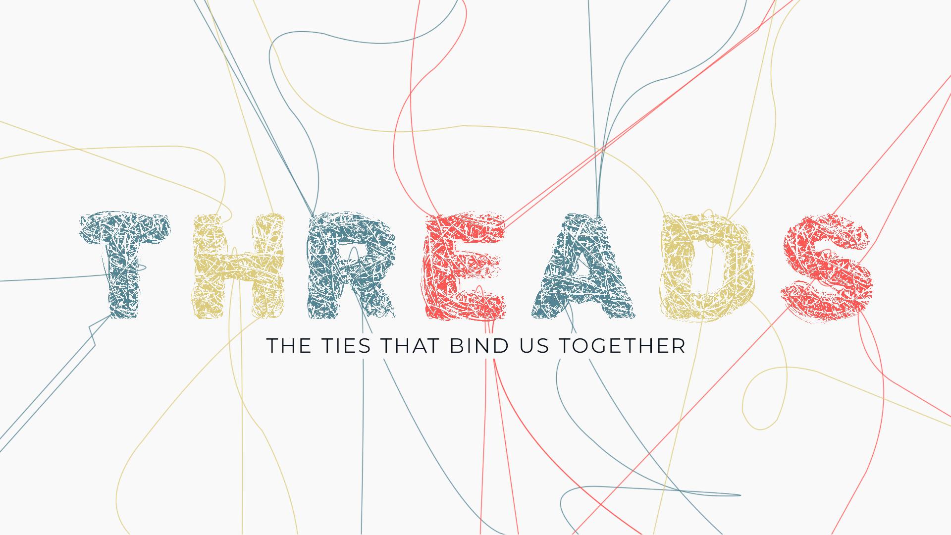
In Threads, every letter of the title is built from tangled colored thread, and a few loose lines run across a white background. It's a simple move, and the series is about the ties that bind us together, so the lettering looks tied together too. That's why it suits a series on community or belonging. You don't need a big idea to borrow it. Build one word from rope, yarn or ribbon, then let a few loose ends wander across your slides and invite cards.
Let a Leaf Cut Through Your Letters
A kraft-paper panel does most of the work in Seeds + Soil. The type is heavy and set in just two colors, and a leaf shape is cut through the letters so you see the paper underneath. It suits a church series because it feels earthy and honest, and that's a good match for a series about growing in faith. To use the same idea, pick one shape that fits your series, cut it through a bold title, and let a warm paper tone fill the background. Two colors don't ask much of you, so it's easy to repeat on every slide.

Let a Hand-Drawn Icon Sit on Soft Paper
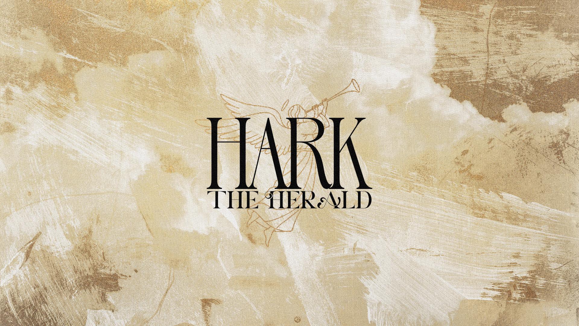
In Hark the Herald, a narrow serif title and a hand-drawn trumpet sit over a cloudy, painterly paper texture. It reads like an old Christmas card, but the loose drawing keeps it from feeling stiff. For a church that's handy: the design announces the season the way a herald would, and it doesn't lose anything on the lobby TVs or a printed invite card. You could do the same by choosing one hand-drawn symbol from your series title and giving it a soft, textured paper background.
Repeat the Title Down the Edges in Orange
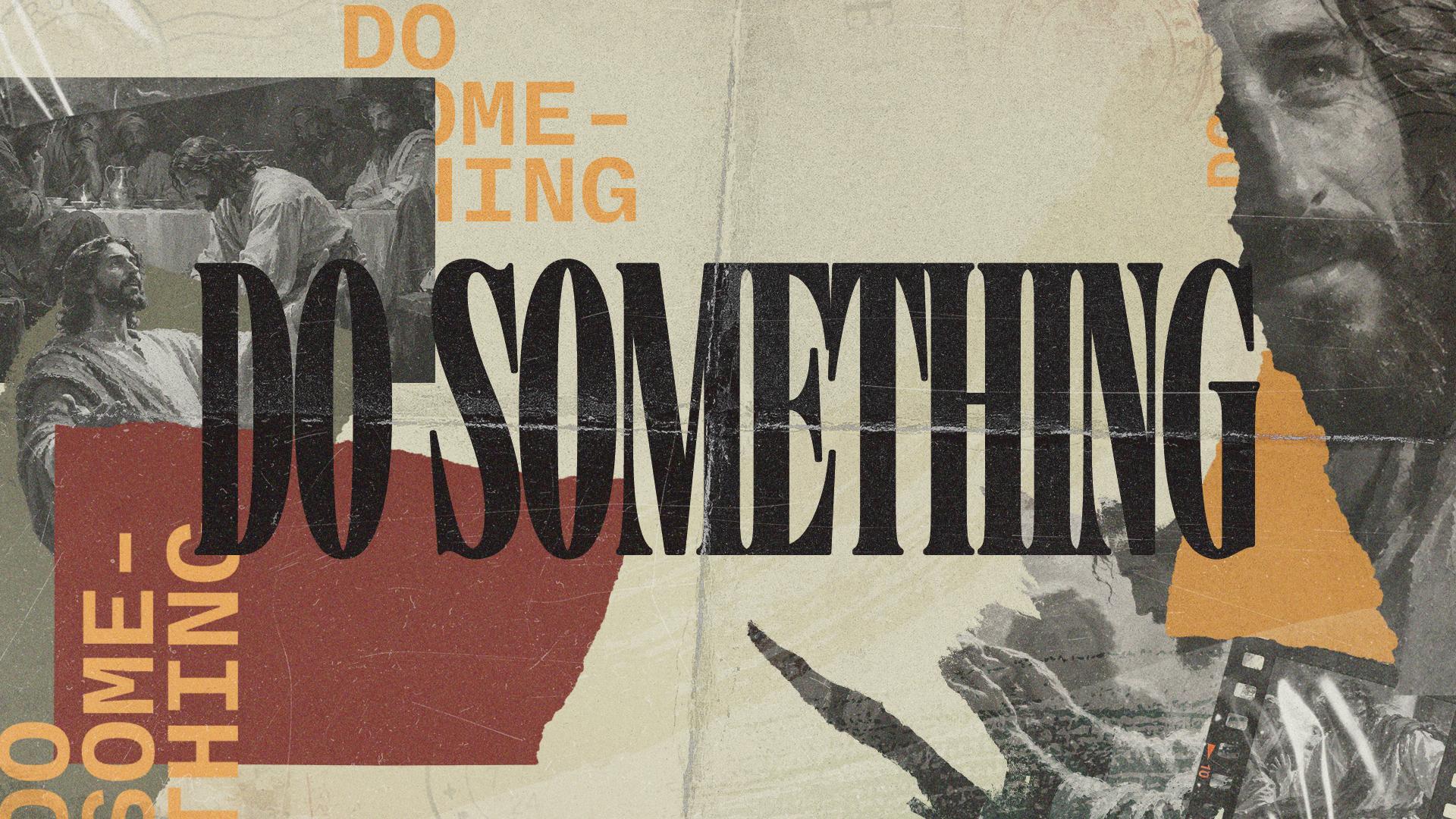
Our Do Something series design tears classic paintings into a paper collage, with the title in condensed black type that's repeated in orange down the edges. It works for a series about acting, because torn paper looks like something somebody's making with their hands right now. A church could use the same idea by tearing a few printed paintings into strips, layering them behind a tall, narrow title, and letting one bright color run down the edges of every slide and invite card.
Let One Bright Star Carry the Christmas Title
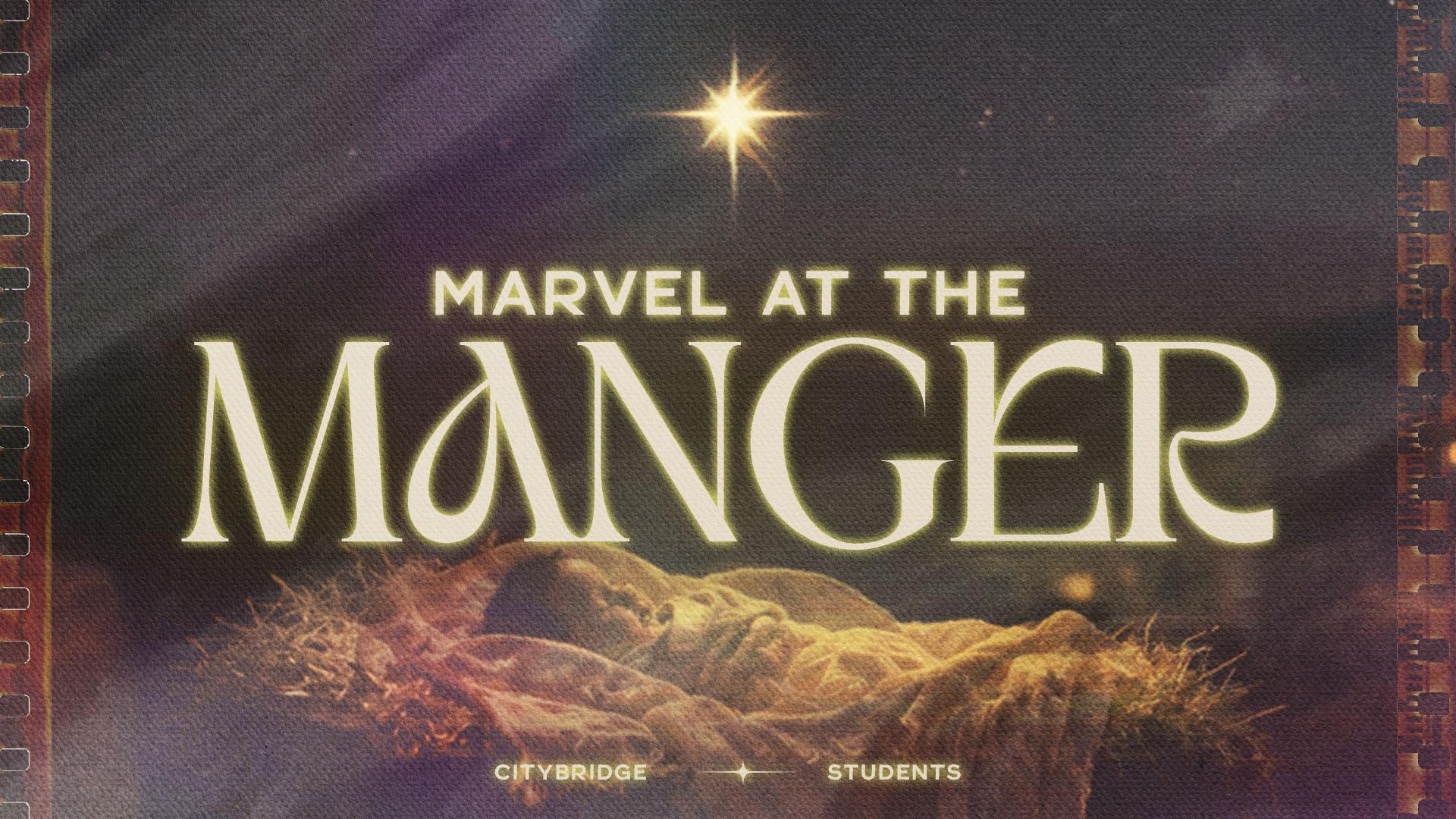
It's easy to overthink a Christmas series, and Marvel at the Manger, a student series, doesn't. It's a warm, grainy photo of straw, one bright star above it, and a large display serif for the title, all framed like a strip of film. The mood is quiet and a little nostalgic, which suits the season. A church could borrow the idea by picking one simple object from the story, shooting it with warm grain, and giving the title room to be big.
How We Count a Series Design for Your Church
A series design is one graphic on our plans. That one graphic is the key art and everything made from it: every size, the slides, the social posts and the invite cards. The Graphics plan gives you 5 graphics each billing cycle at $797 a month on a 12-month agreement. Revisions run until it's right, and our published lead time for a series is two weeks.
More Real Series Designs and Topic Ideas
If you want to see more of how this looks in practice, browse our gallery of sermon series graphics. Every design in it is a real series our Design Squad made for a church, so you can see how the key art carries across slides, social posts and invite cards. And if you're still deciding what to preach, we've got a separate page of sermon series ideas sorted by topic. Start there for the subject, then come back to the gallery for how it could look.
Want this handled for you?
Sermon series, events, social, print, and merch, designed by people who used to sit in your chair on a Thursday night.


Published by Church Media Squad on November 11, 2026.