



Every church celebrates Mother’s Day with a slightly different heart—and the tone you choose shapes how the message is felt. Whether you’re creating something celebratory, reflective, encouraging, lighthearted and fun, or more inclusive and sensitive, your visuals help communicate that intention clearly and thoughtfully. These moodboards are designed to help you choose a style that supports the tone you’re setting and connects with the moms in your community right where they are.
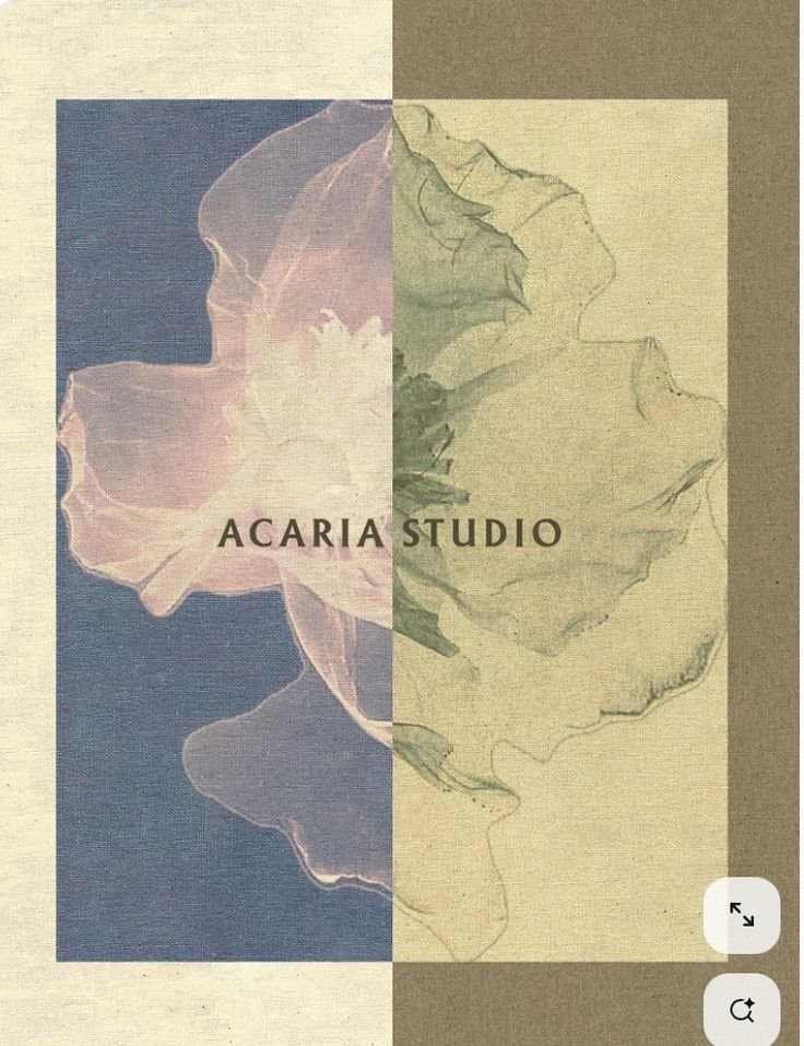
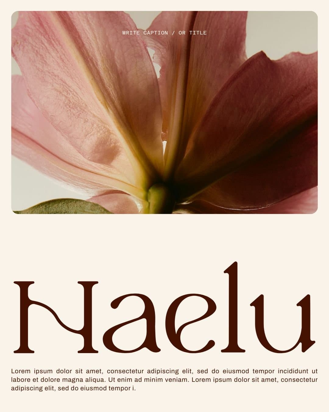
Soft & Elegant Neutrals
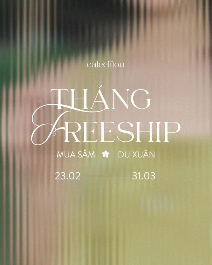
This style leans into muted tones and delicate details to create a calm, thoughtful feel. It’s a natural fit for churches wanting to honor the depth of motherhood with a more reflective and meaningful tone.
How to get this look:
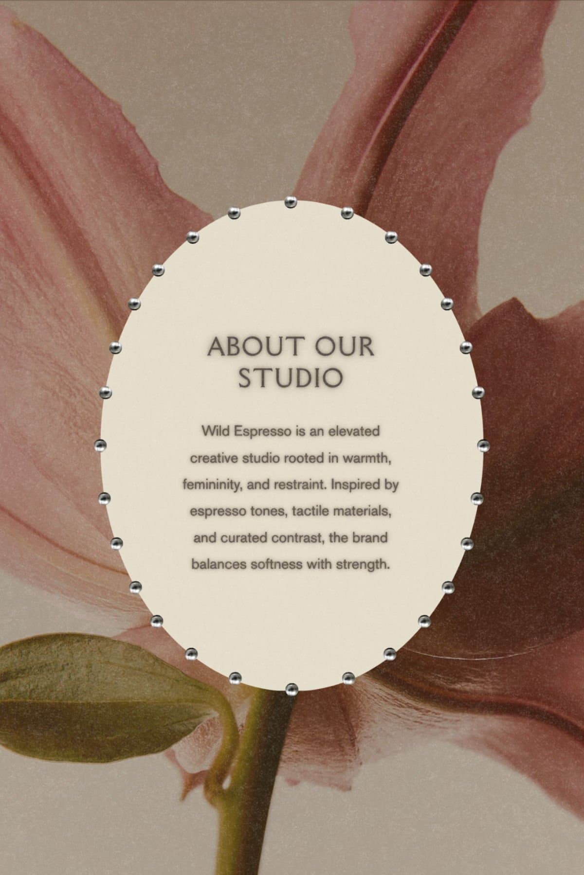

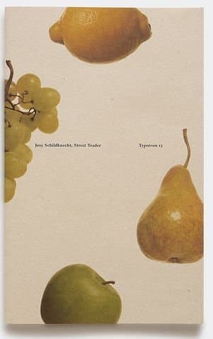

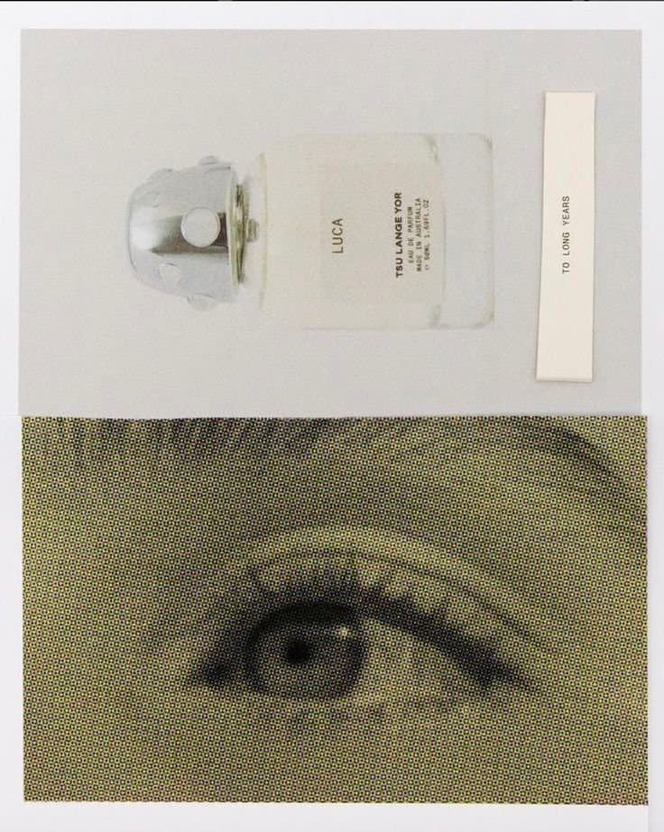
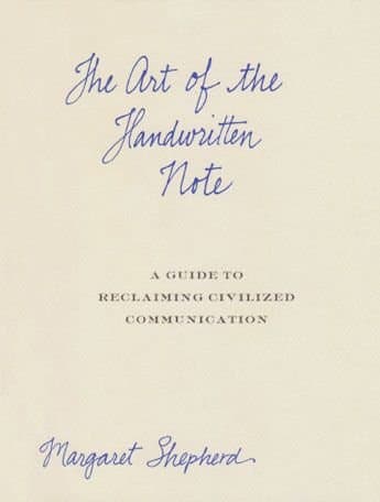
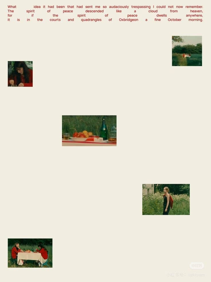

- Neutral color palette (cream, sage, soft peach, warm beige)
- Minimal layouts with lots of white space
- Editorial-style serif fonts
- Subtle textures (paper grain, linen)
- Simple botanical or still-life imagery
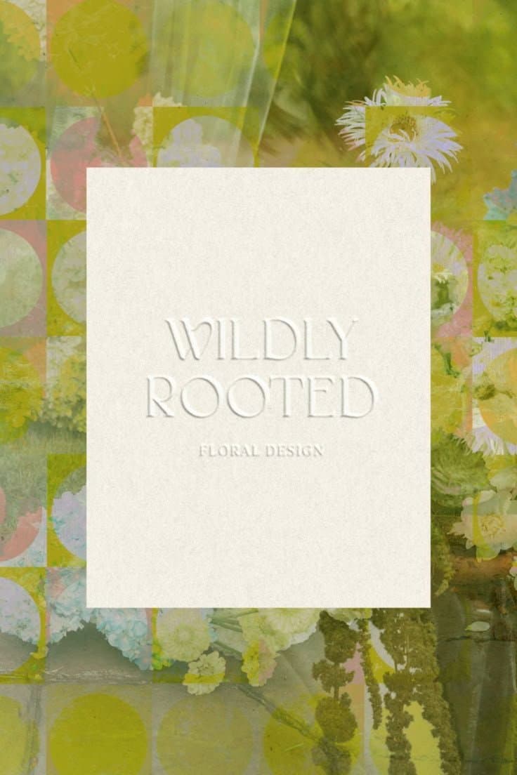
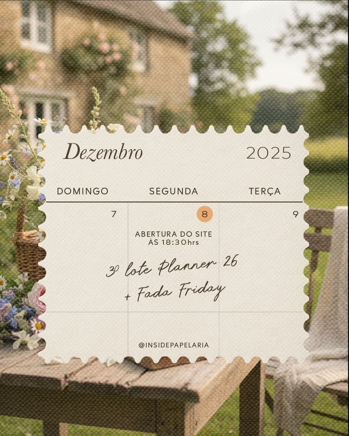
Modern Botanical & Earthy
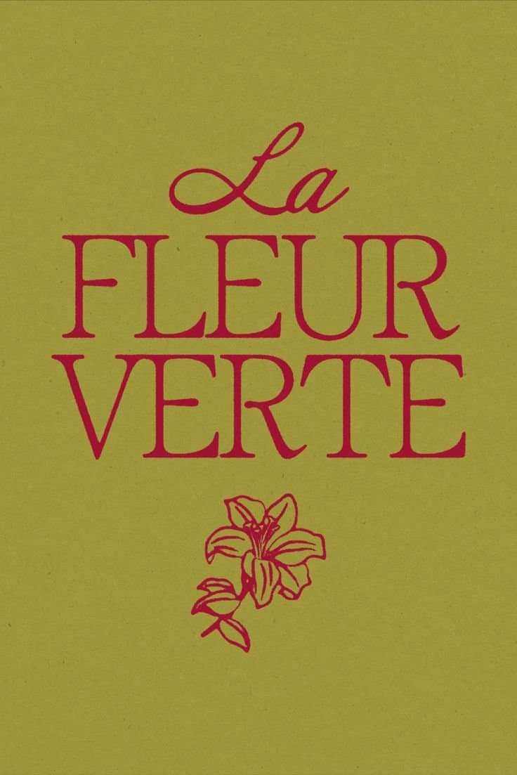
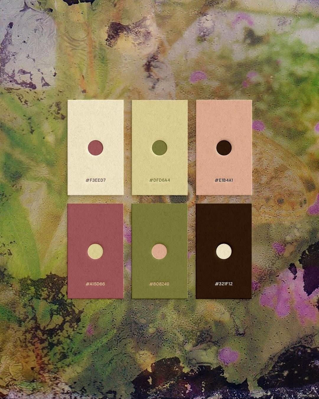
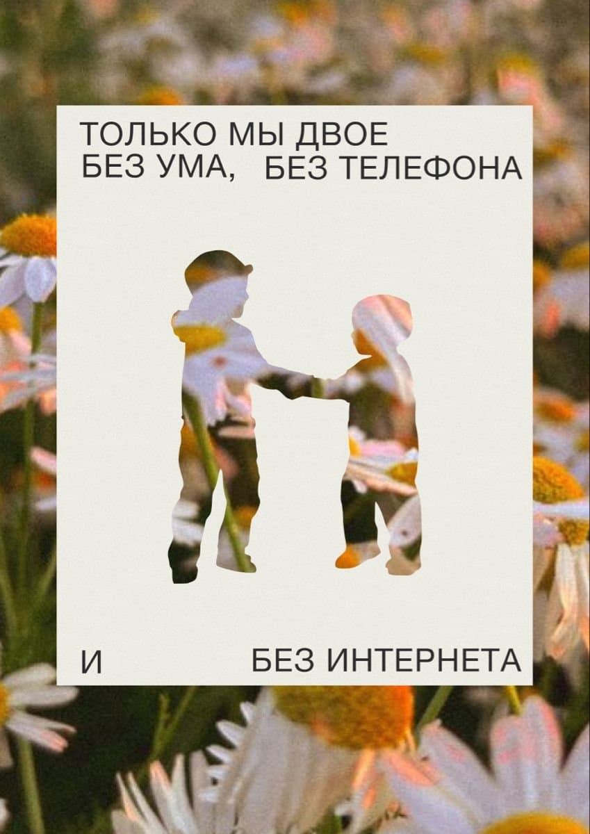
Grounded in natural elements and organic shapes, this style feels steady and life-giving. It works well for churches wanting to communicate encouragement, growth, and the quiet strength of motherhood.
How to get this look:
- Earth tones (olive, moss, clay, muted gold)
- Organic shapes and soft curves
- Botanical illustrations or plant photography
- Clean, modern serif or sans-serif pairings
- Light layering and collage-style composition
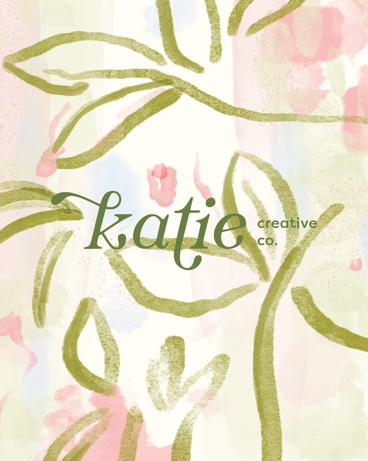
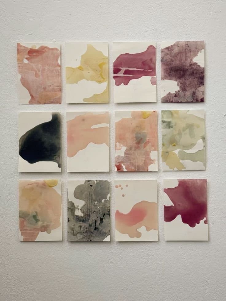
Painterly & Watercolor Florals
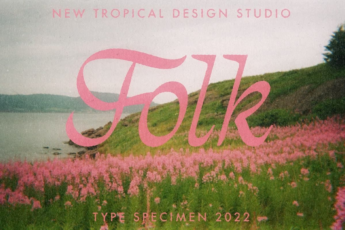
With soft blends and expressive textures, this style creates space for a wide range of emotions. It’s a beautiful option for churches wanting to approach Mother’s Day with sensitivity and care, acknowledging that the day can hold both joy and complexity.
How to get this look:
- Watercolor textures and gradients
- Blended, slightly abstract color palettes
- Hand-painted or illustrated florals
- Soft shadows and light overlays
- Elegant script or handwritten-style fonts
Free Download
〰️
Free Download 〰️ Free Download 〰️
Steal our Mother’s Day Social Media Captions
We put together 15+ of our favorite social media captions for churches to use on Mother’s Day. No matter how you celebrate, there’s something for you here!
“ + detail + ”
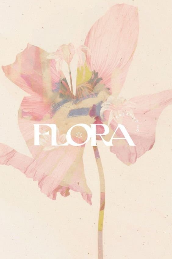
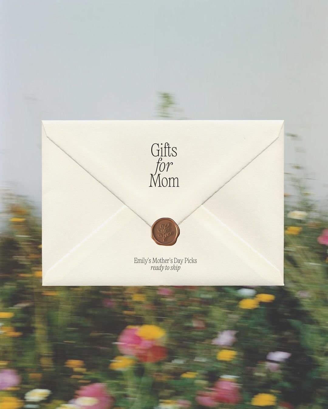
Light, Airy & Lifestyle-Inspired
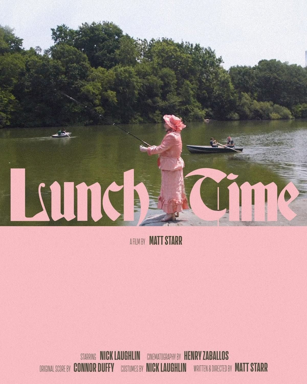
This style feels warm, candid, and easygoing, capturing everyday moments with a sense of joy. It’s a great fit for churches wanting a lighthearted tone that feels relational and approachable.



How to get this look:
- Bright, natural-light photography
- Soft pastel or neutral overlays
- Candid, lifestyle imagery (families, flowers, moments)
- Clean, minimal typography
- Gentle blur or film-style grain
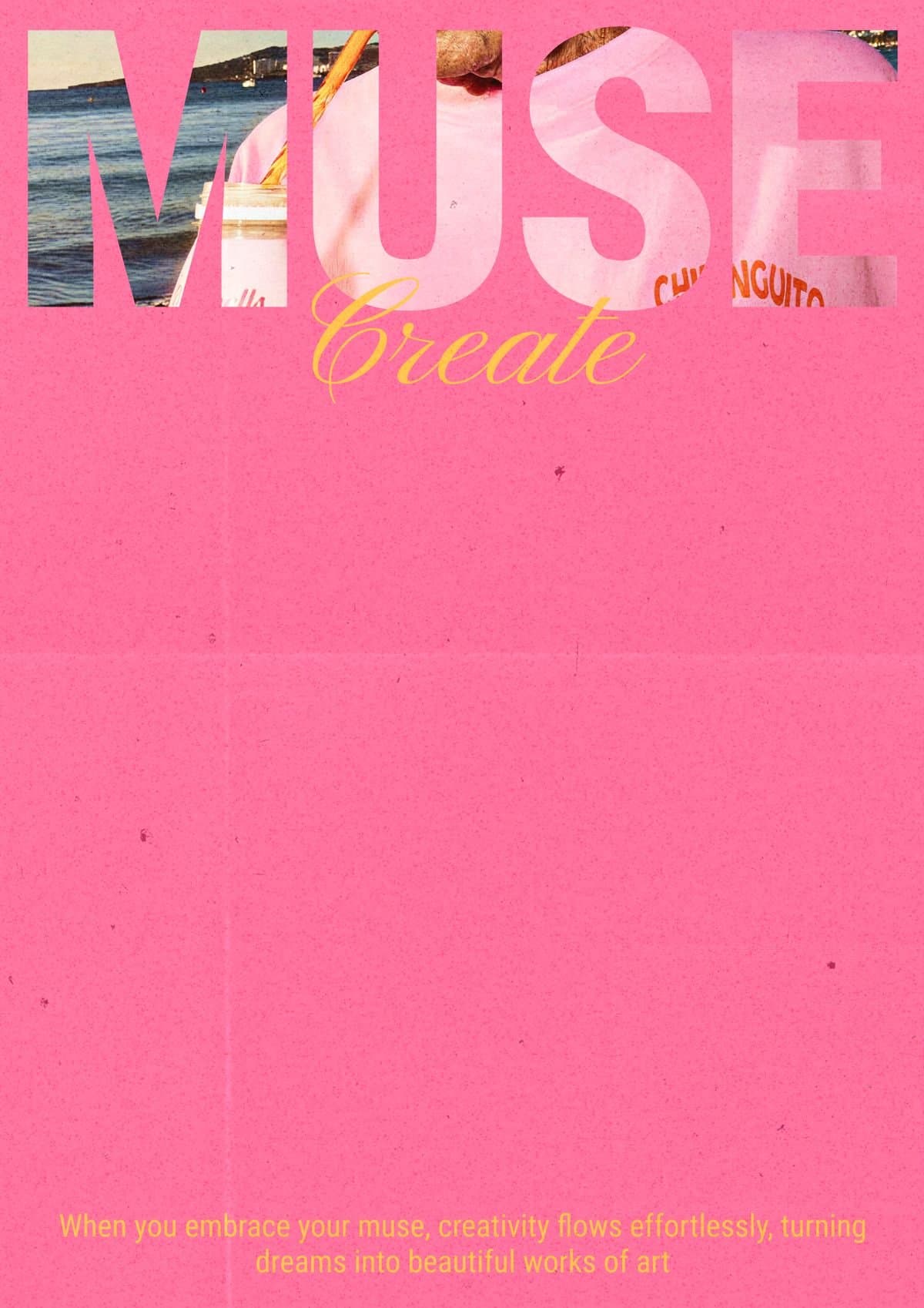
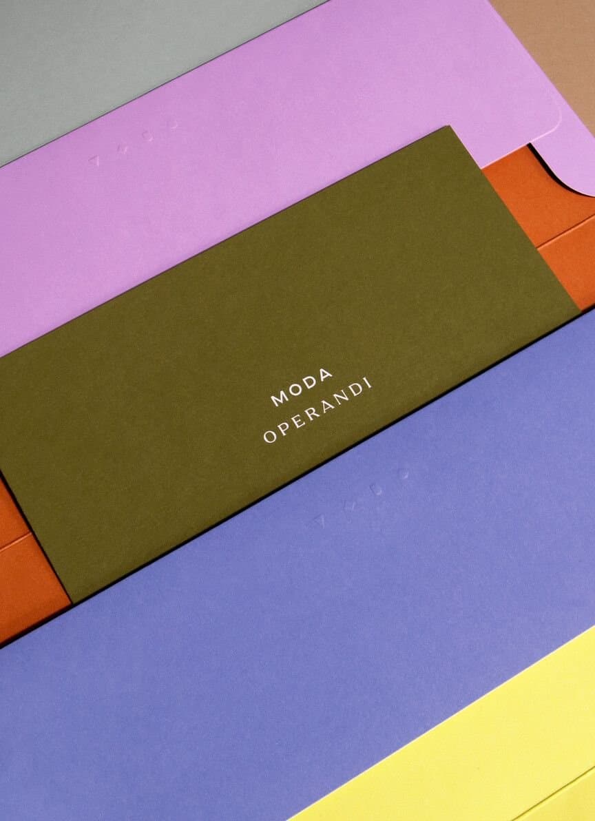
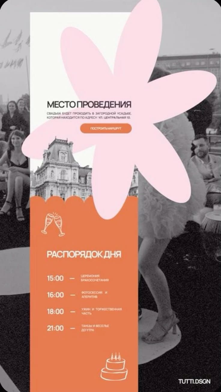
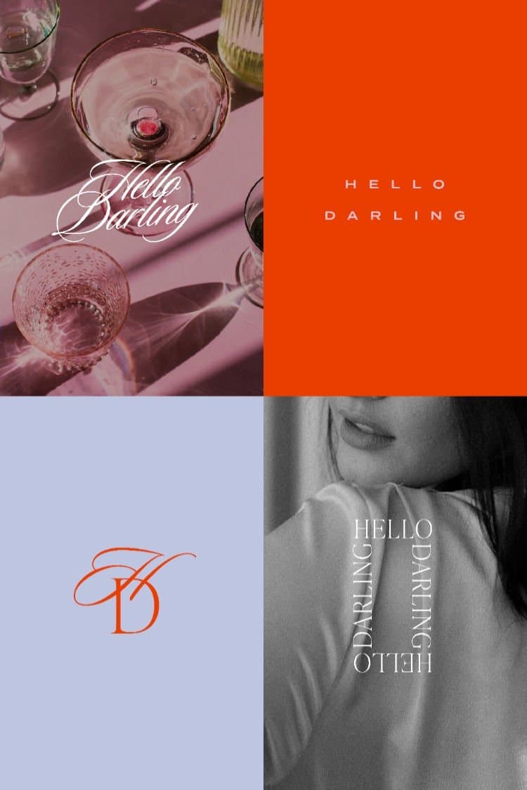
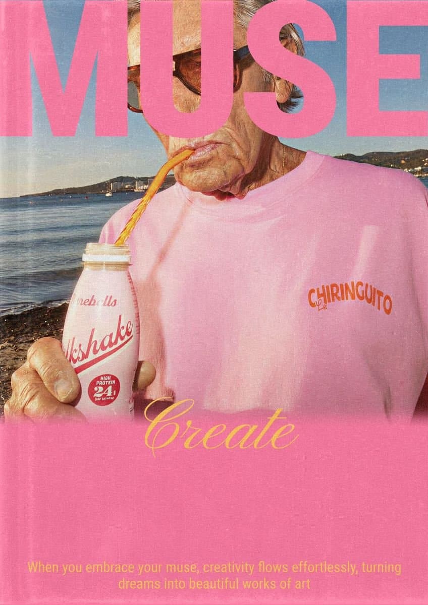
Bold, Playful & Color-Forward
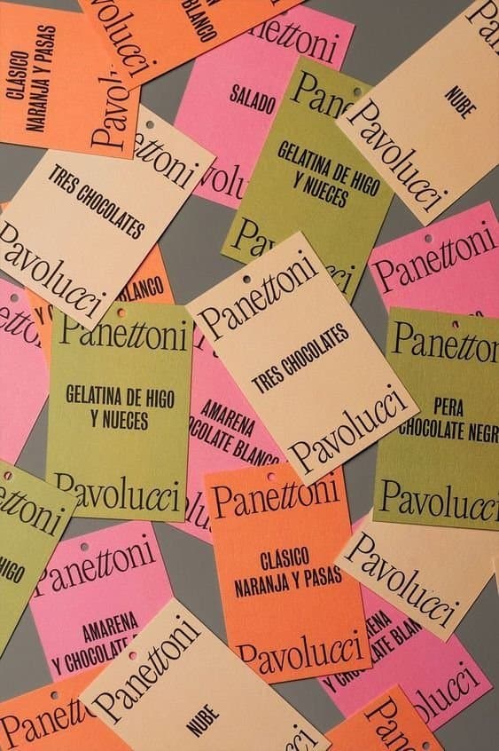
With bright colors and expressive layouts, this style brings energy and excitement. It’s perfect for churches leaning into a celebratory tone that feels vibrant, joyful, and full of life.
How to get this look:
- Bold color blocking (orange, pink, red, lime)
- High contrast palettes
- Chunky, modern sans-serif fonts
- Playful layouts and layered elements
- Graphic shapes and abstract patterns






Want this off your plate next week?
A real Squad of church creatives handles your graphics, video, social, branding, and website. Twenty minutes on a call is usually enough to tell whether it fits.


Published by Church Media Squad on April 6, 2026.