
Summer Graphics Inspiration for Churches
Summer is a big moment for churches that often doesn’t get as much attention as it should. People are looking for community, seeking belonging, and you have the chance to invite people into how God is moving in your church. Whether you're promoting a series, an event, or just showing your church is alive and active, finding the right look can be the difference between someone staying home and stepping into your community. These moodboards are designed to help you land on a style that fits your church and connects with the people you're trying to reach.
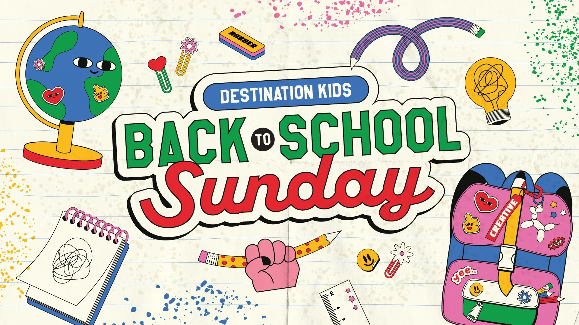
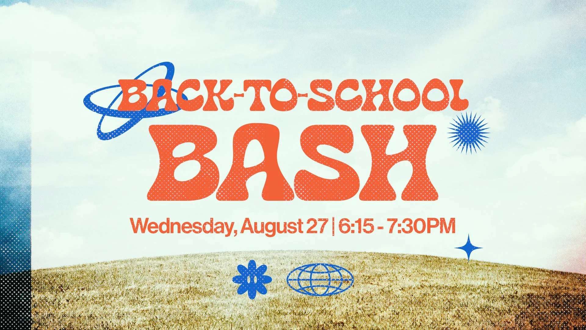
Illustrative & Icon-Driven
This style puts custom illustrations, graphic characters, and hand-drawn icons at the center of the design. The imagery does the storytelling, and the result feels distinct, intentional, and full of personality. If you want a visual representation of the joy that’s felt in your church, we love this style for you!
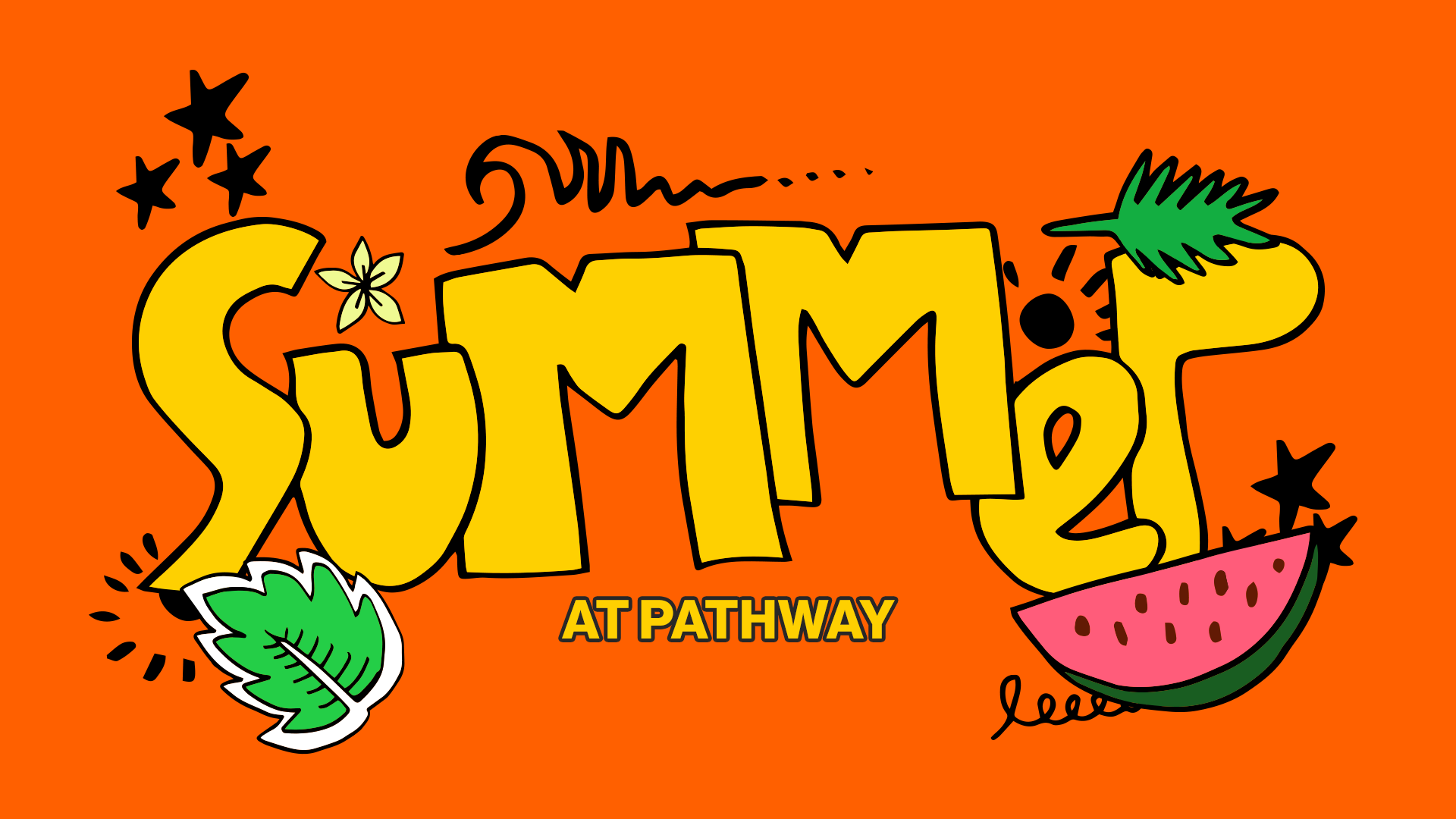
How to get this look:
Flat vector icons or illustrated characters
Warm, saturated color palettes
Grid or tile-style layouts
Bold, bubbly or retro-rounded typography
Illustrated overlays on photography
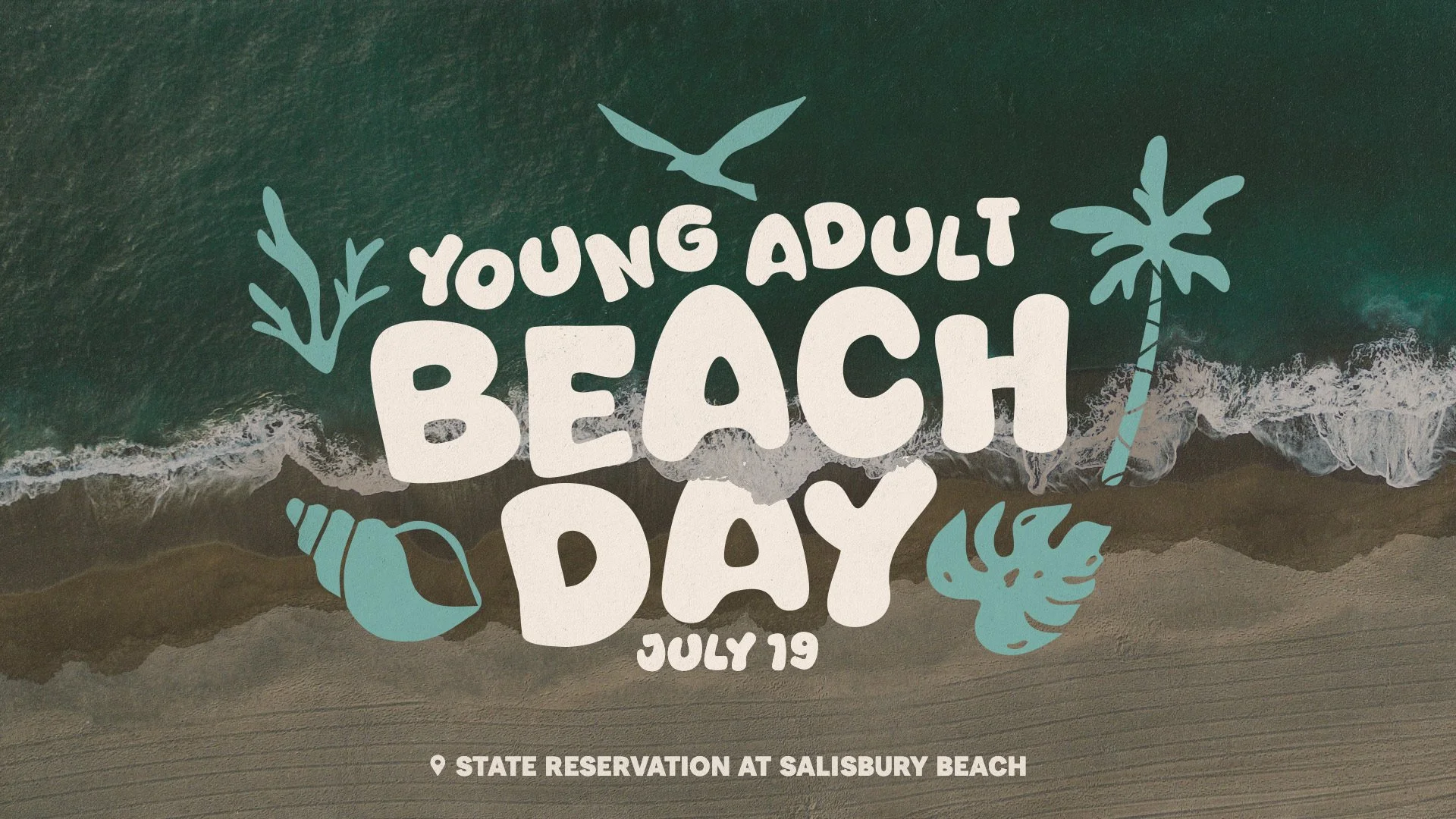
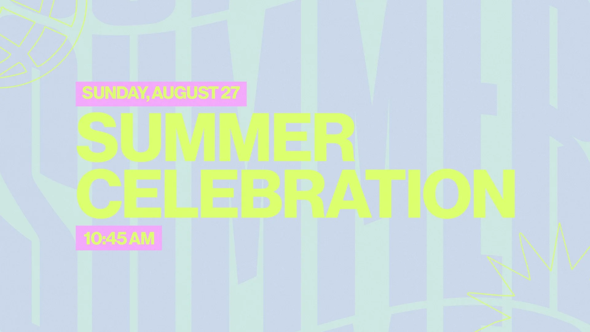
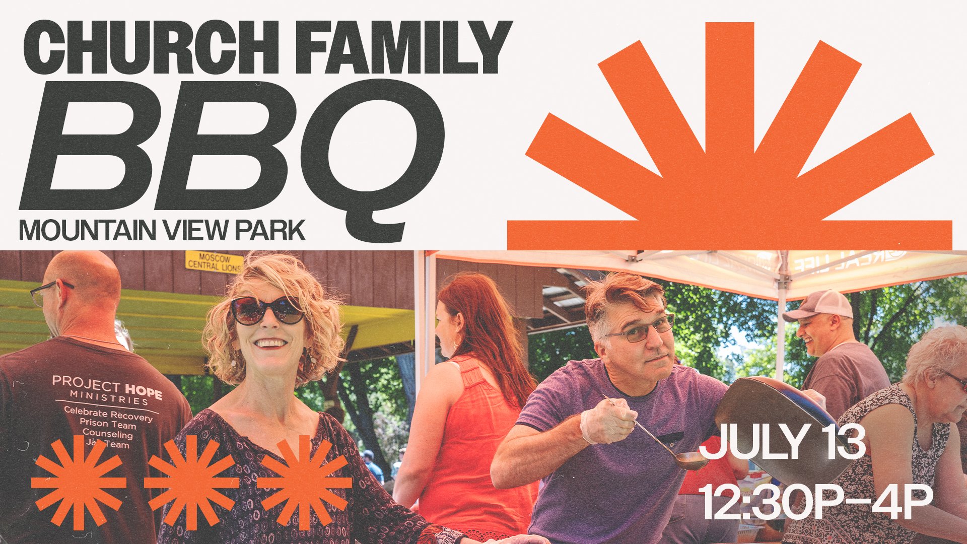
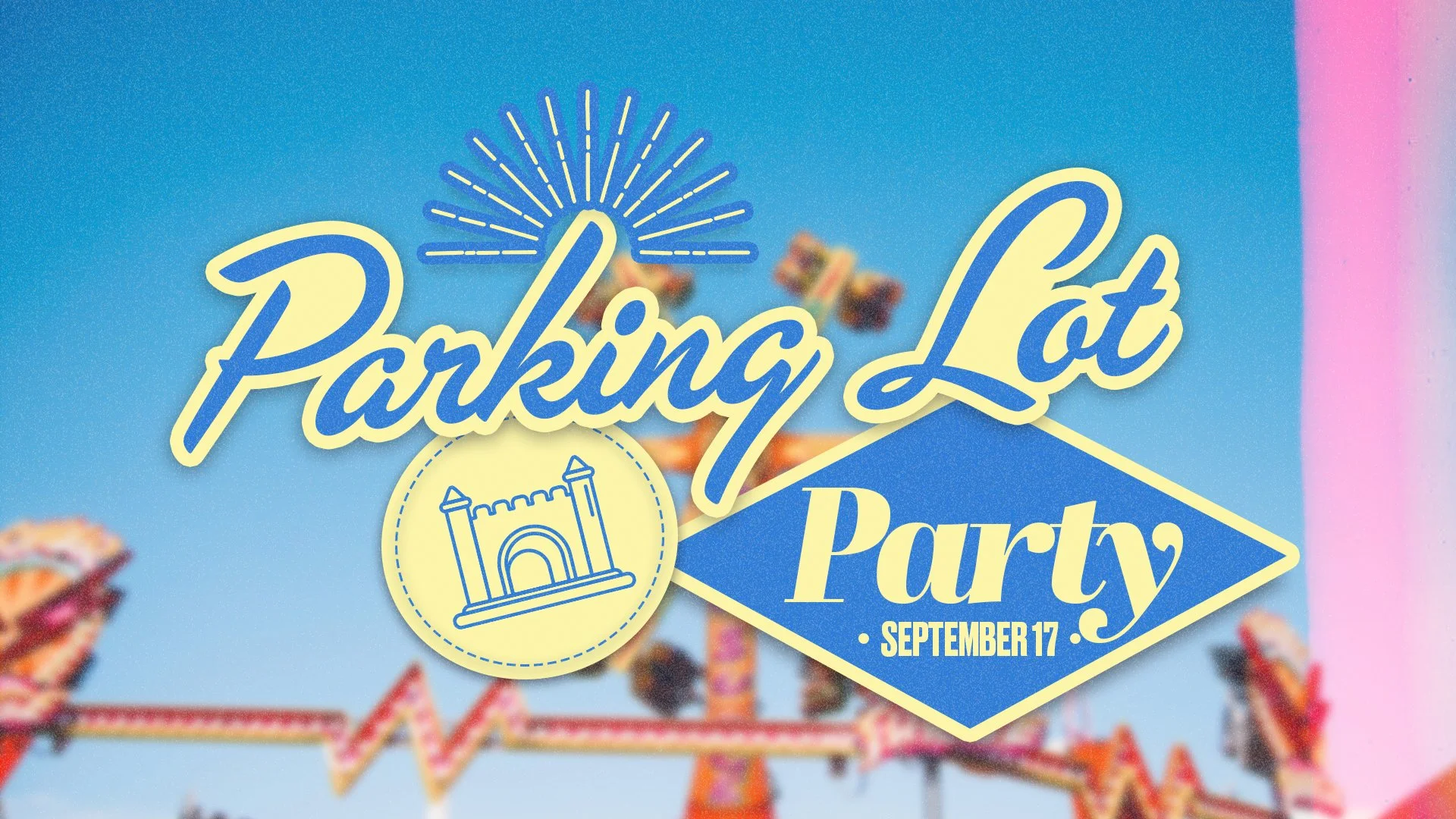
Clean & Minimal
This style leads with strong typography and intentional use of space. The restraint might feel simple to some, but it makes a point. Every element is thoughtful, showing people that you’re not adding any fluff to how you present yourself because your community of faith speaks for itself.
How to get this look:
Ultra-bold display fonts as the hero
Heavy negative space
Simple geometric shapes as anchors
Restrained 2–3 color palette
Subtle paper or film grain texture
Free Download
〰️
Free Download 〰️
Join the 30-day Church Media Challenge
One focused action per day, designed to help your team breathe easier and build momentum without pulling time away from ministry. You’ll get 30 practical tips that set the trajectory of your church media—built by people who know and love ministry.
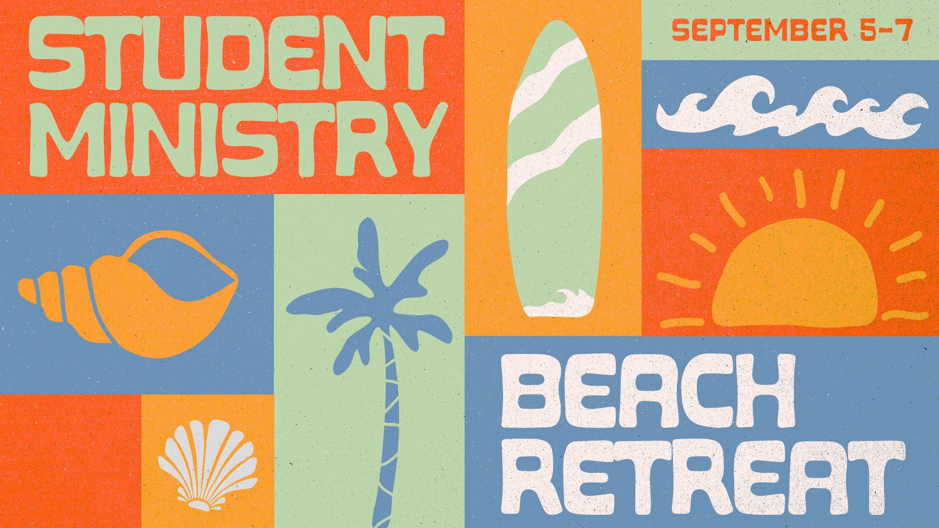
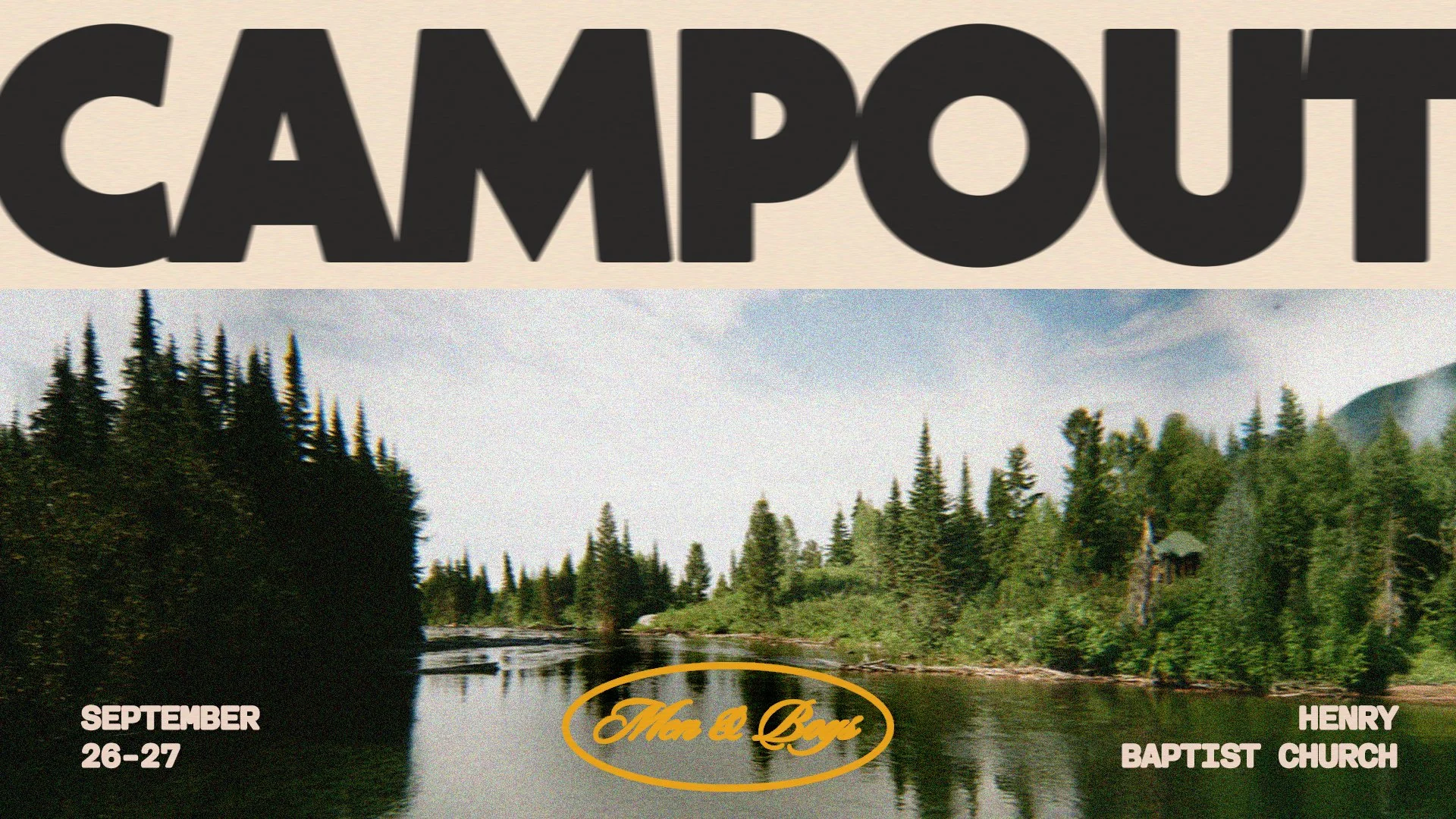
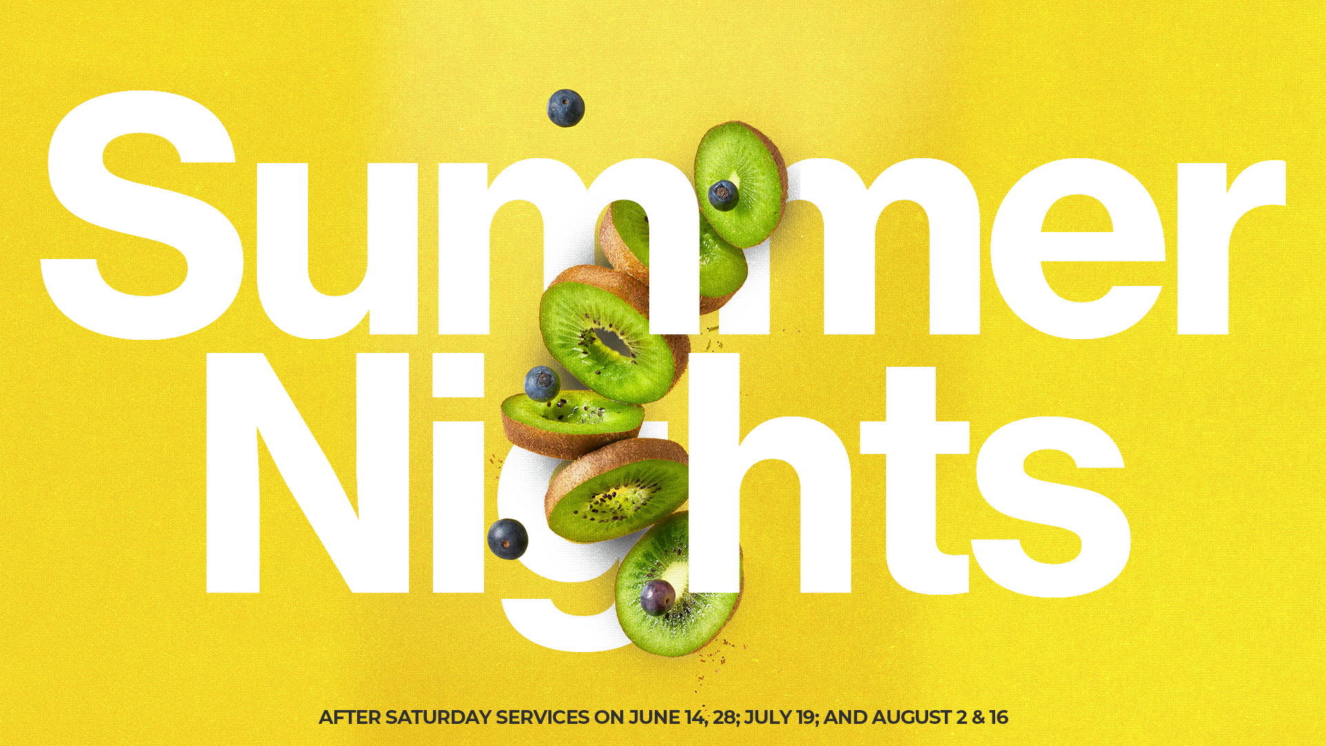
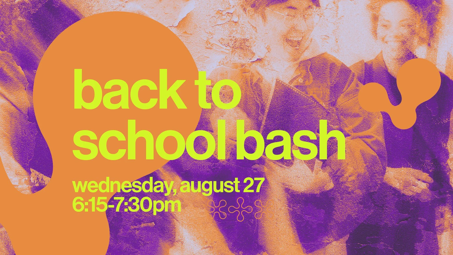
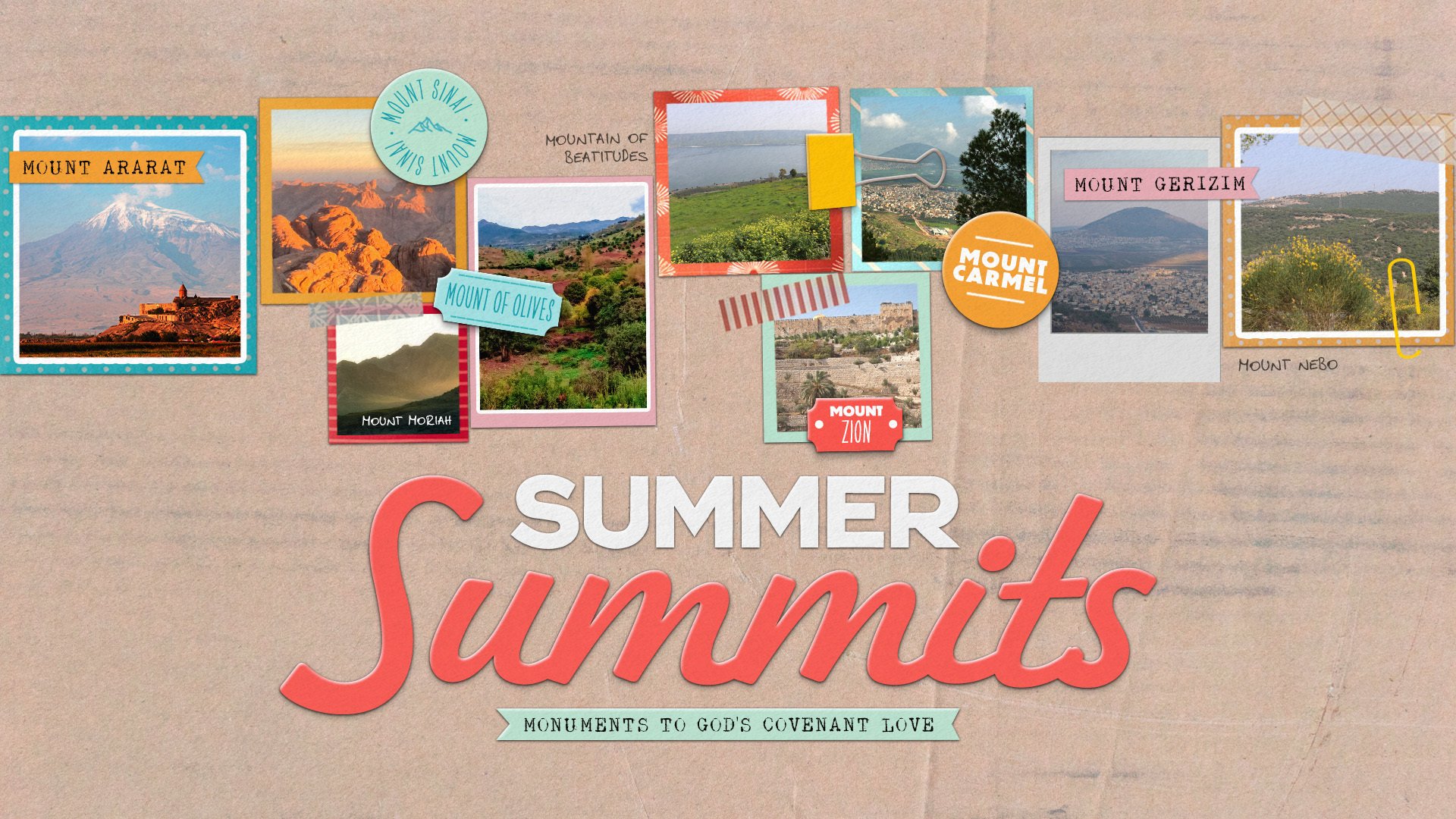
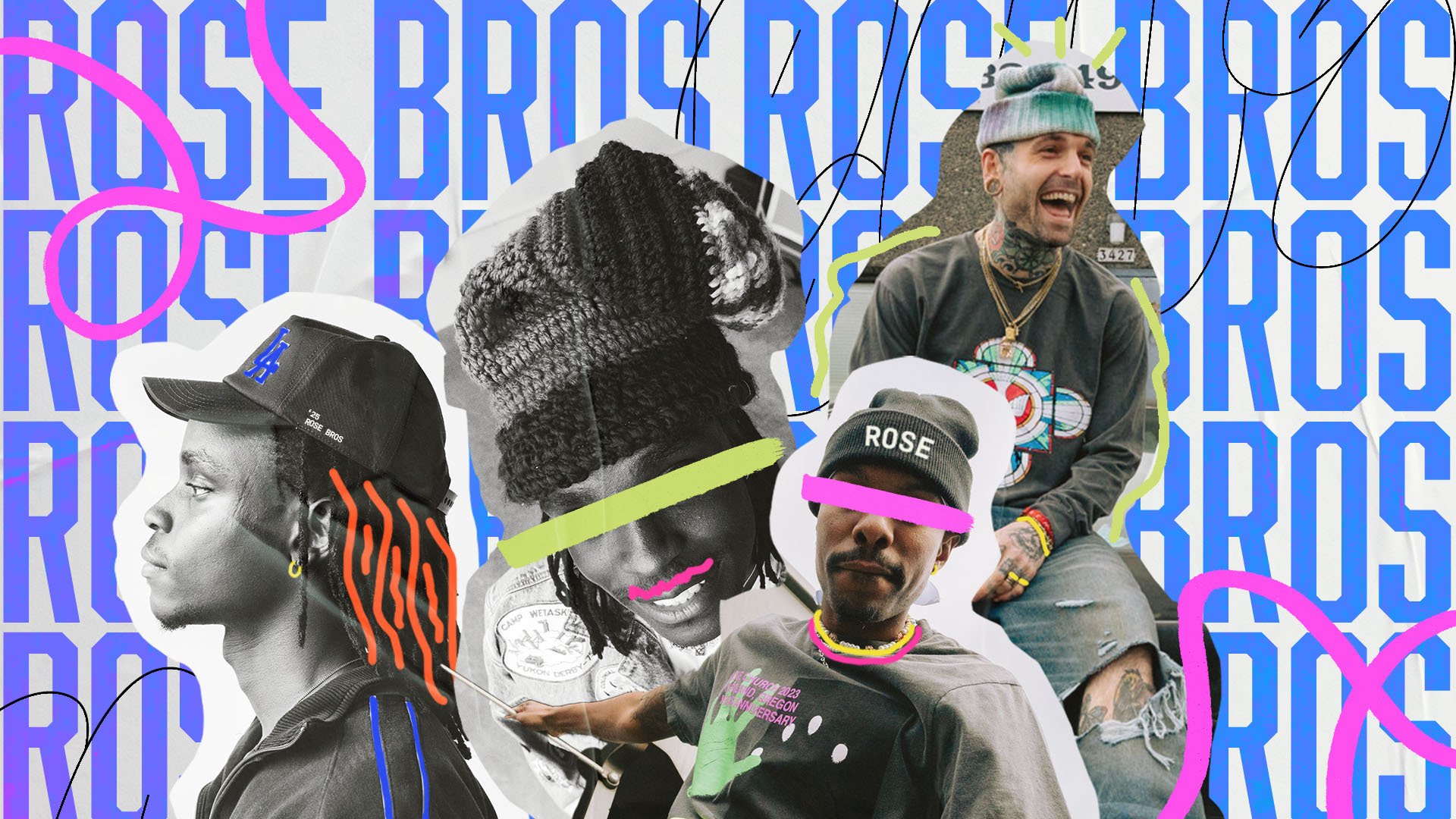
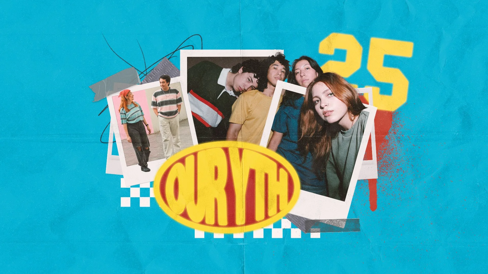
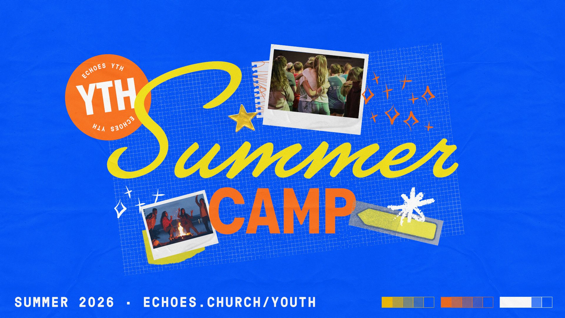
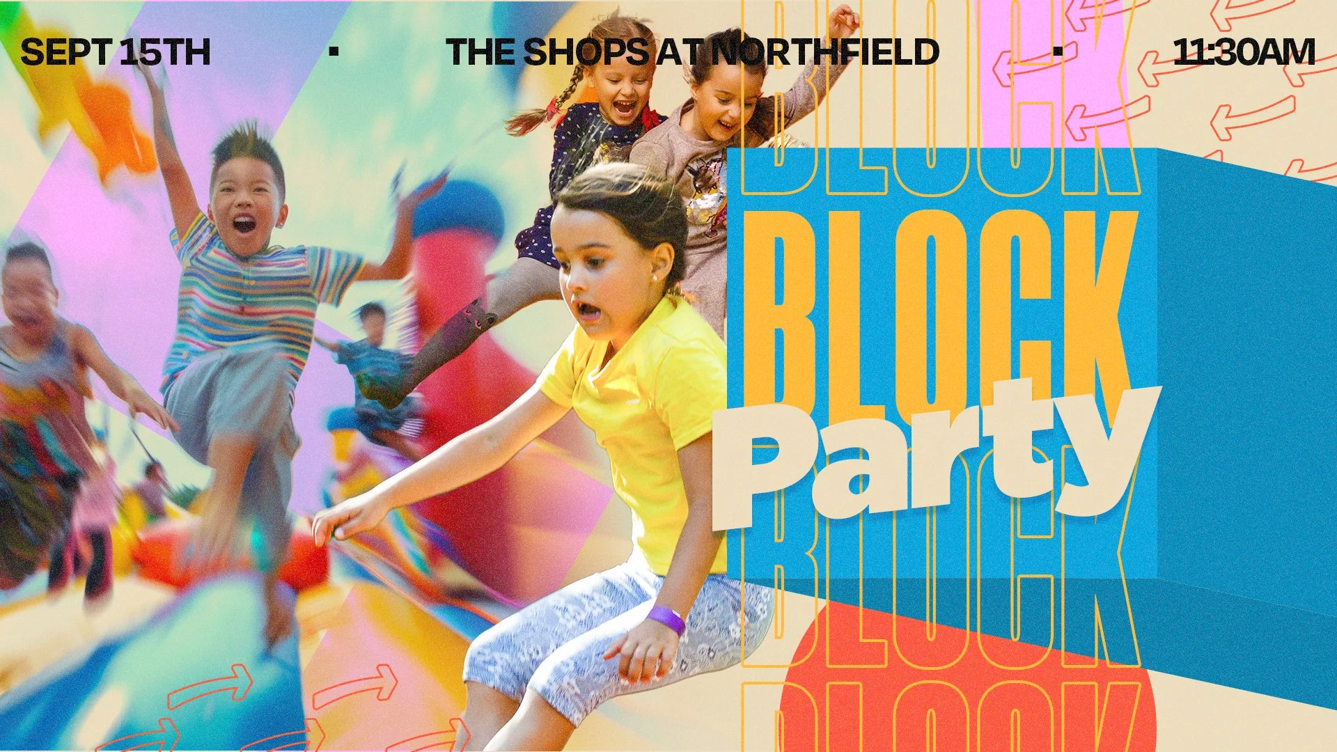
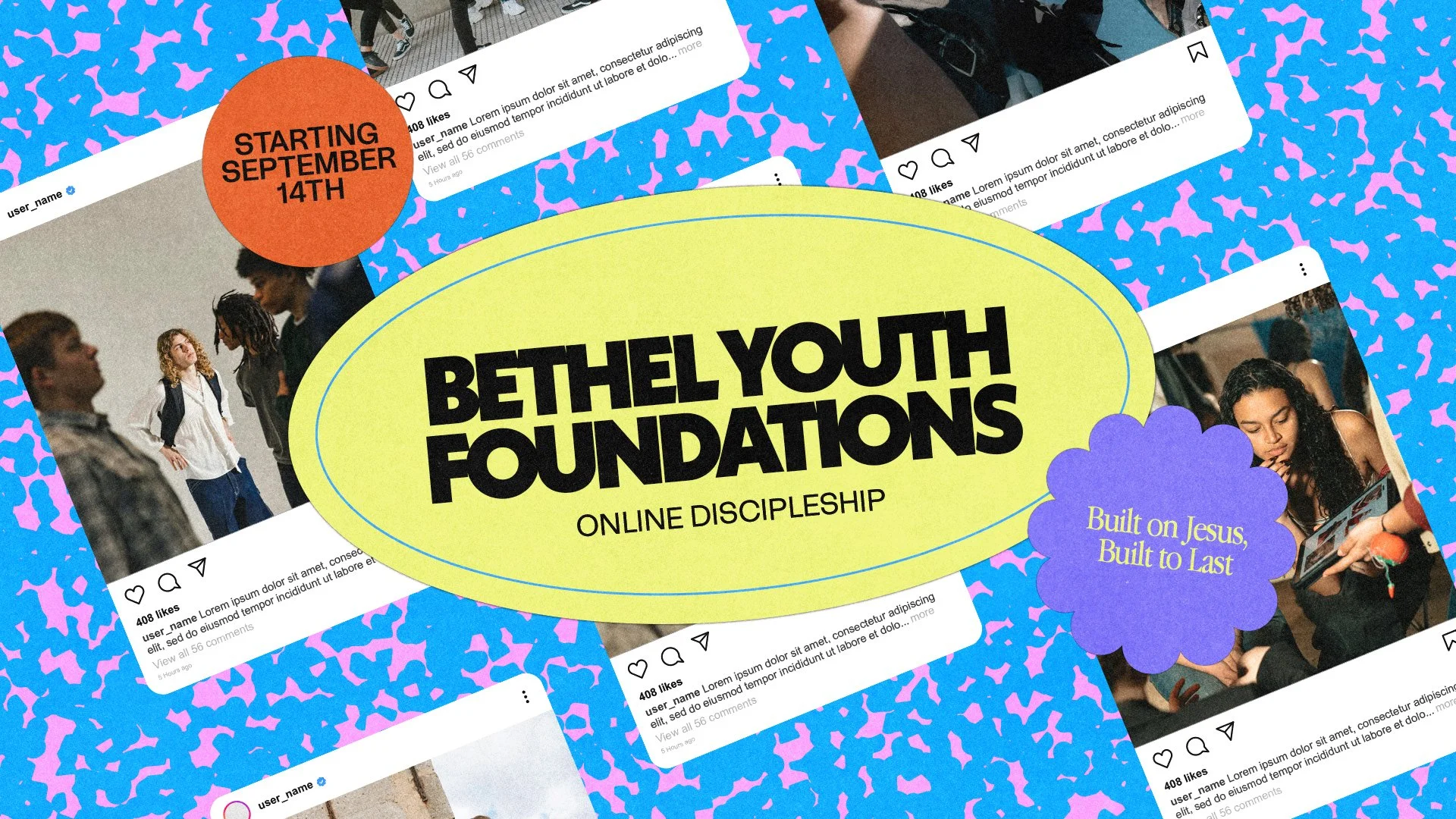
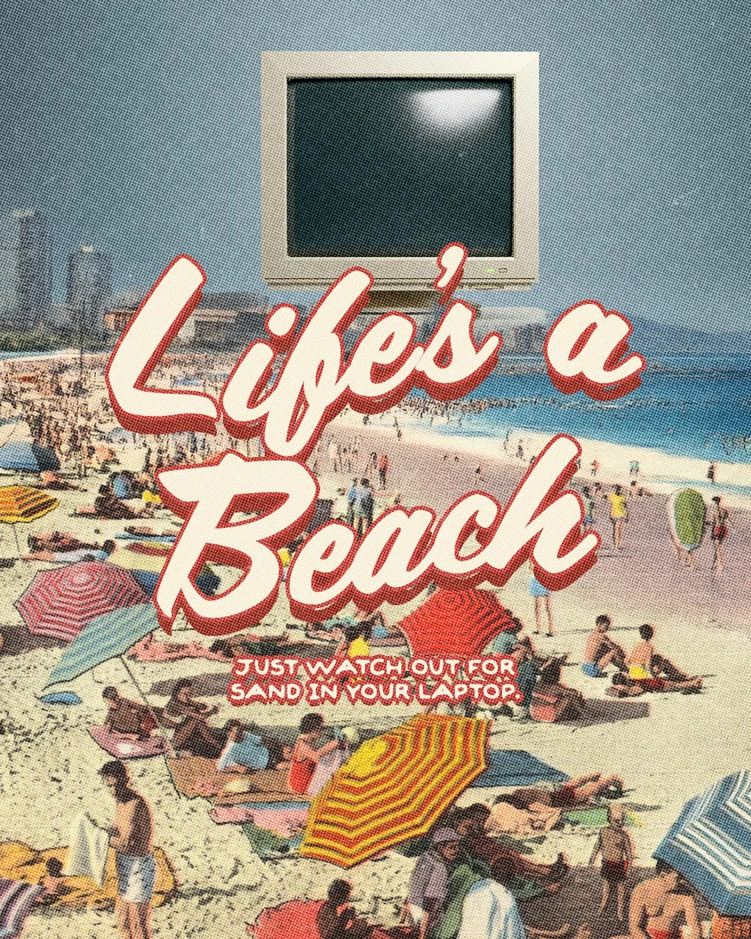
Collage & Photo Layered
Layering real photography with graphic elements and mixed-media textures gives this style a handmade, lived-in quality. It feels personal and community-rooted—like something your people would recognize themselves in.

How to get this look:
Real photography as the design foundation
Polaroid frames or film strip borders
Layered graphic shapes and bold background color
Mixed typography (handwritten + display)
Textured details like tape, torn edges, or crinkled paper
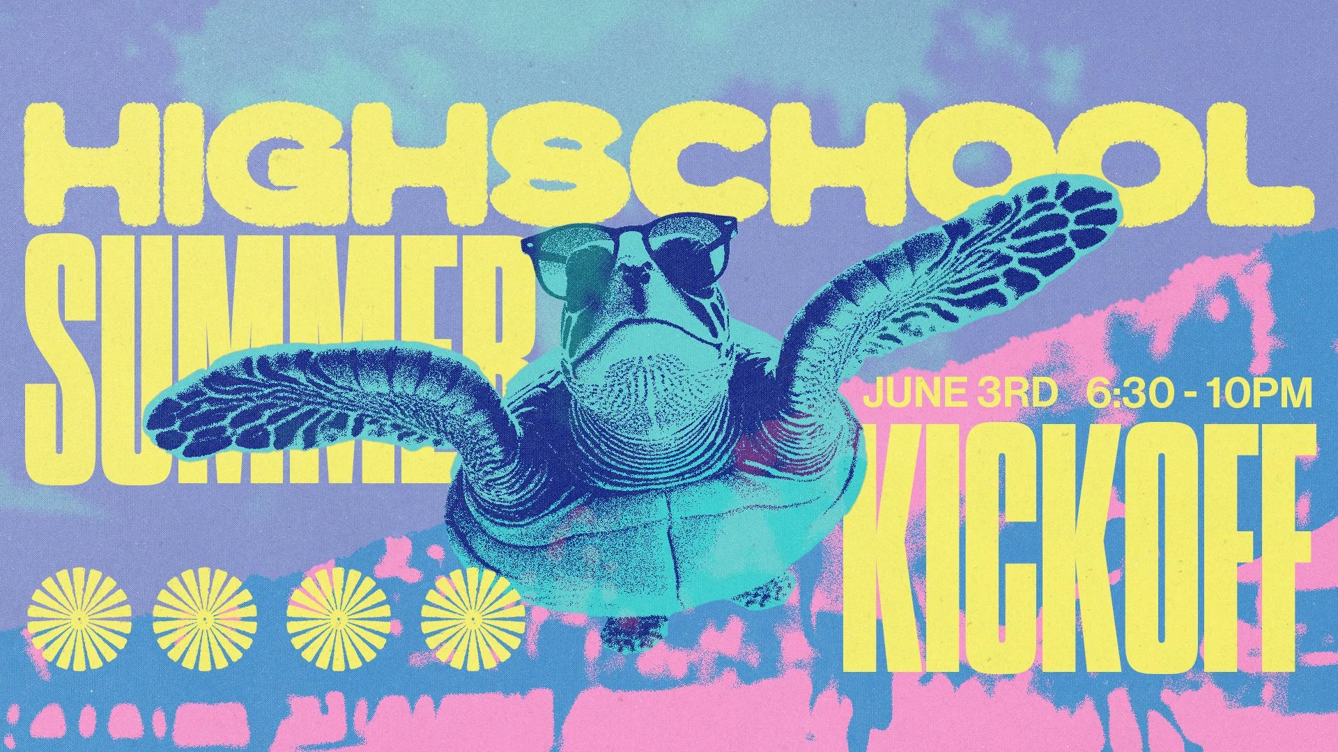
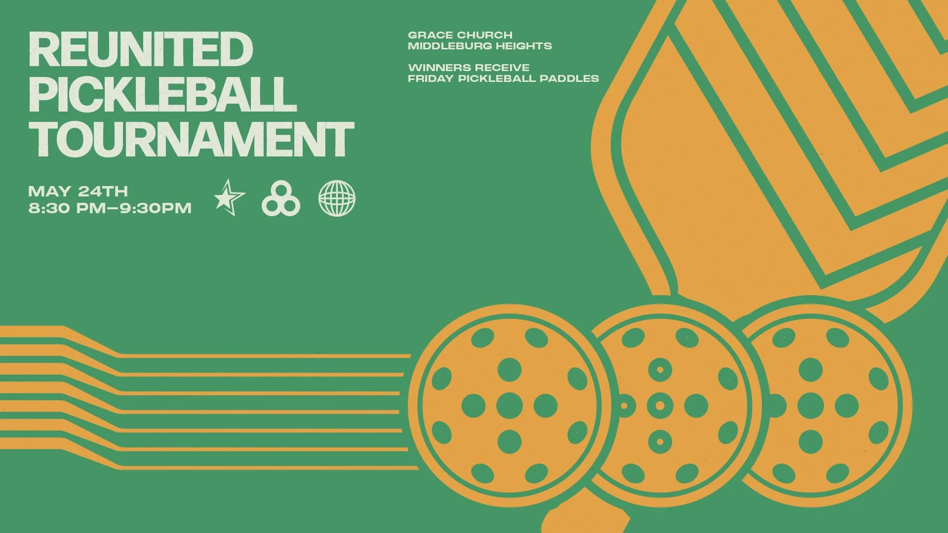
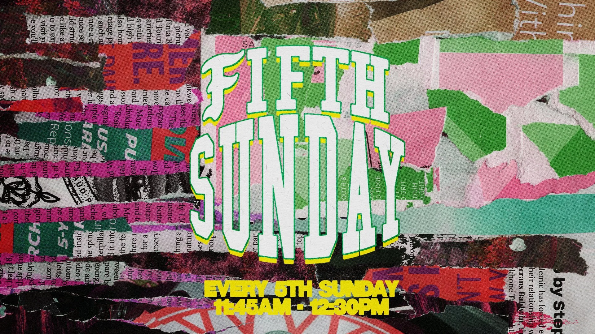
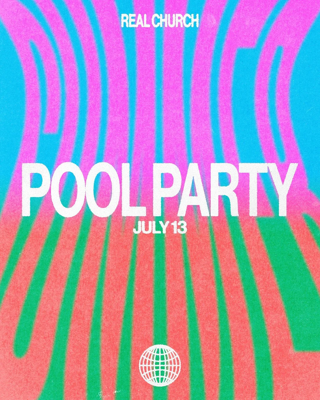
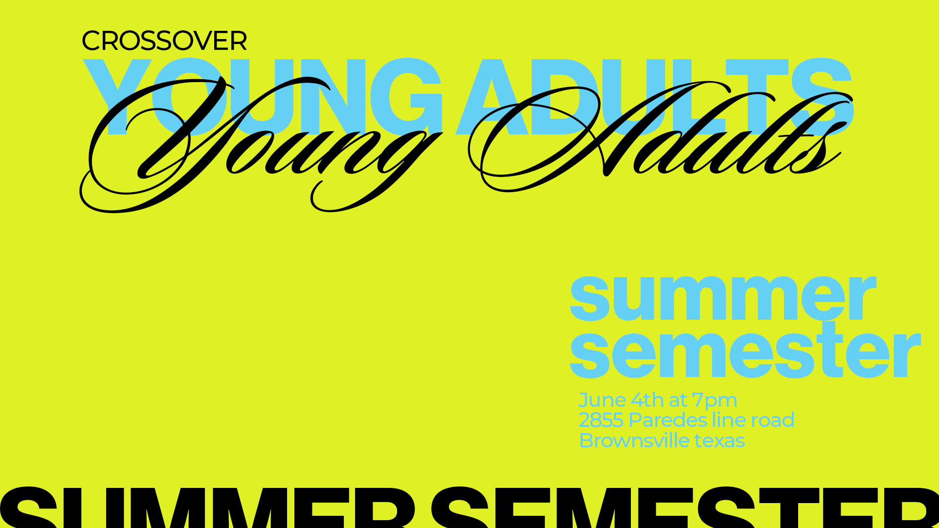
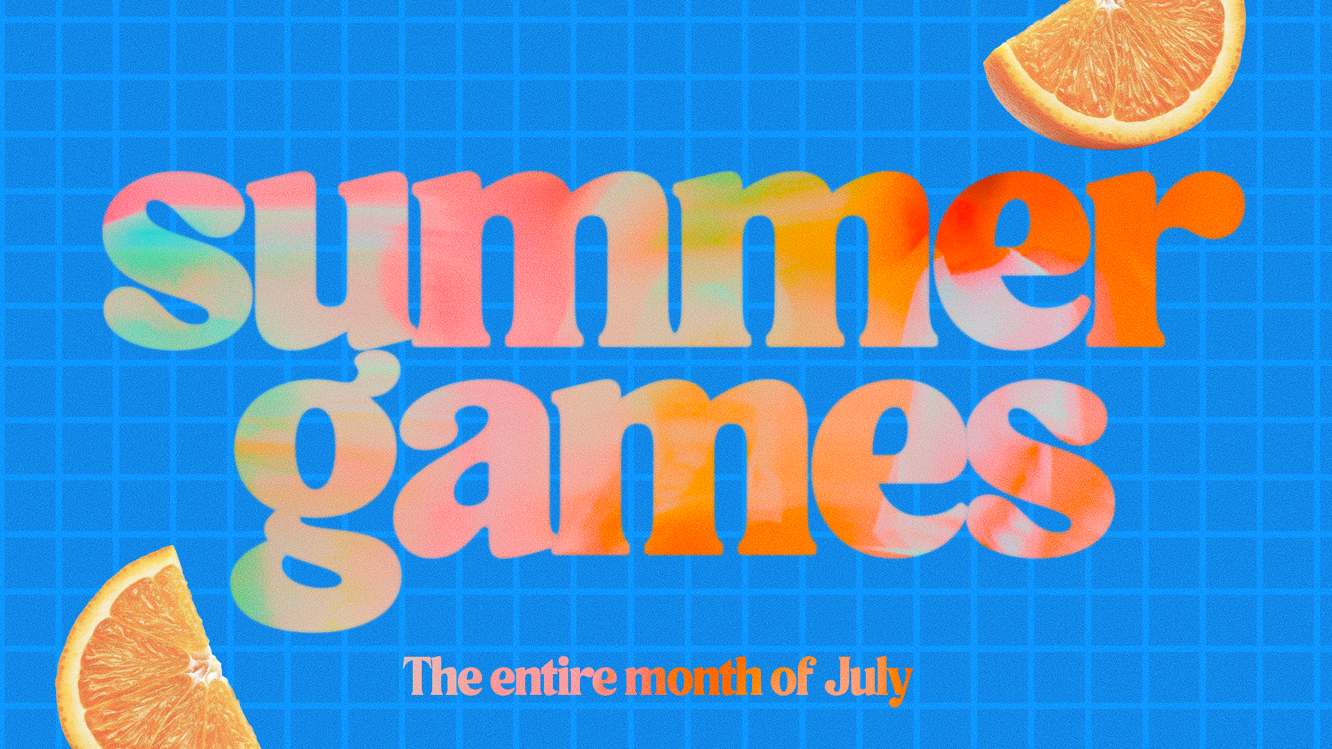
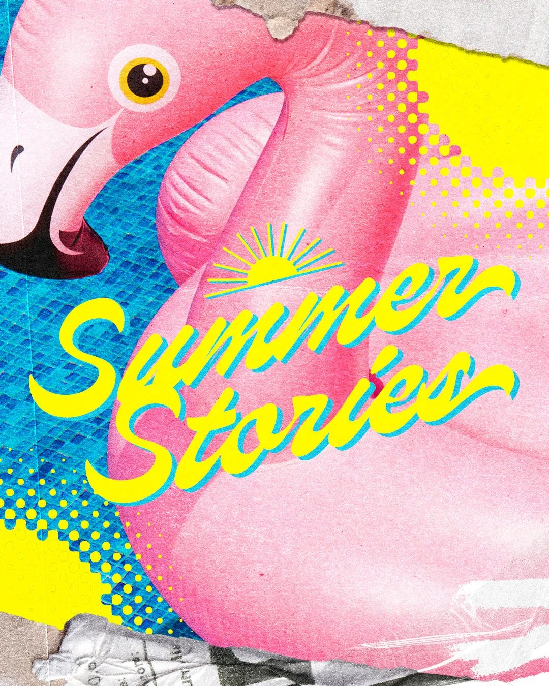
Bright & Bold
Maximum color energy and type that demands attention—this style is unapologetically loud, and it draws people in. It's one of the most eye-catching looks you can put in someone's feed, and it has the kind of personality that's hard to ignore.
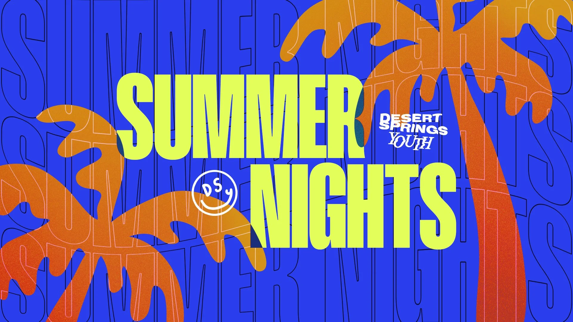
How to get this look:
Ultra-saturated, high-contrast color combinations
Oversized typography that fills or bleeds the frame
Repeated stacked text as a background texture
Photography colliding with bold color blocks
Layered elements with strong visual rhythm
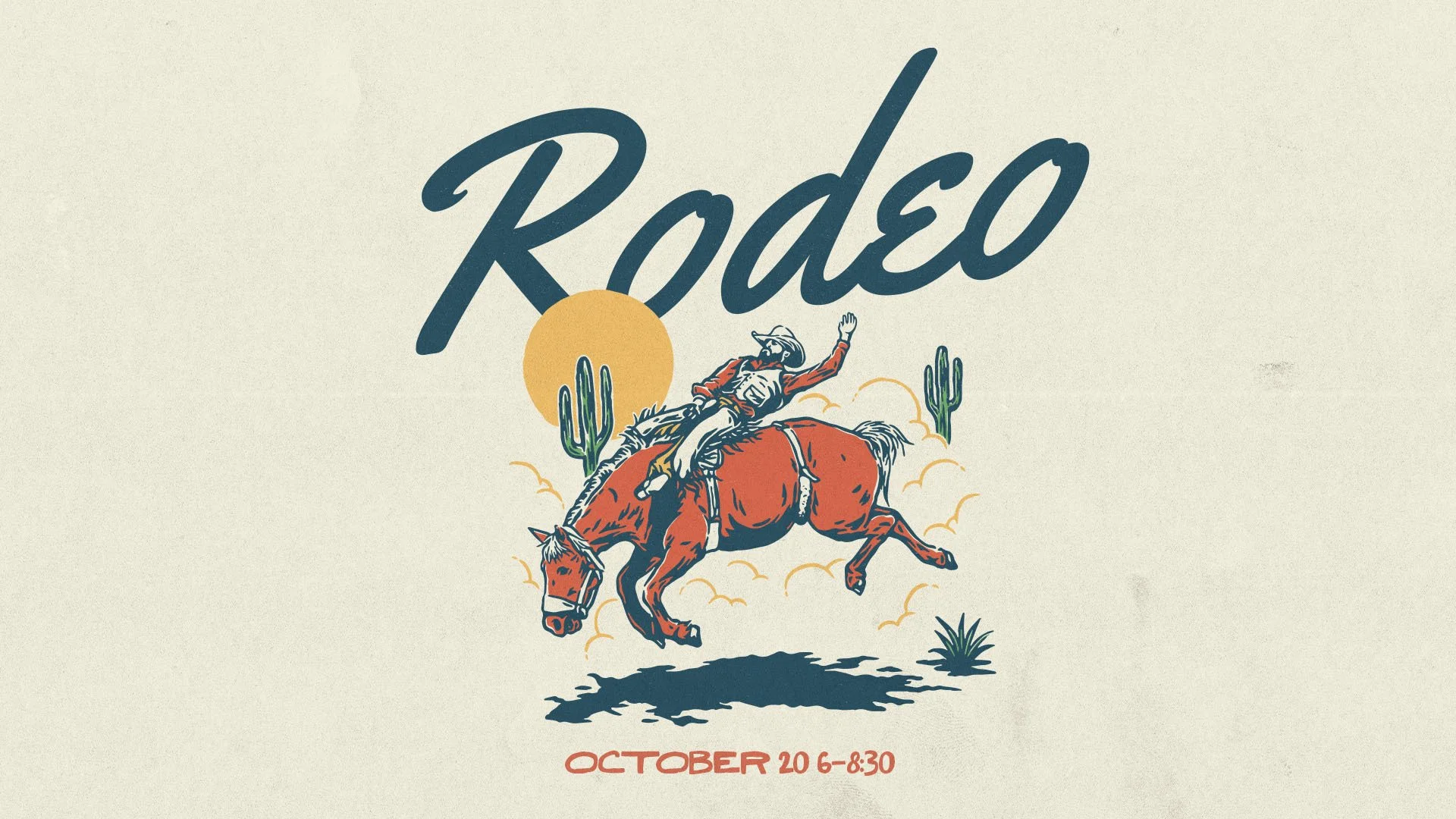
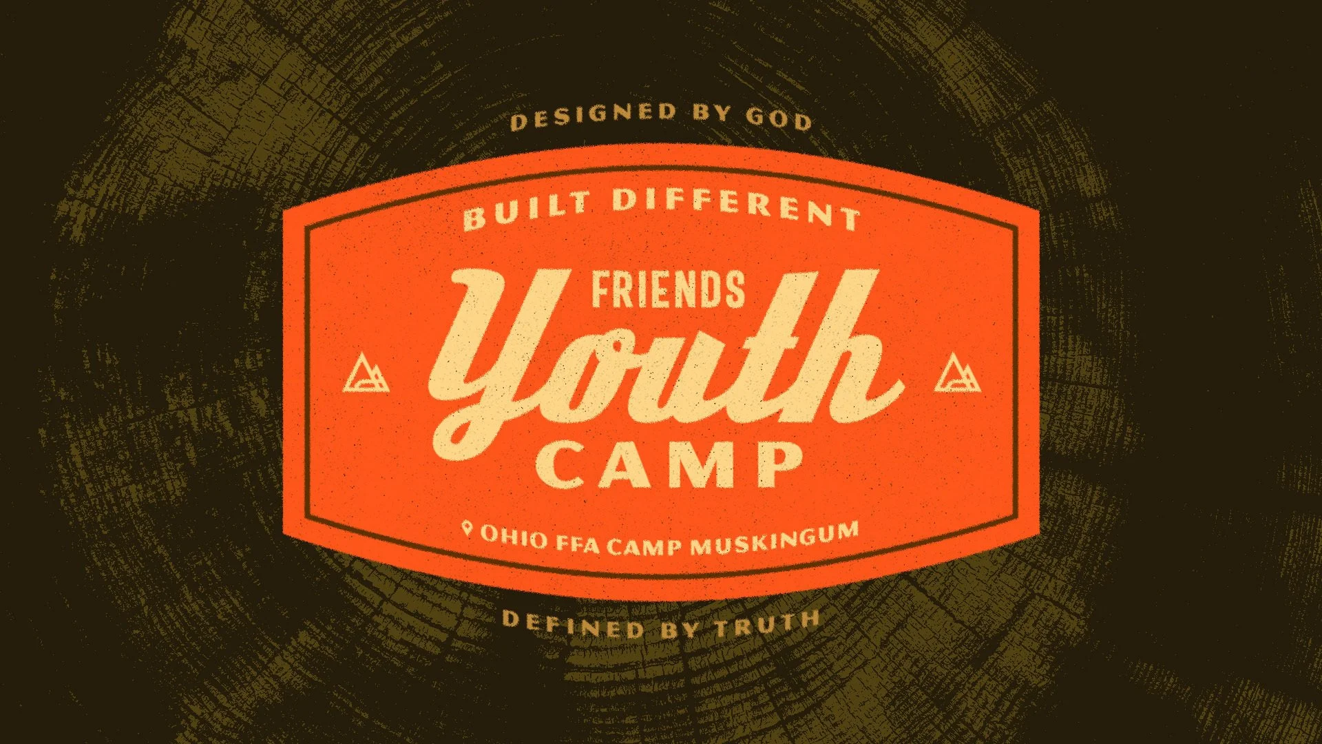
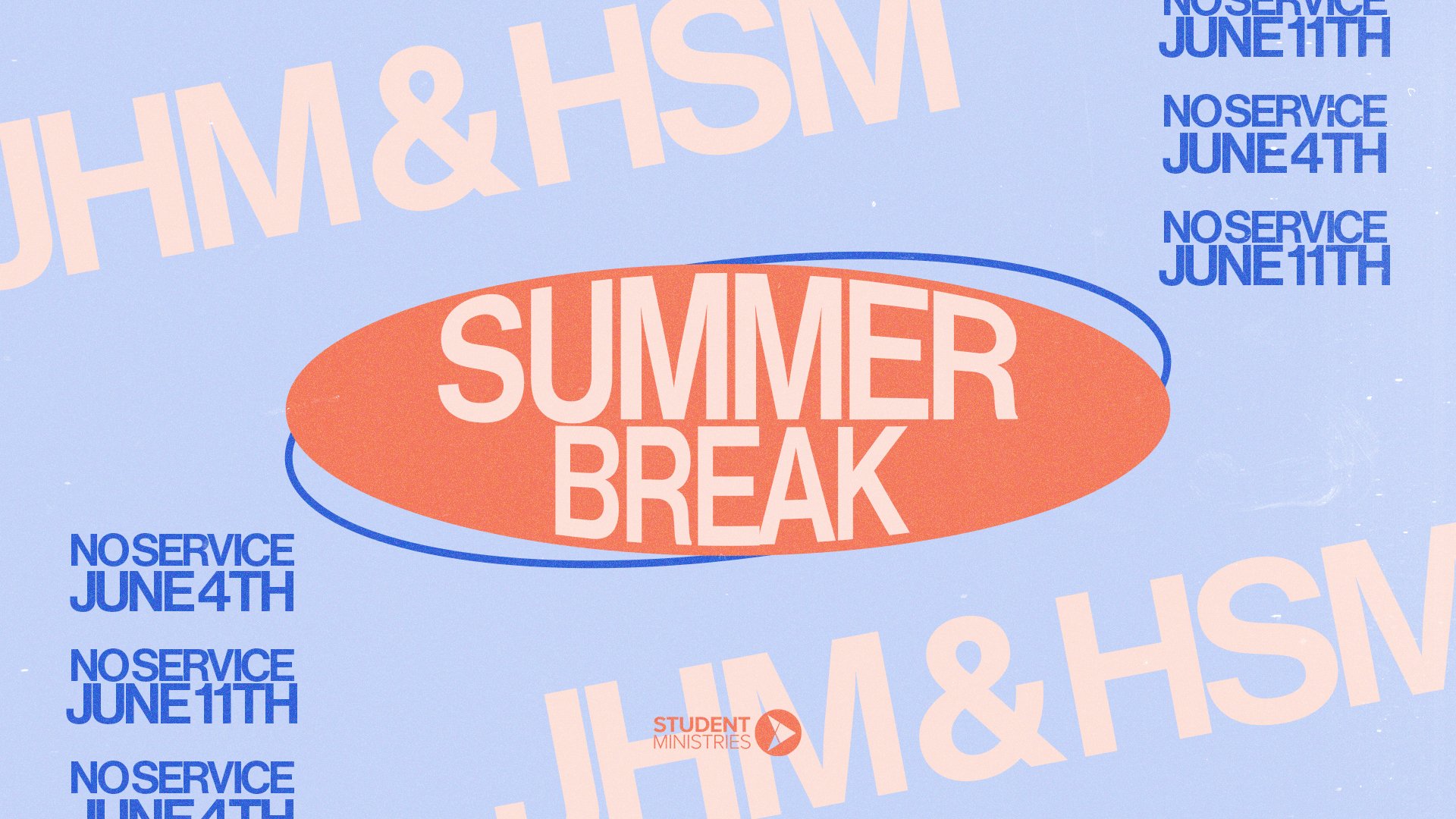
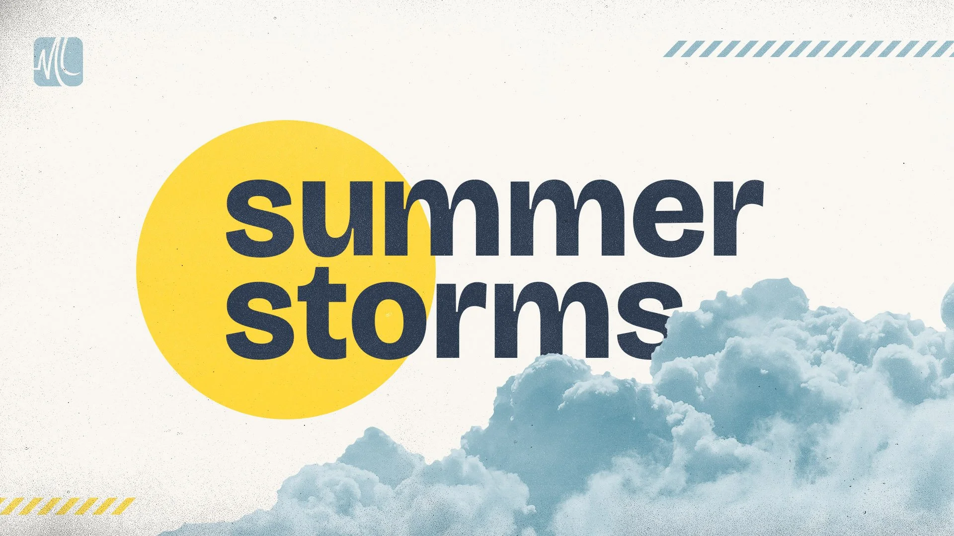
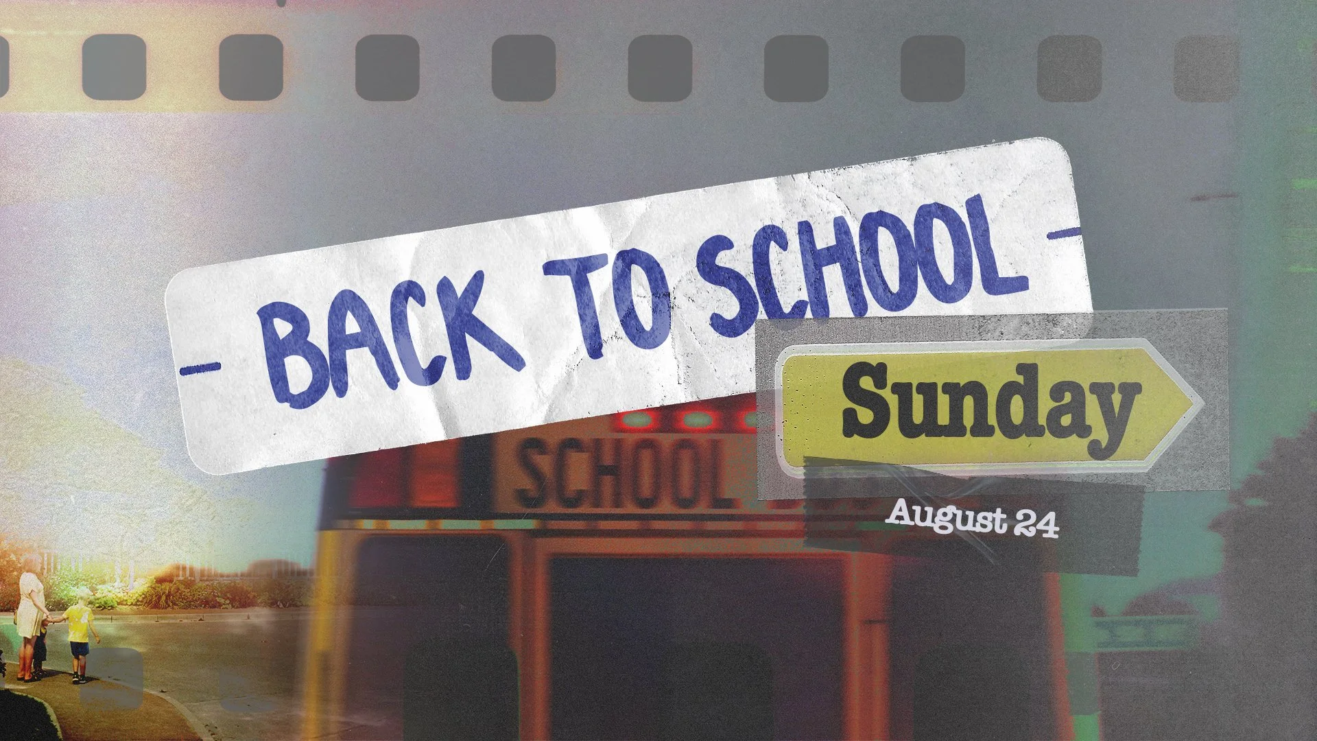
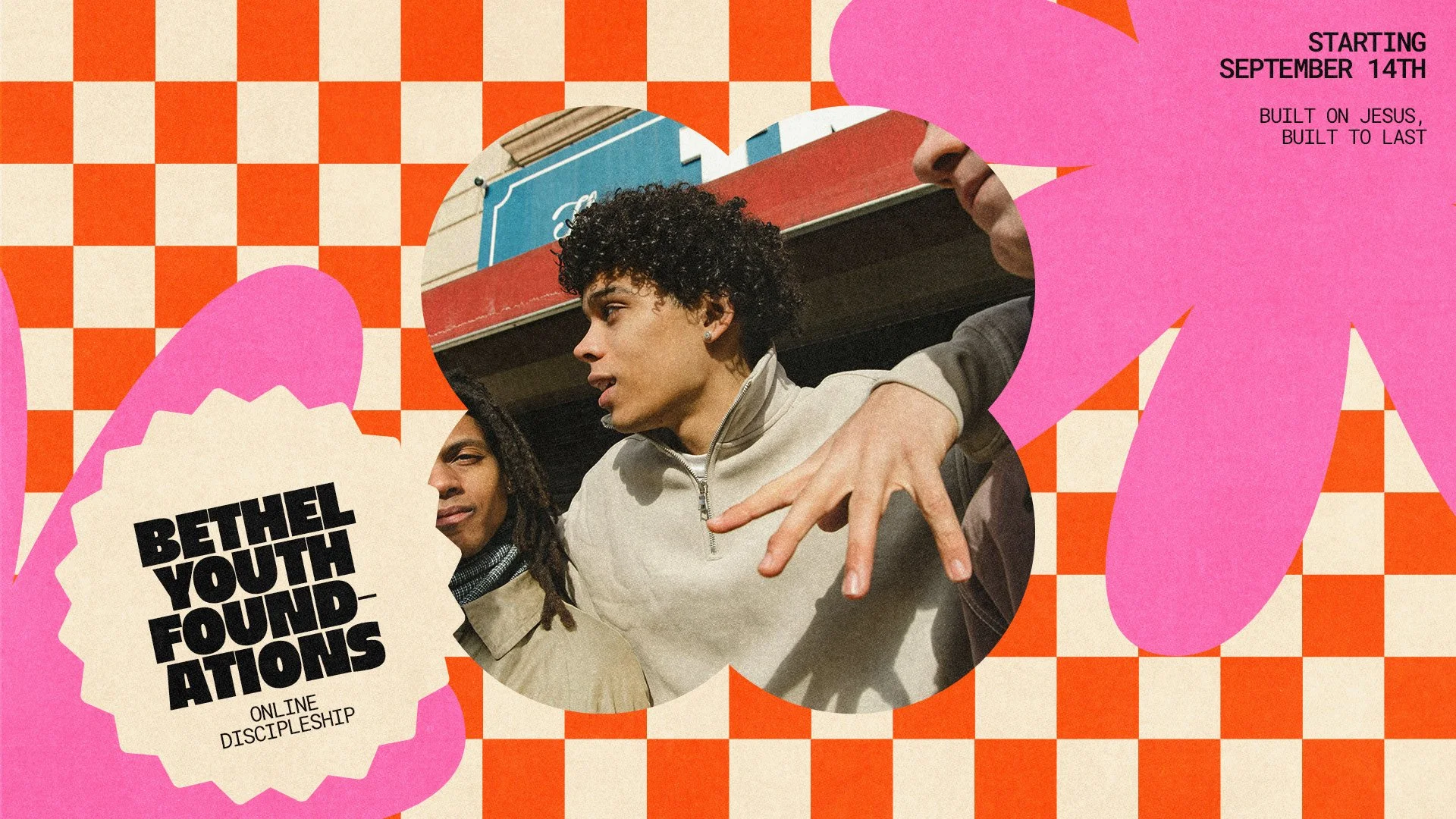
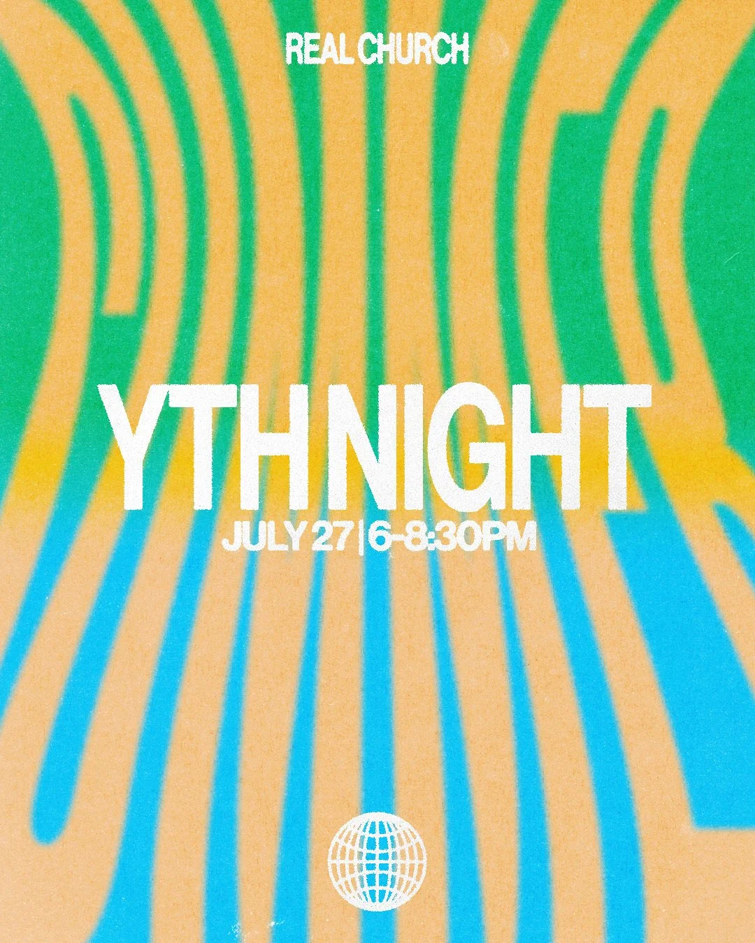
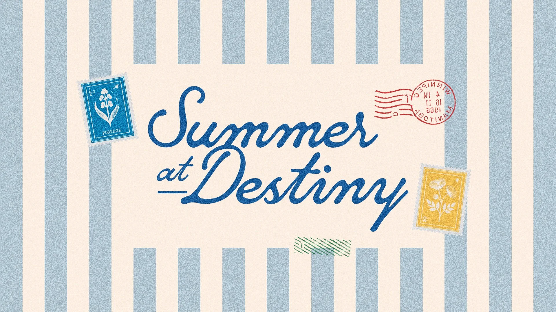
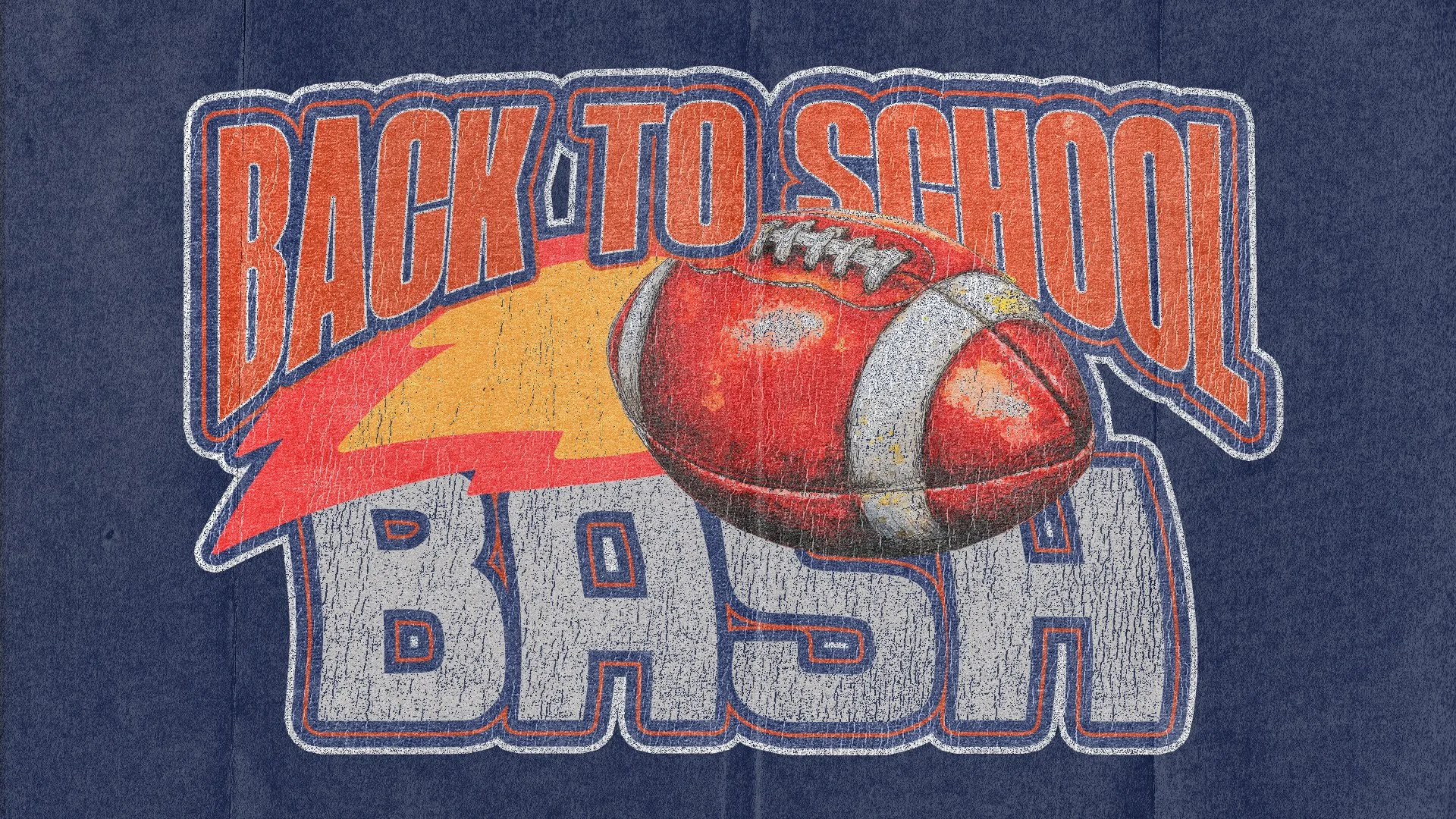
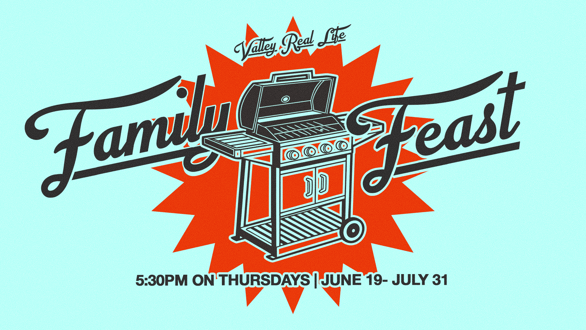
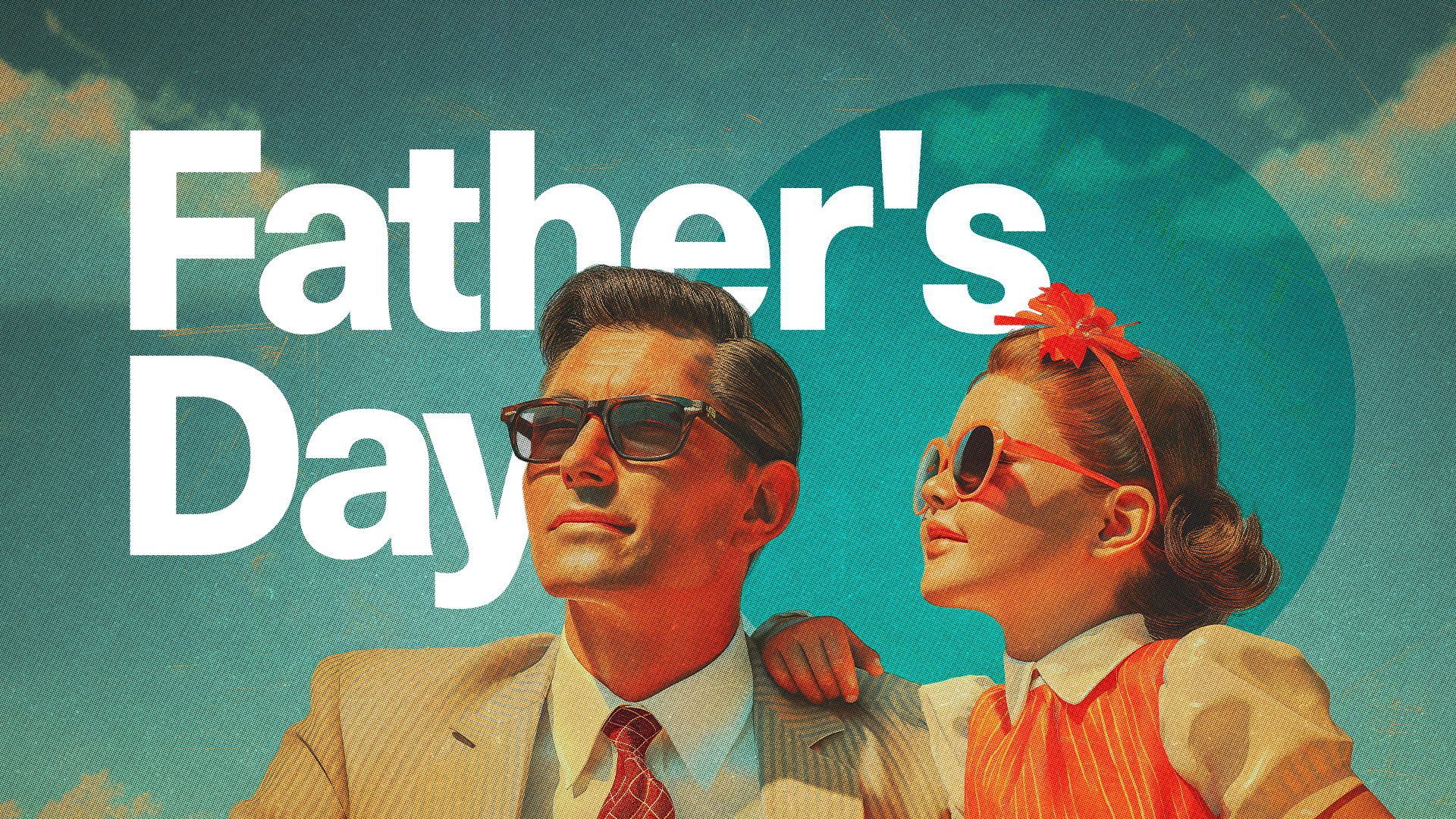
Vintage & Retro
Worn textures, aged color palettes, and throwback type treatments that feel warm and familiar without feeling dated. This style has a staying power that a lot of trends don't. People love it because it feels human.

How to get this look:
Distressed or aged textures (denim, iron-on, faded print)
Film photography aesthetics with light leaks and grain
Retro graphic elements (starbursts, script, oval badges)
Muted, warm color palettes (rust, mustard, teal, cream)
Outlined or shadow lettering with a worn-in feel
Where To Go From Here
Whatever style your church is drawn to, the right graphic can reflect who you are and extend an invitation to your community. And if you want a creative team to help you bring it to life this summer, Church Media Squad is here.