


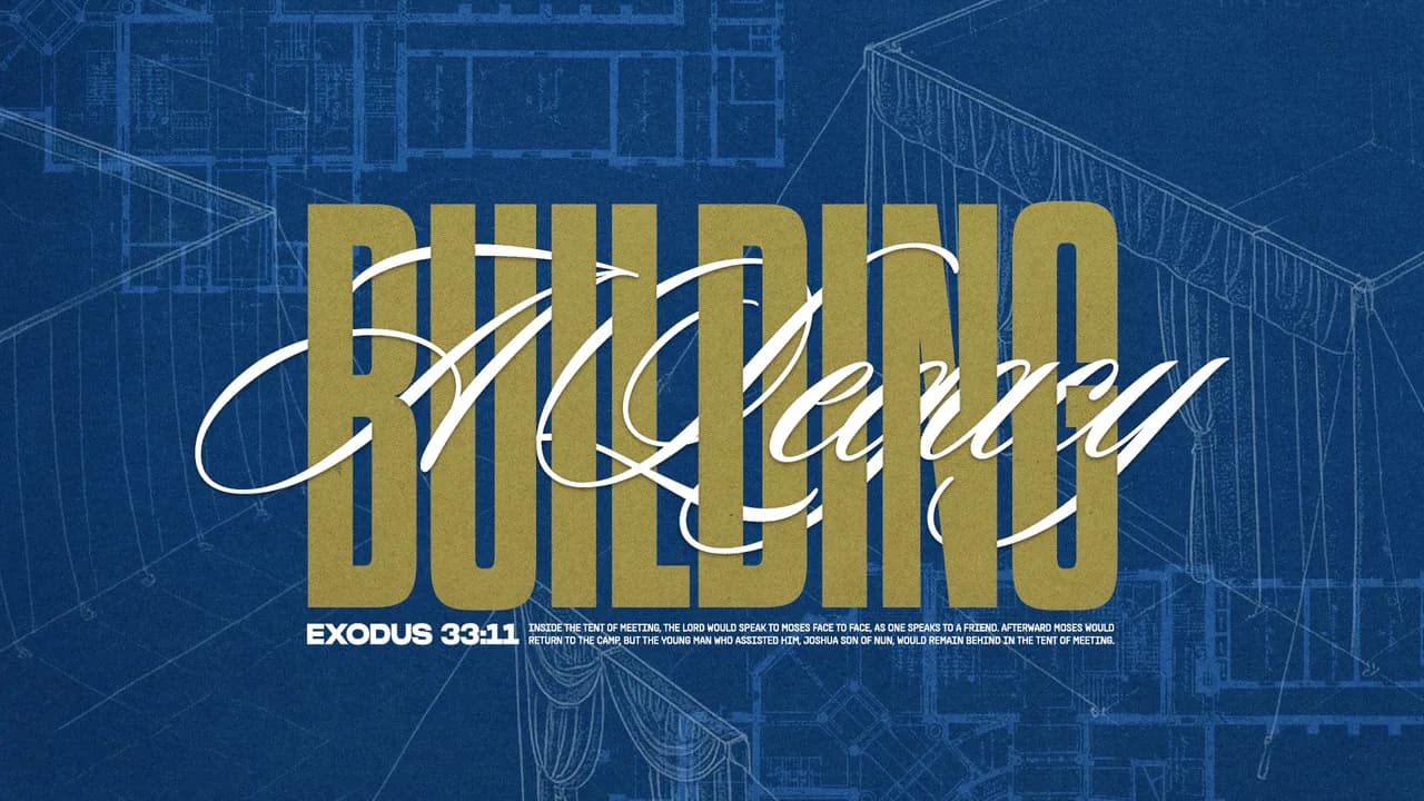
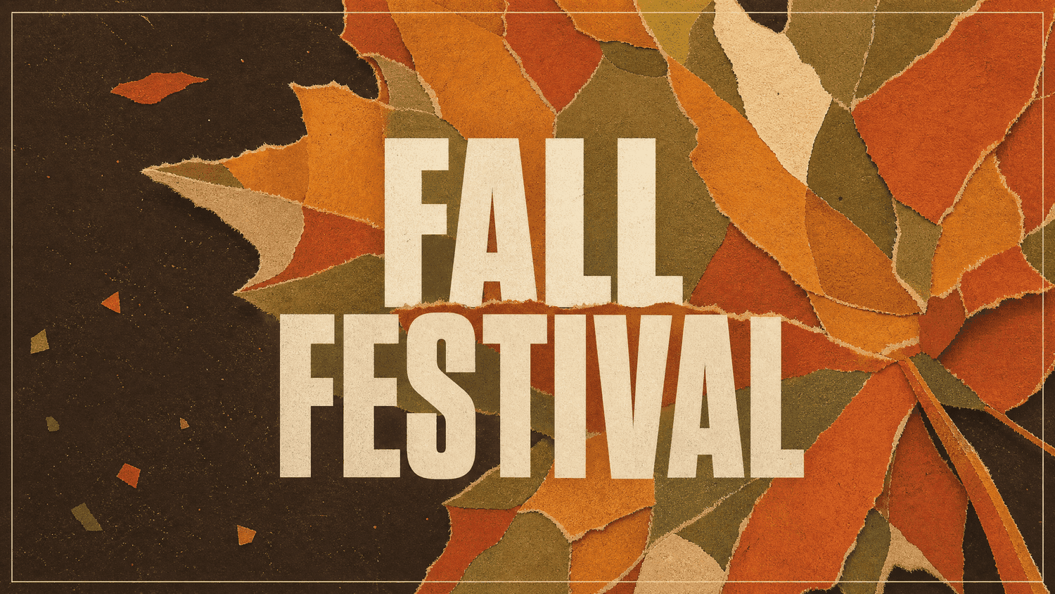
Fall is one of the easiest seasons to design for and one of the easiest to overdo. The color palette practically writes itself, which is exactly why so much fall design ends up looking the same. Orange gradient, a leaf or two, a serif font that feels vaguely cozy, and you have something that could belong to anyone.
The good news is that fall has more range than we usually give it credit for. It can be warm and nostalgic, but it can also be moody, textured, stripped back, or a little strange. Below are five directions we keep coming back to this season, along with the language you can hand straight to whoever is designing it.
1) Collage
Collage borrows the feel of a scrapbook or a corkboard, layering torn paper, tape, photo scraps, and handwriting into something that looks assembled by hand. It suits fall because the season already carries that gathered, layered quality. The trick is restraint in the palette. Hold the whole thing to three or four colors, anchor it with one strong photo, and leave an area of the layout genuinely empty so the eye has somewhere to rest.
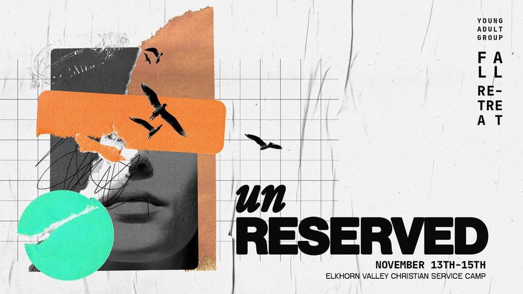
Try it for: sermon series with several connected themes, small group promotion, year-end recaps.
2) Photo-Driven
This one puts a single strong photograph at the center and asks the type to stay out of its way. No heavy overlays, no busy graphics, just an image with enough atmosphere to carry the design alone. Everything depends on the photo, so sourcing matters most. Look for a clear focal point, open space where a headline can sit, and real texture over anything staged. Morning and late afternoon light will do most of the work for you.
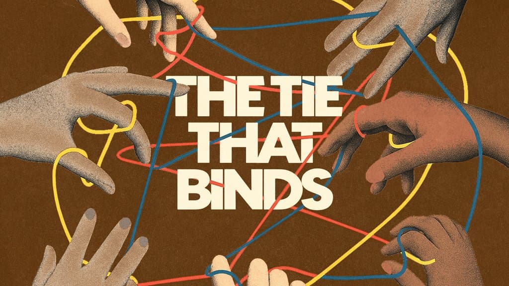
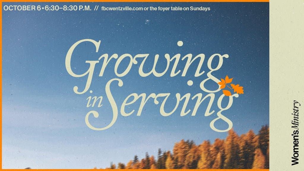
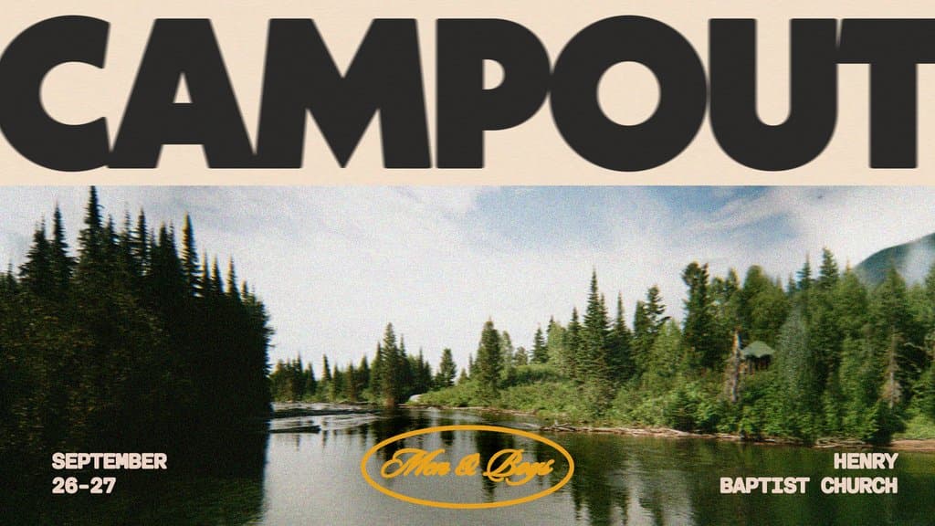
Try it for: series titles, invitation graphics, anything you want to feel grounded and human.
3) Darker Tones
Fall design defaults to warm and bright, which is why the darker end of the season stands out. Deep greens, oxblood, charcoal, dusty navy, and burnt umber pull the season somewhere more reflective. Contrast is what makes it work. A dark background needs one element that breaks through, whether that is bright type, a warm highlight in a photo, or a thin rule that catches the eye. Watch accessibility here, since low contrast type on a dark field is the most common problem we see in this style. Try it for: series on grief, waiting, lament, or anything that calls for weight and honesty.
4) Unexpected
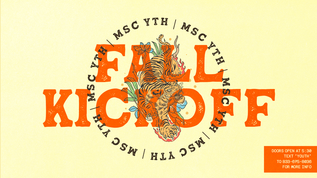
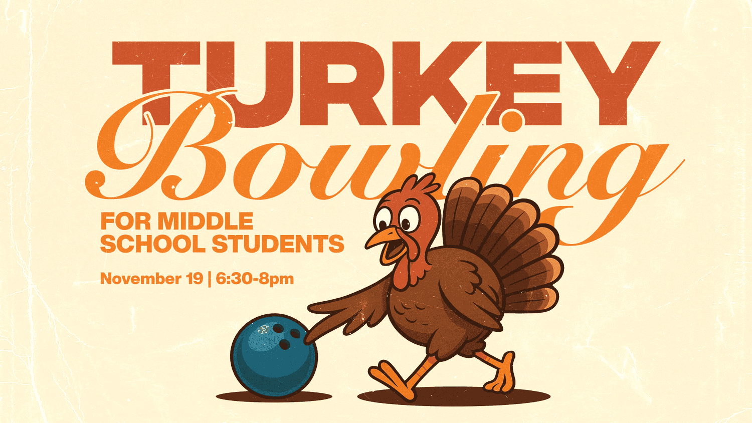
Every so often it is worth designing against the season instead of with it. That might mean electric blue and lime in October, brutalist type on a soft photo, or a color pairing that has no business working and somehow does. If you go this route, commit to it completely, because half of an unexpected idea reads as a mistake while the whole idea reads as a choice. Keep one familiar element in place, such as your usual type family, so people still recognize it as yours.
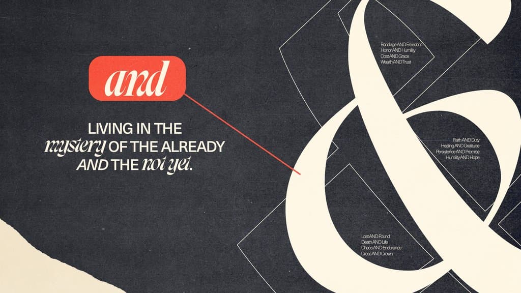
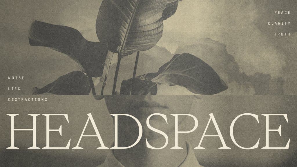
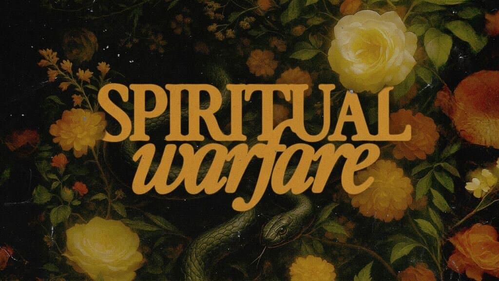
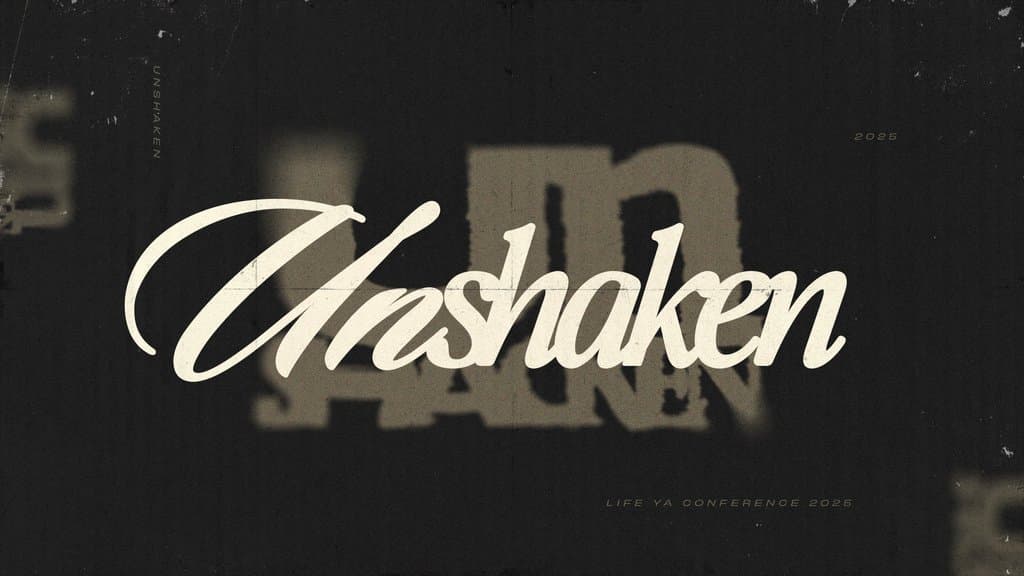
Try it for: student ministry, launches, one-off events, anything that needs to interrupt the scroll.
5) Minimal
Minimal fall design strips the season down to one gesture. A single muted color field, a lot of open space, one line of type set carefully, and maybe one small mark. It is the most forgiving direction to look at and the least forgiving to execute, because with so few elements on the page, every one has to be right. Spend your time on typography and spacing, choose two colors, and resist the urge to fill the empty space. The restraint is the idea.

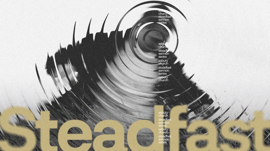
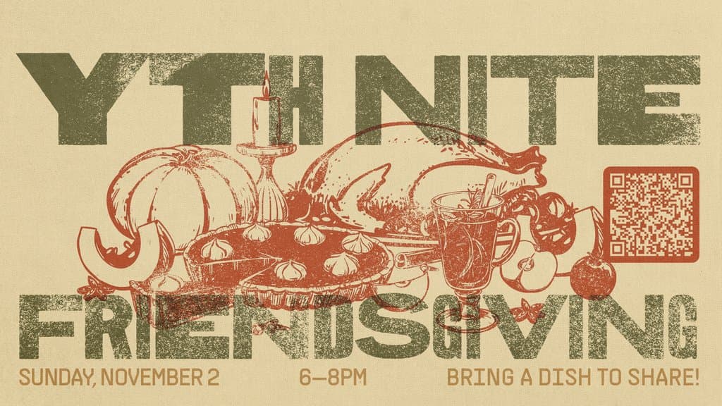
Try it for: teaching series, print pieces, anything that needs to feel calm and considered.
Picking Your Direction
You do not need to choose one of these and build everything around it. A useful approach is to pick one direction as your primary look for the season and borrow a single element from another, such as a collage texture layered into a minimal layout, or a darker palette applied to a photo driven series.
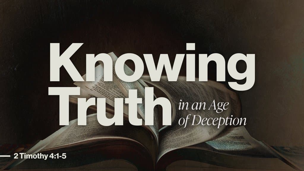
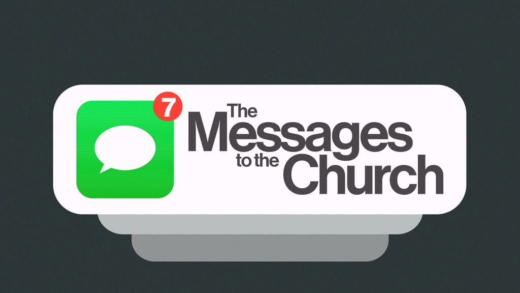
The more useful question is what the content itself is asking for. A series on rest and a series on lament should not look the same, no matter how good your fall palette is. Start with what you are trying to say, then pick the direction that gets out of its way.
Want this handled for you?
Sermon series, events, social, print, and merch, designed by people who used to sit in your chair on a Thursday night.


Published by Church Media Squad on August 13, 2026.