


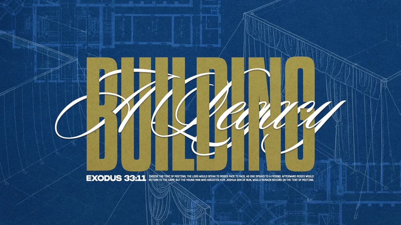
If Easter landed on your plate again, you're probably the same person who is also running Sunday, and that's a lot to carry. We built this page so you have a start date, nine design directions to pick from, and a plan for the invitation, so Easter week can be spent with your people and not with a blank slide.
When Should Your Church Start Easter 2027 Graphics?
Start with the look of your series, and start as early as you can. Easter Sunday 2027 is March 28, with Good Friday two days before on the 26th and Palm Sunday the week before on the 21st. Lock the series look first, because every other piece gets built on top of it. Once that's settled, move to your invitations, then your social posts, then a landing page that answers a first-time guest's questions. Ads, if you're running any, belong in the last two to three weeks before Easter, so they come last on your list and not first. Working in that order makes each step faster, because you're reusing the colors, fonts and imagery you already chose. If you have months, you can do all of this at an easy pace. If you have weeks, the order stays the same and the steps just get smaller.
Nine Easter Design Directions for 2027
These nine directions run from Collage and Photo-Driven to Traditional and Bright and Colorful, and each one comes with images so you can see it in use. Pick the one that fits your people and your space.
1) Collage
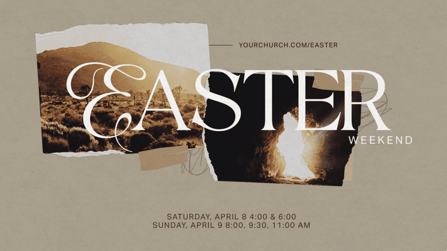
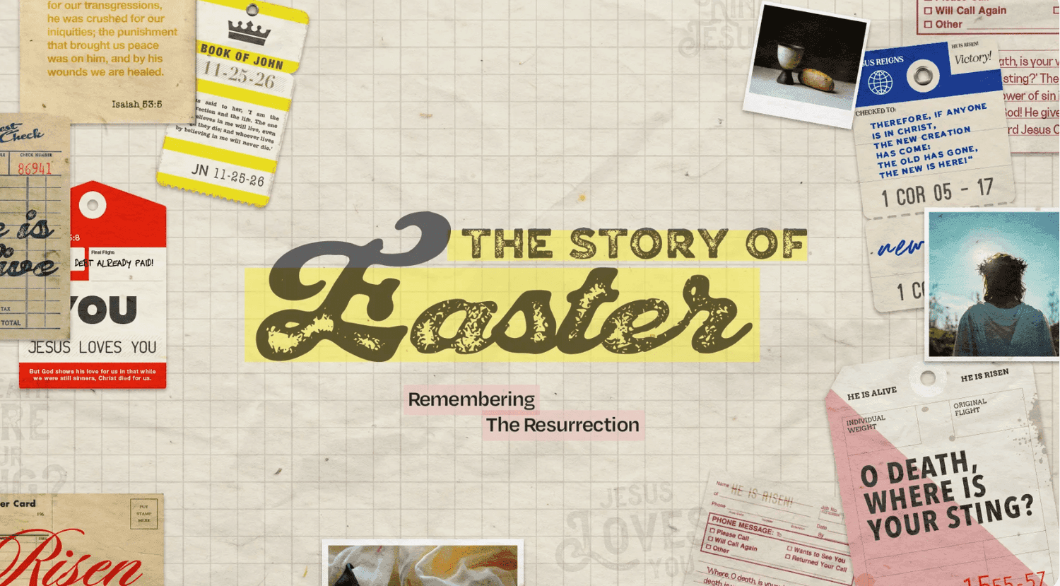
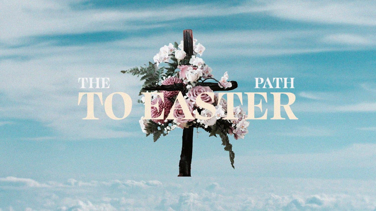
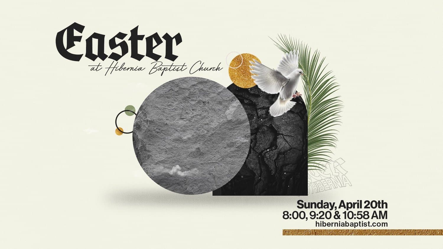
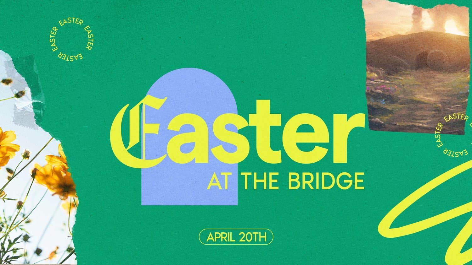
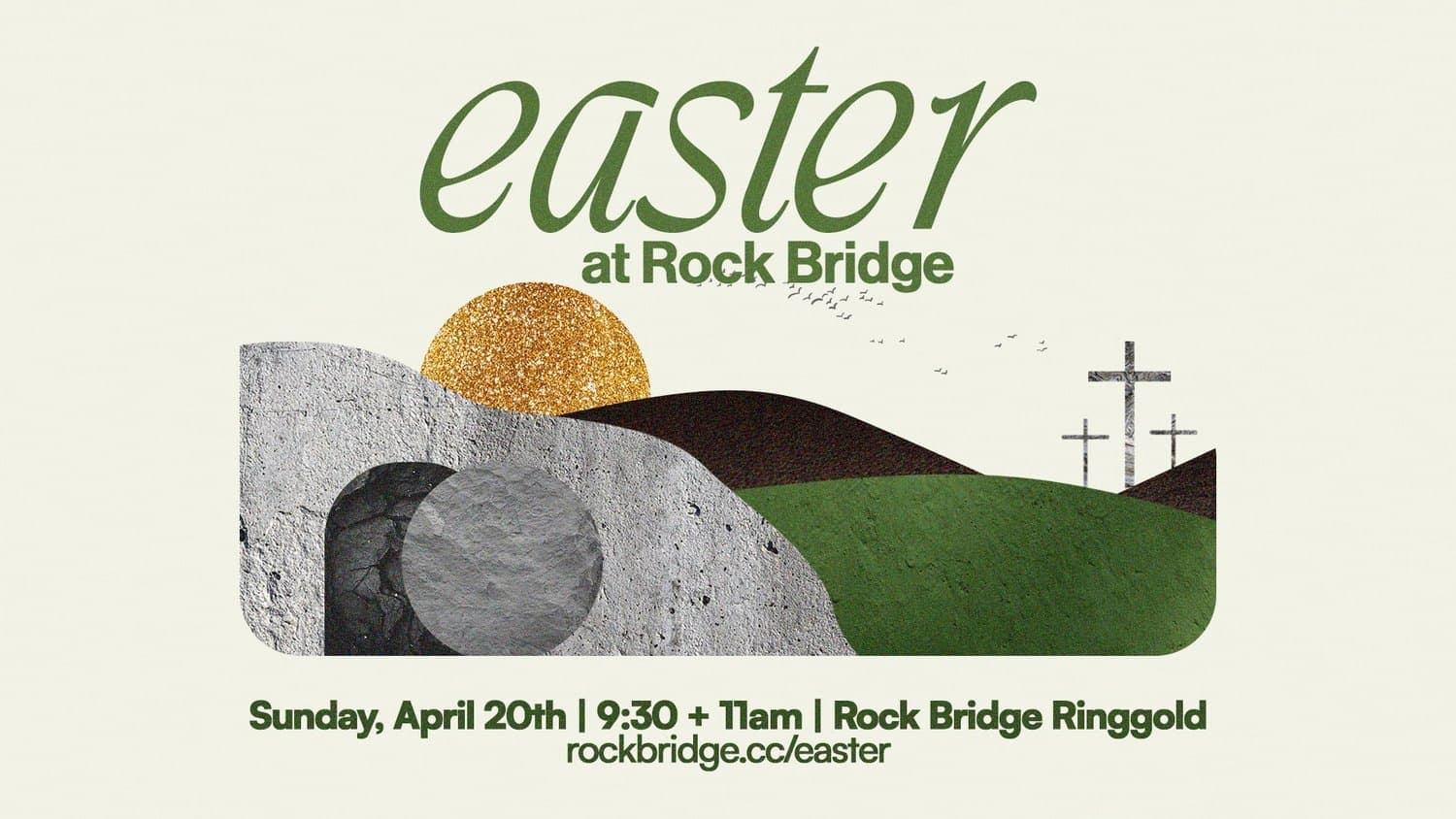
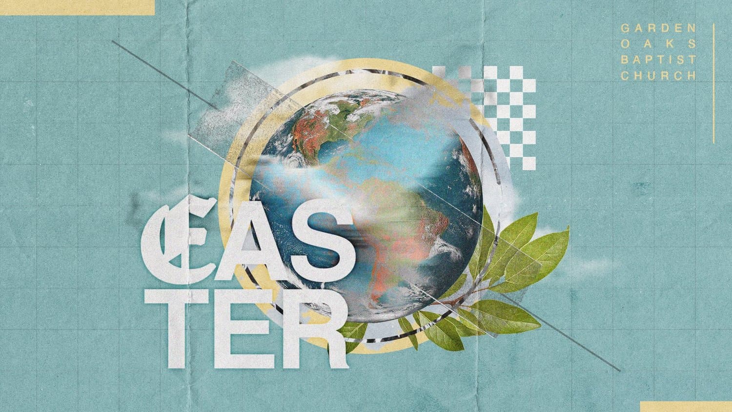
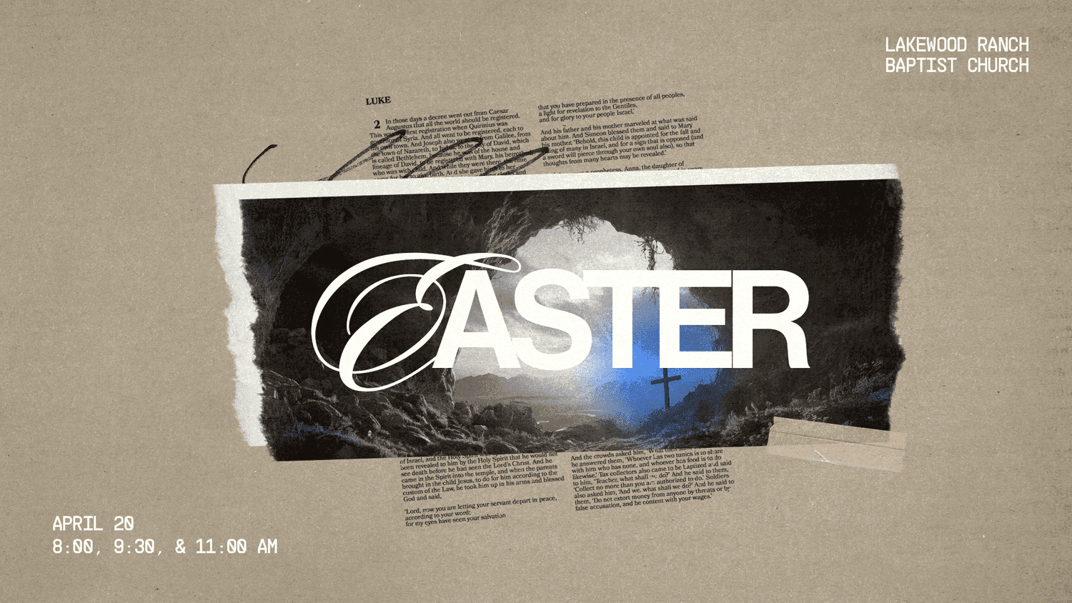
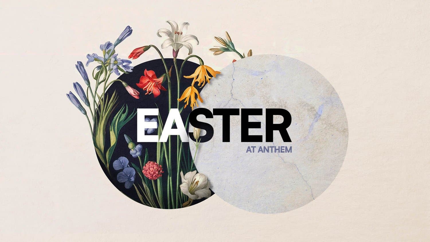
The Easter story has layers: sacrifice and celebration, grief and glory, death and resurrection. A collage style captures that complexity by weaving multiple design elements into one cohesive narrative.
This approach works perfectly for Easter because it mirrors the multi-faceted nature of what we're celebrating. Just as the Easter story includes many moments and emotions, collage design brings together different textures, images, and elements to tell a richer story.
Share these keywords with your designer:
- Multiple overlapping elements
- Mixed media textures
- Layered compositions
- Scrapbook aesthetic
2) Photo-Driven
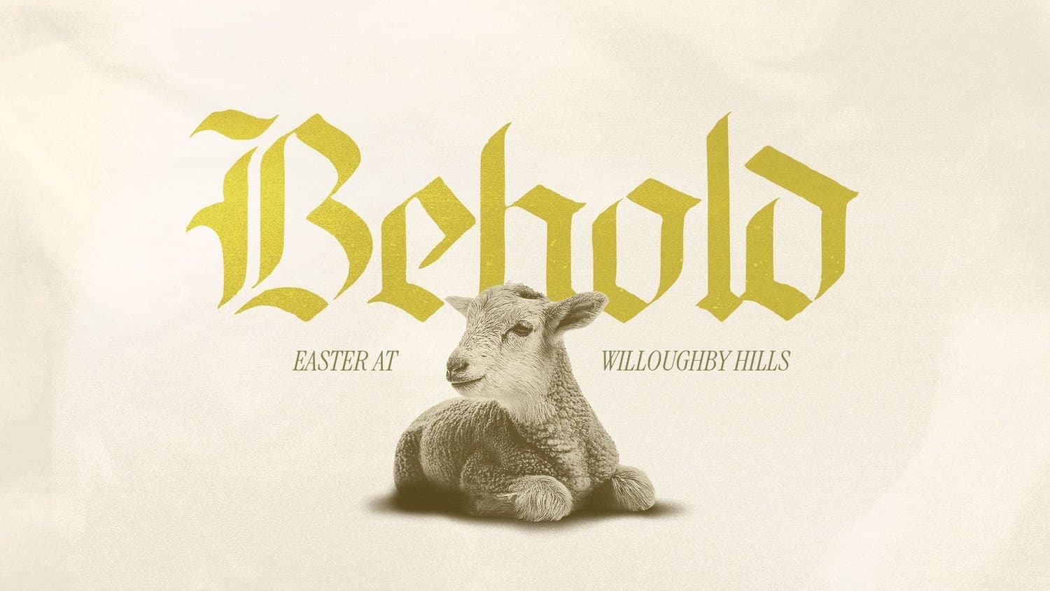
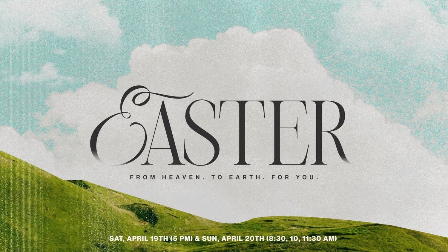
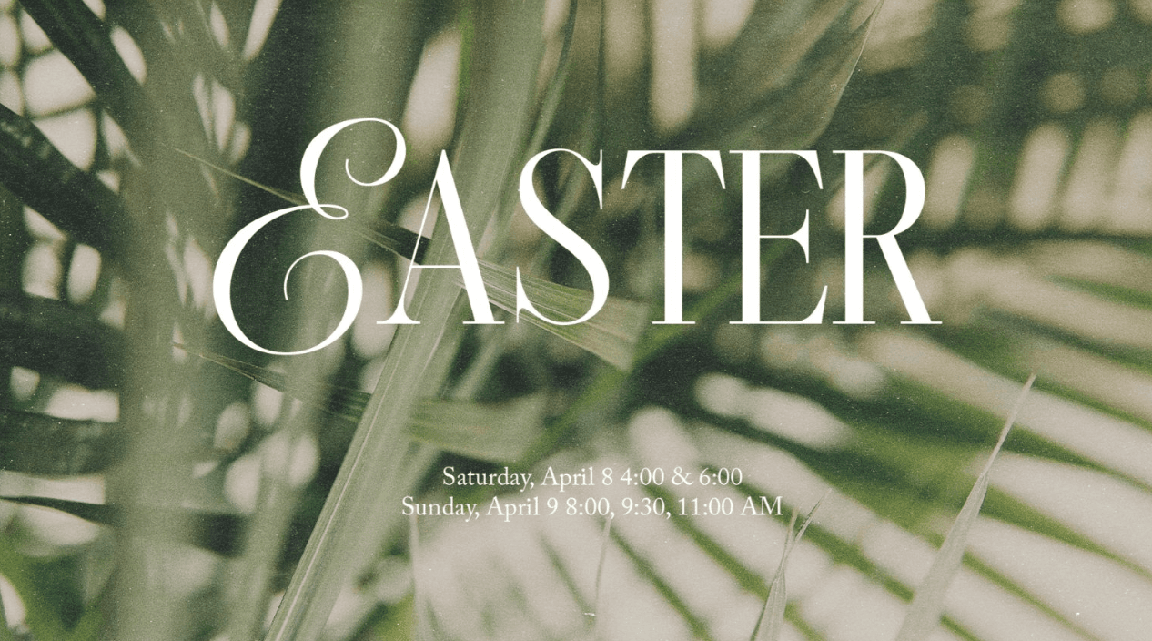
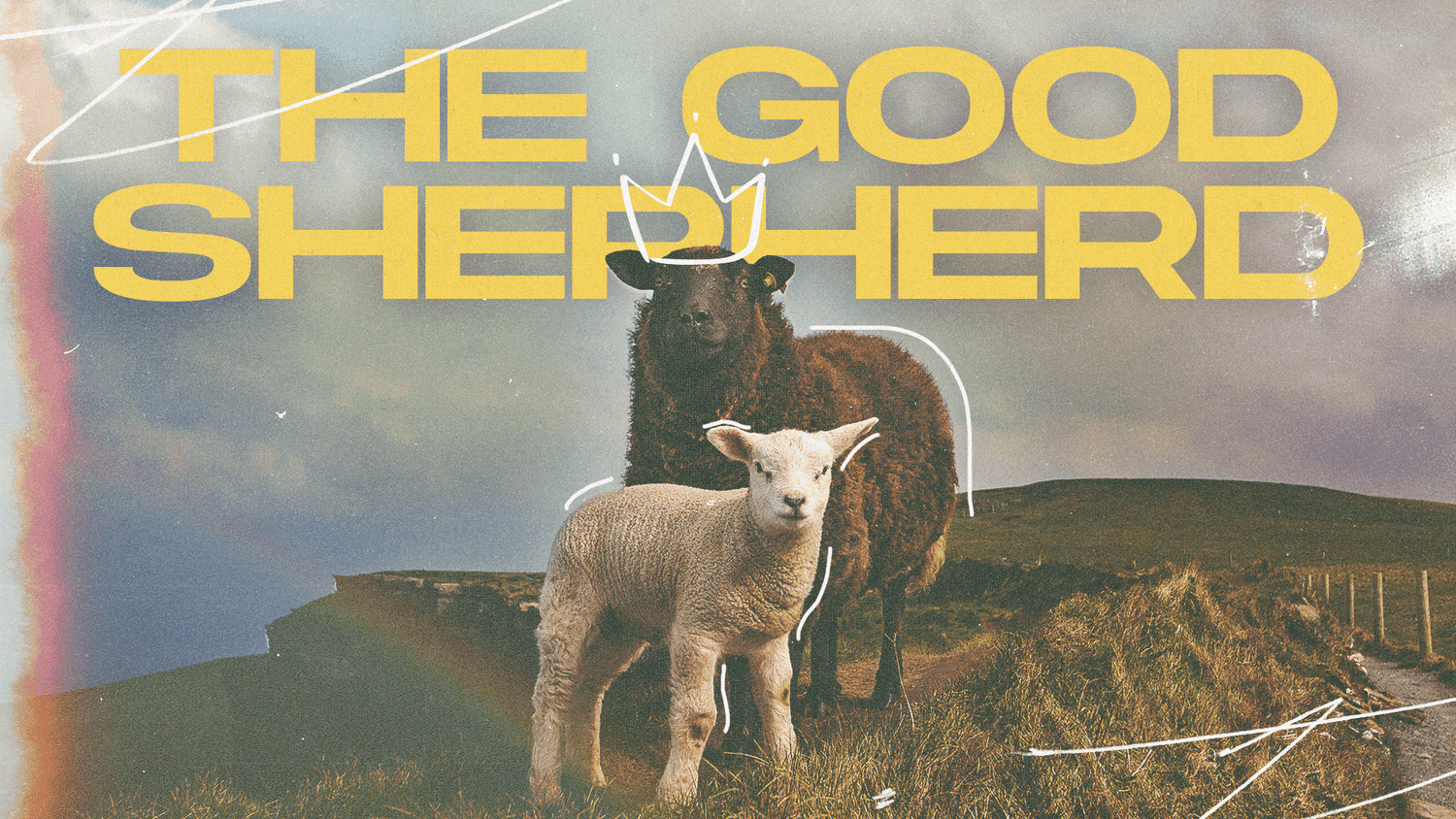
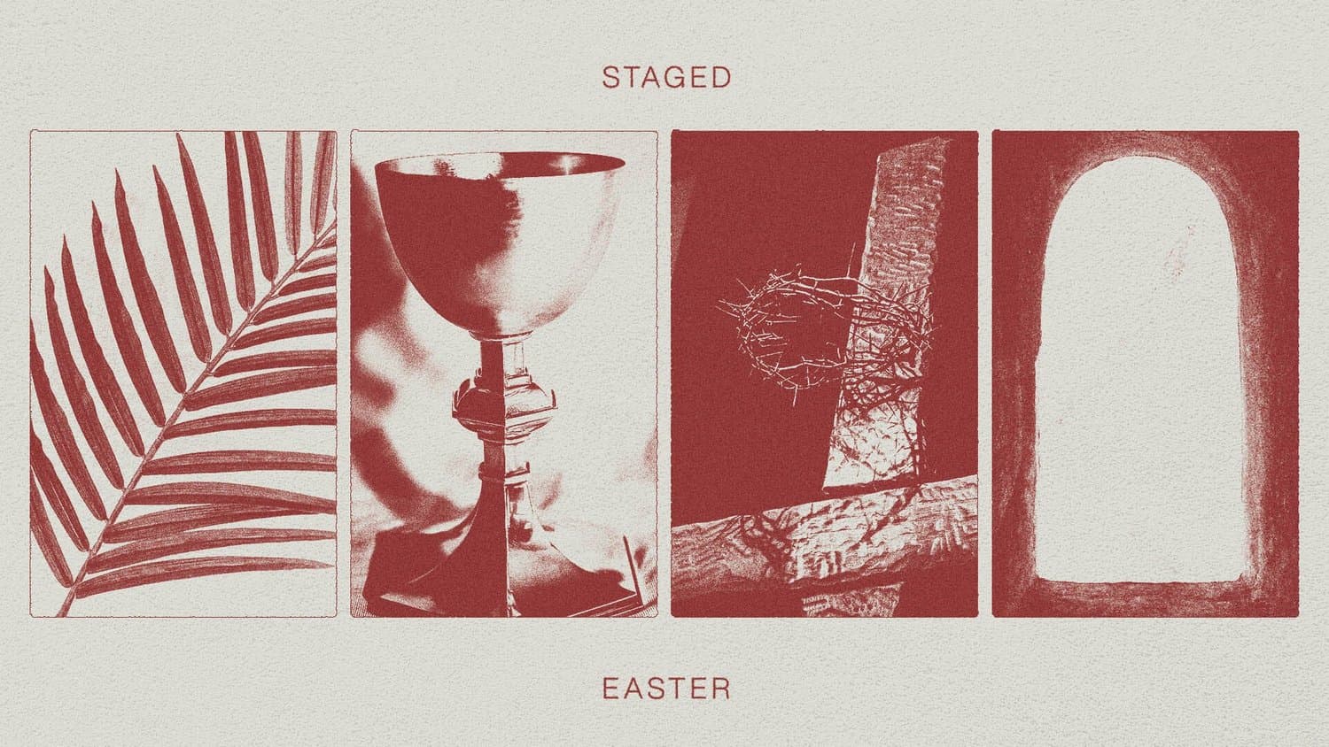
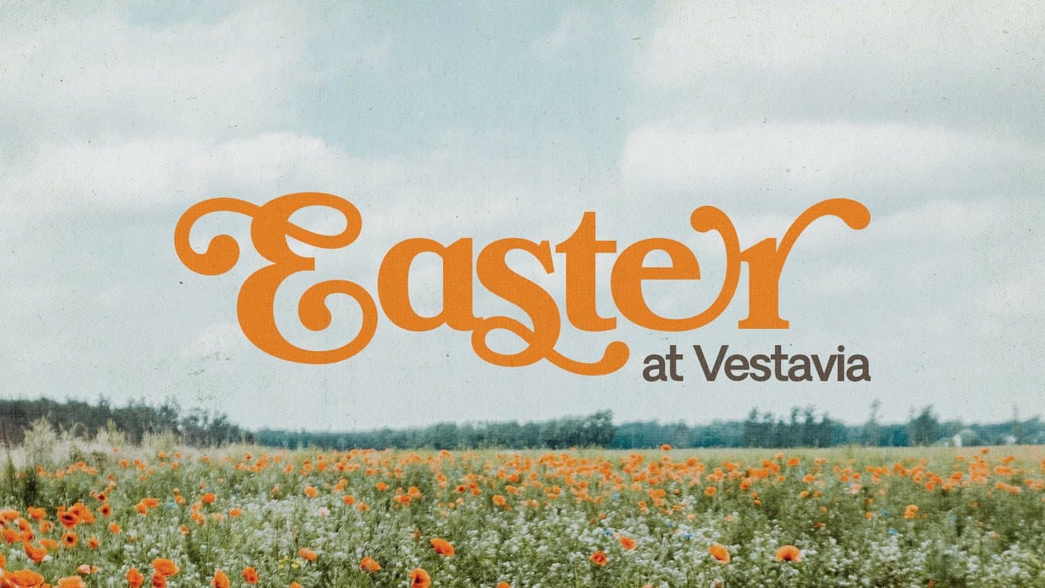
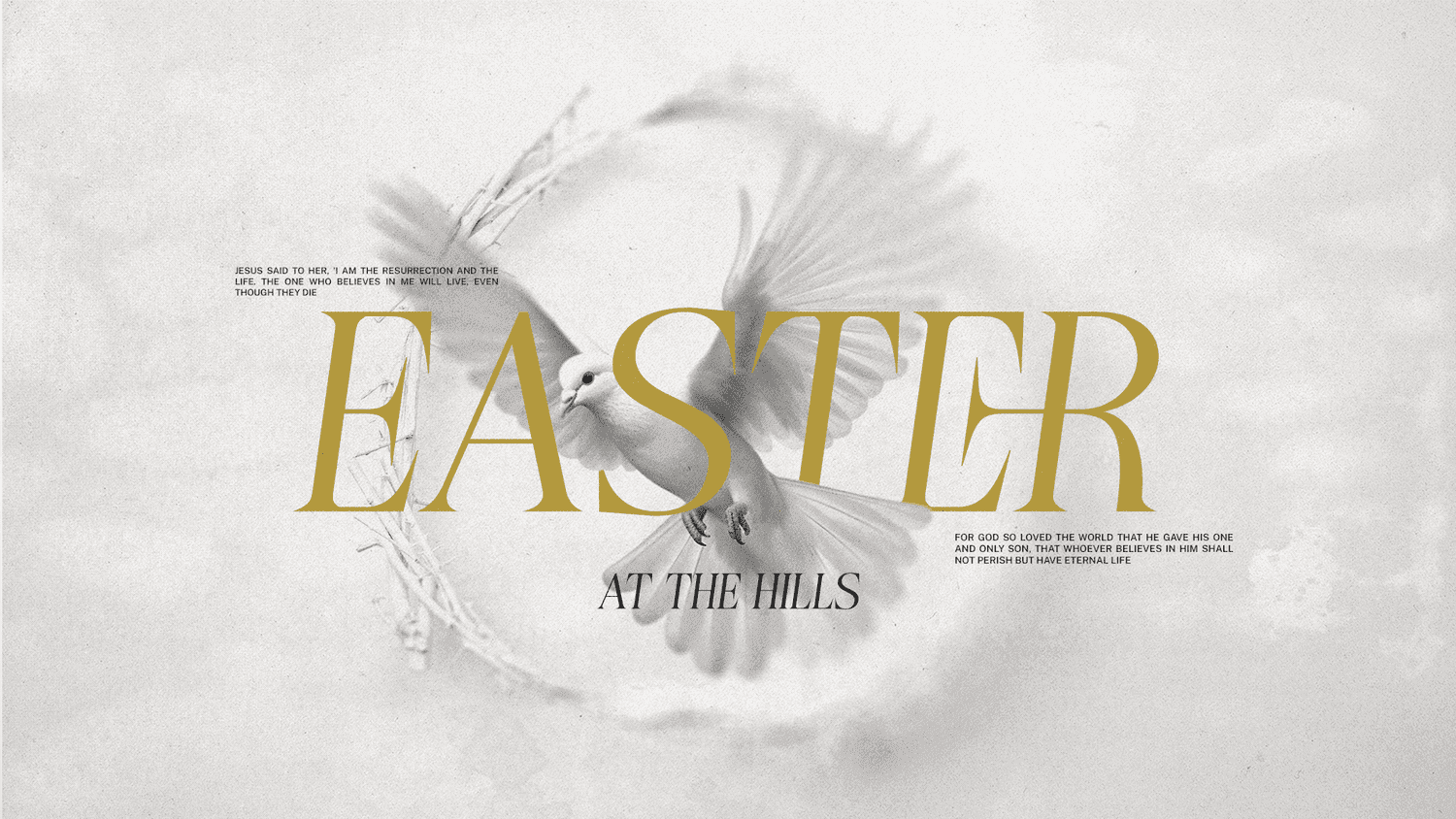
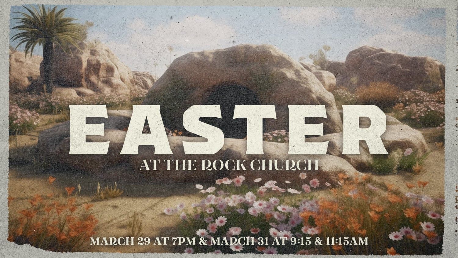
Sometimes a picture truly says a thousand words. When words fall short of capturing the magnitude of what Jesus did, a powerful image can communicate what words cannot.
An imagery-driven approach lets stunning photography carry your message, creating an immediate emotional connection that draws people in and makes them feel the significance of your Easter invitation.
Share these keywords with your designer:
- Hero photography
- Photo-forward layouts
- Emotive imagery
- Visual focal points
3) Dark and Moody
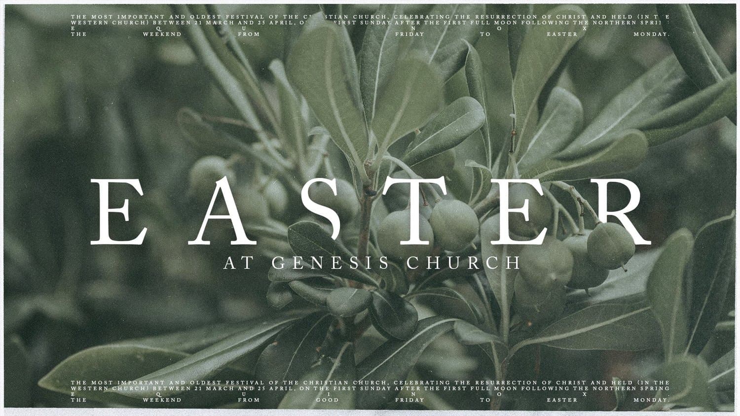
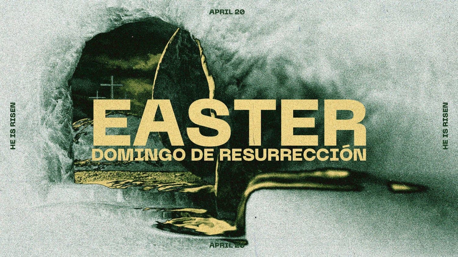
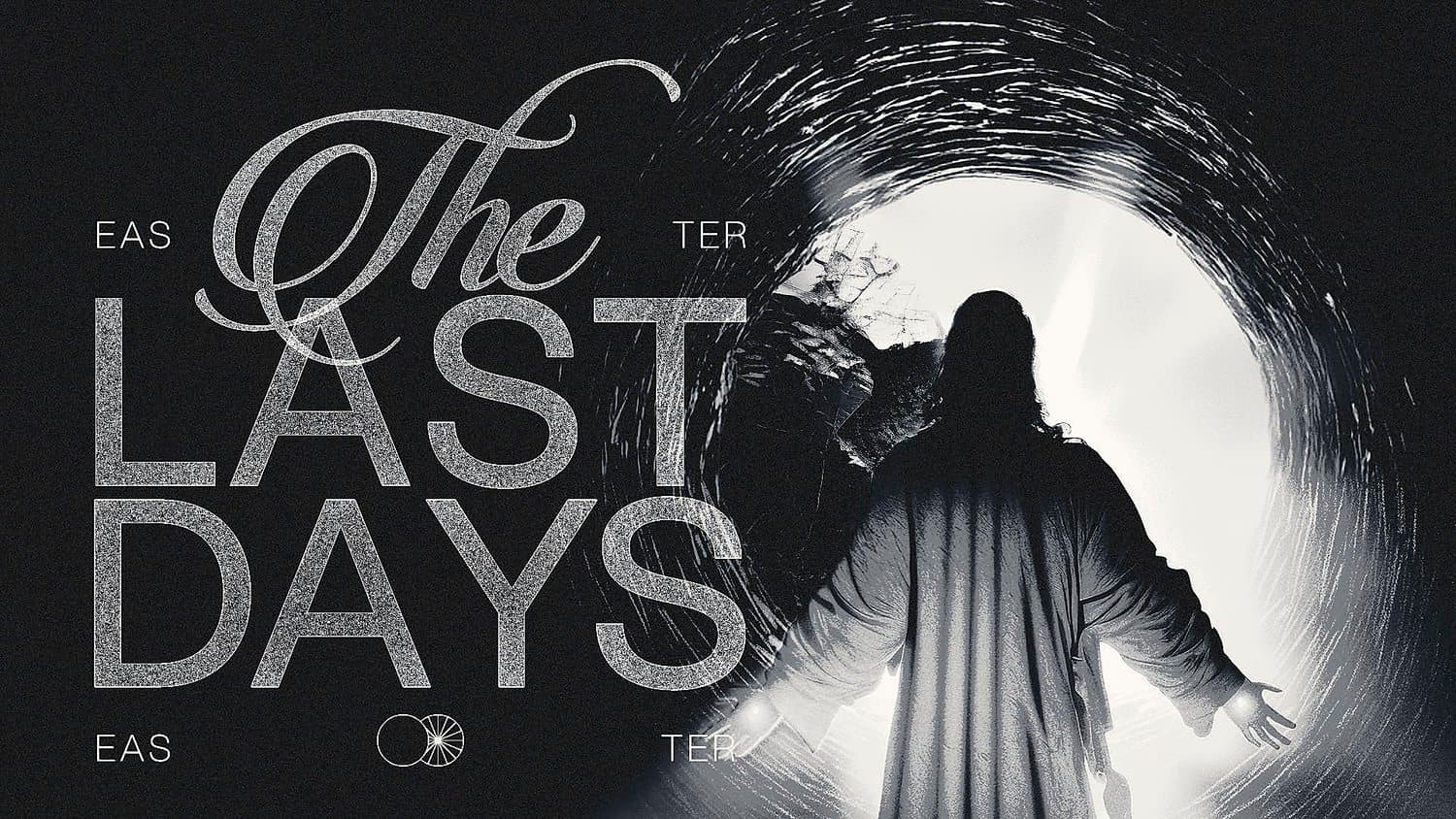
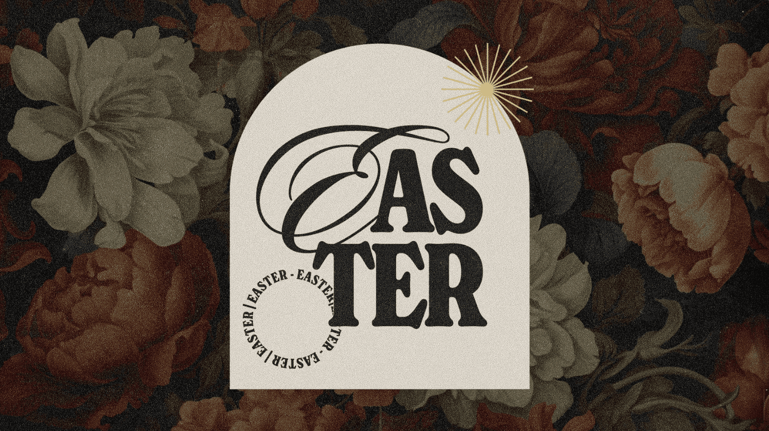
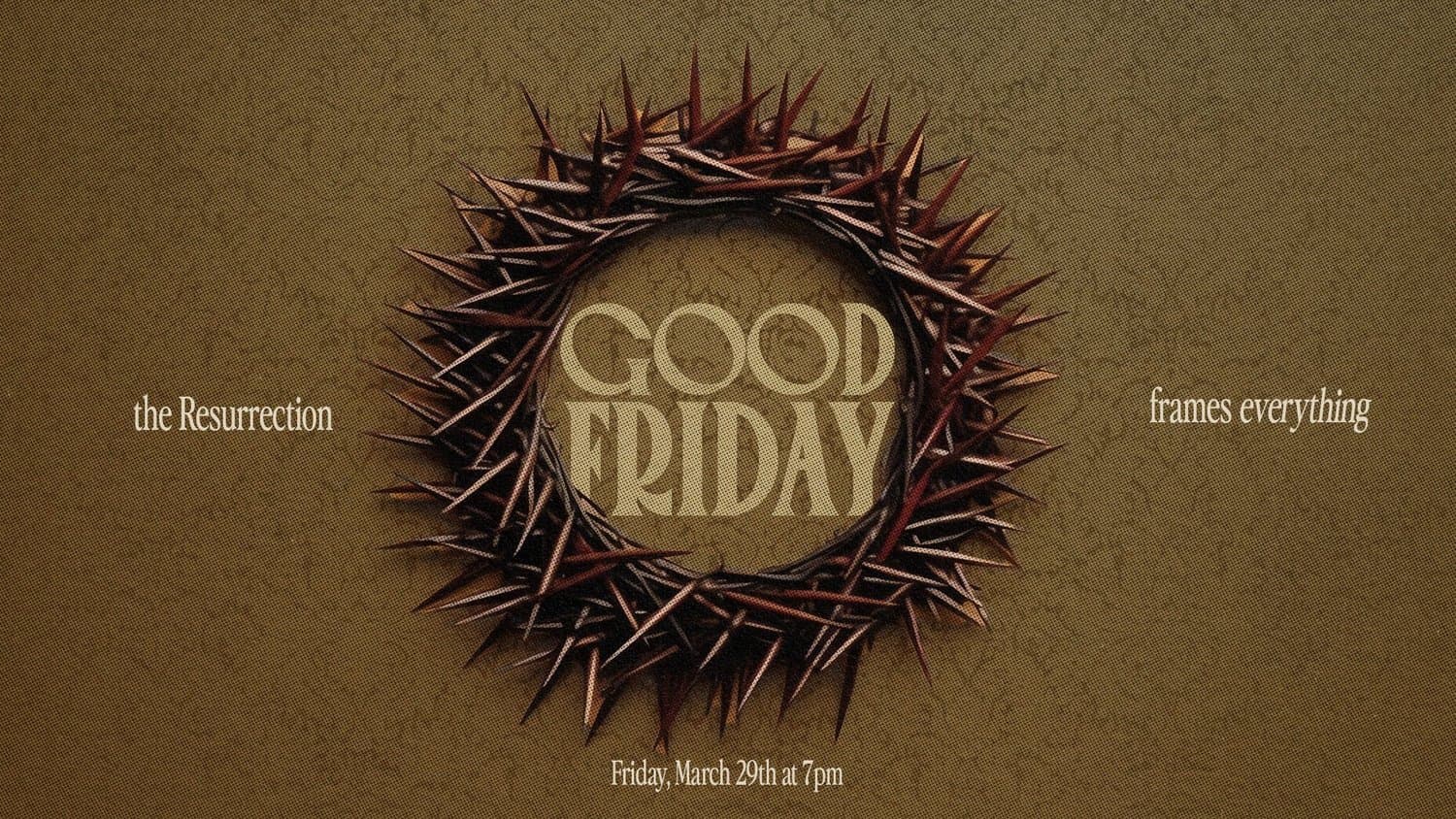
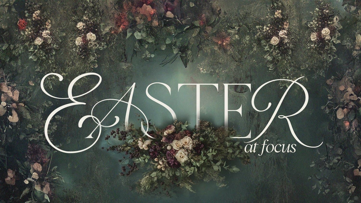
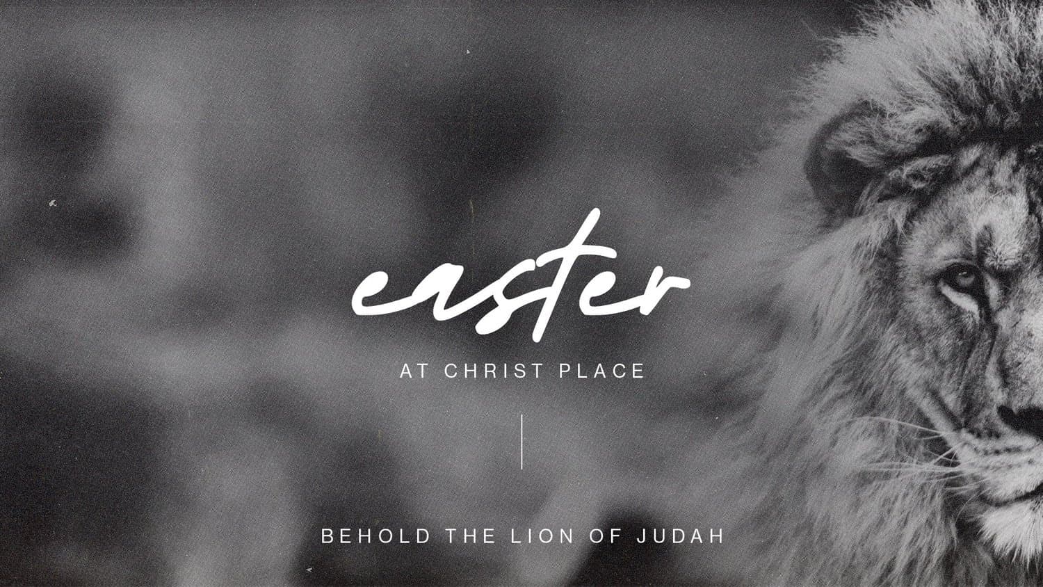
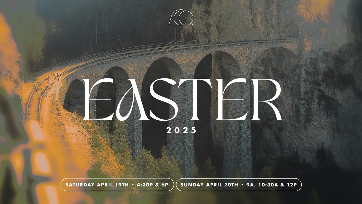
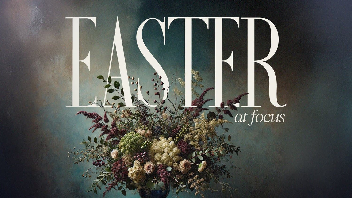
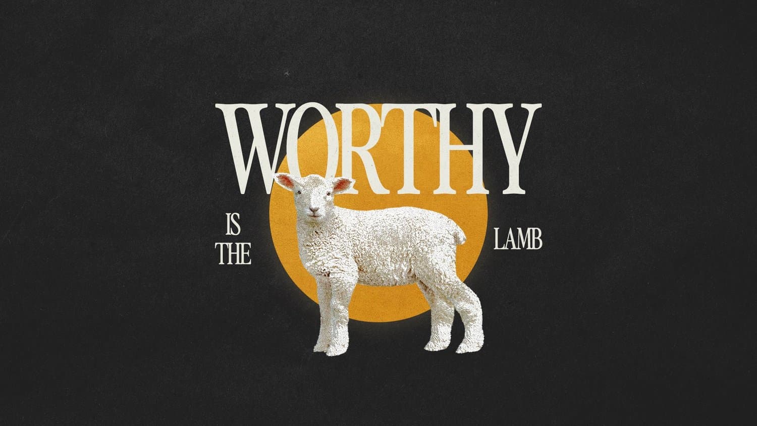
Before there was resurrection morning, there was a cross. A dark, moody design approach honors the weight of Christ's sacrifice and creates space for your church to sit in that gravity before celebrating the triumph of Easter.
This style builds anticipation, moving your congregation through the darkness of Friday toward the light of Sunday. It's honest about the cost of redemption while pointing toward hope.
Try these descriptions to get this style:
- Deep, rich color palettes
- High contrast imagery
- Gothic elements
- Moody florals
- Shadow and depth
4) Unexpected
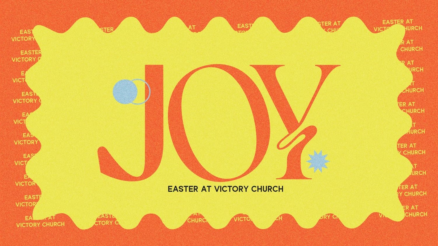
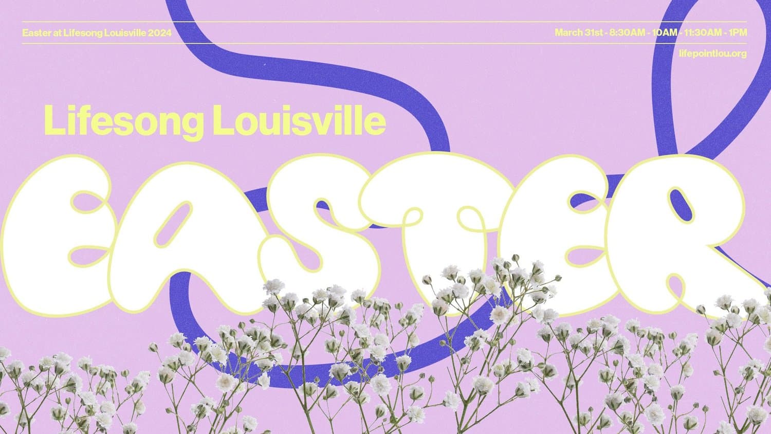
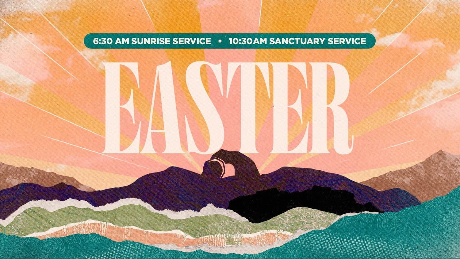
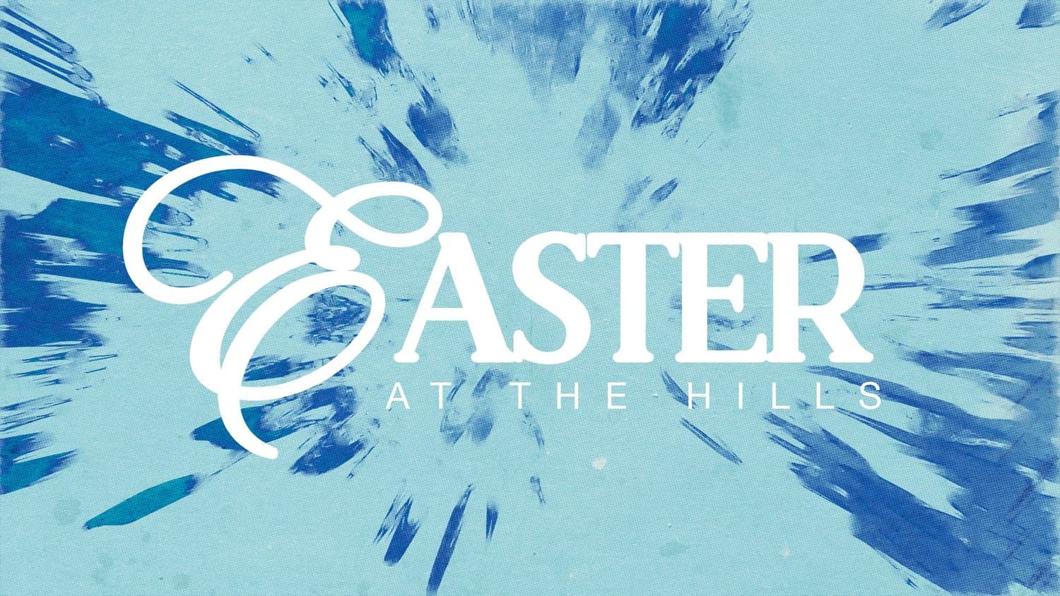
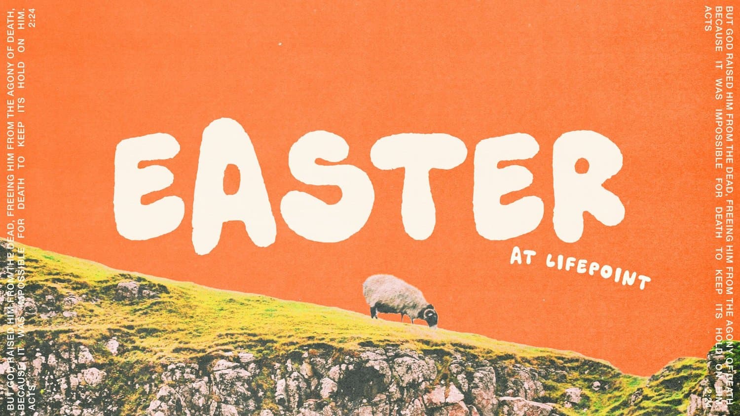
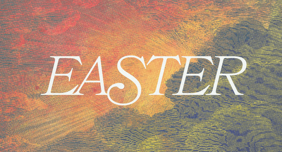
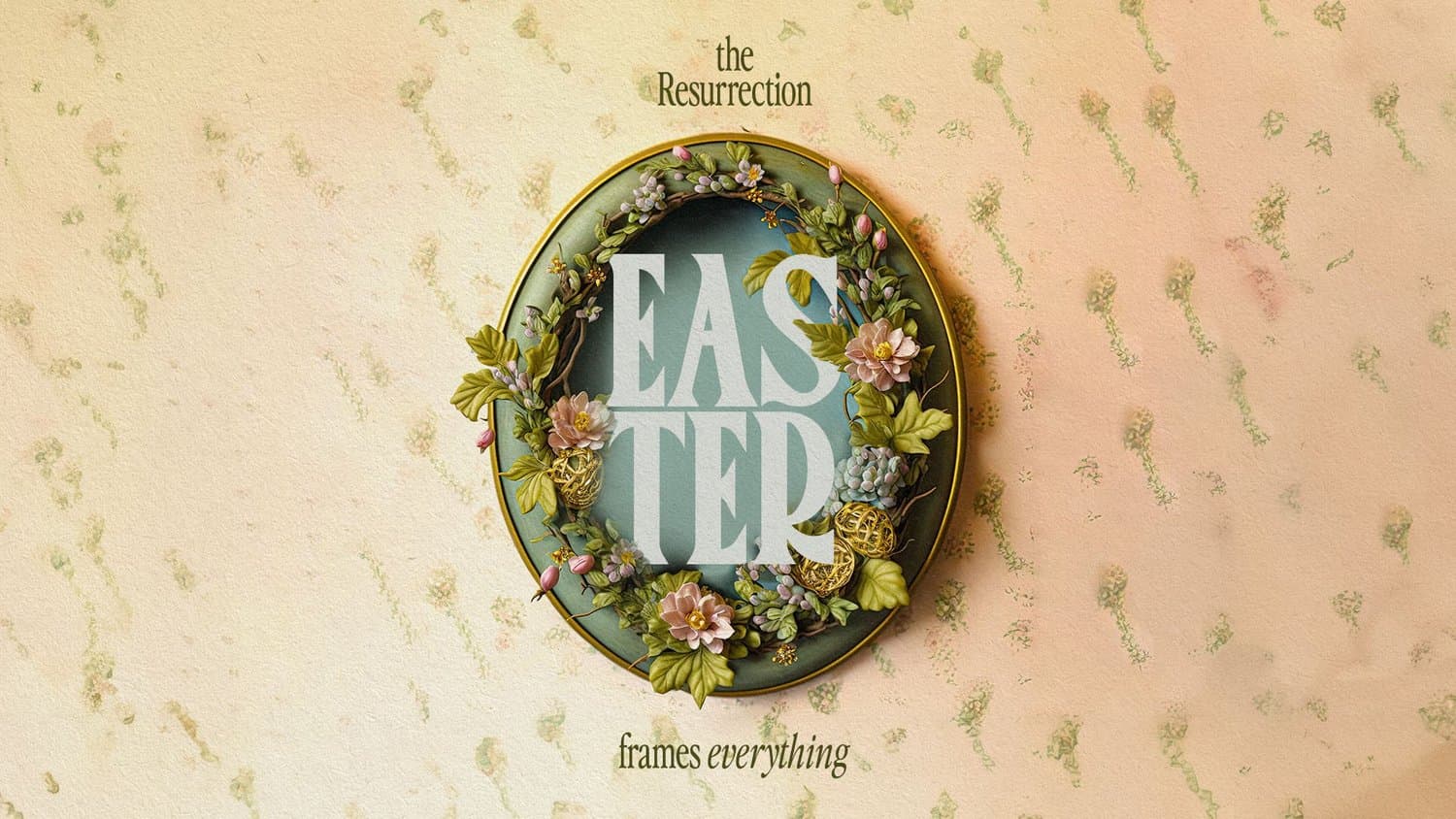
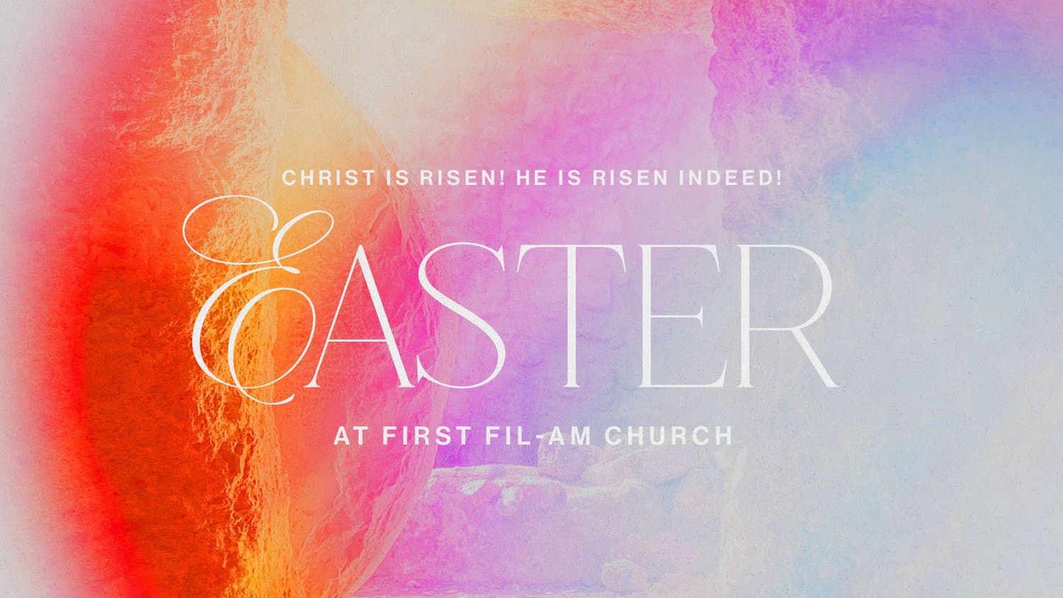
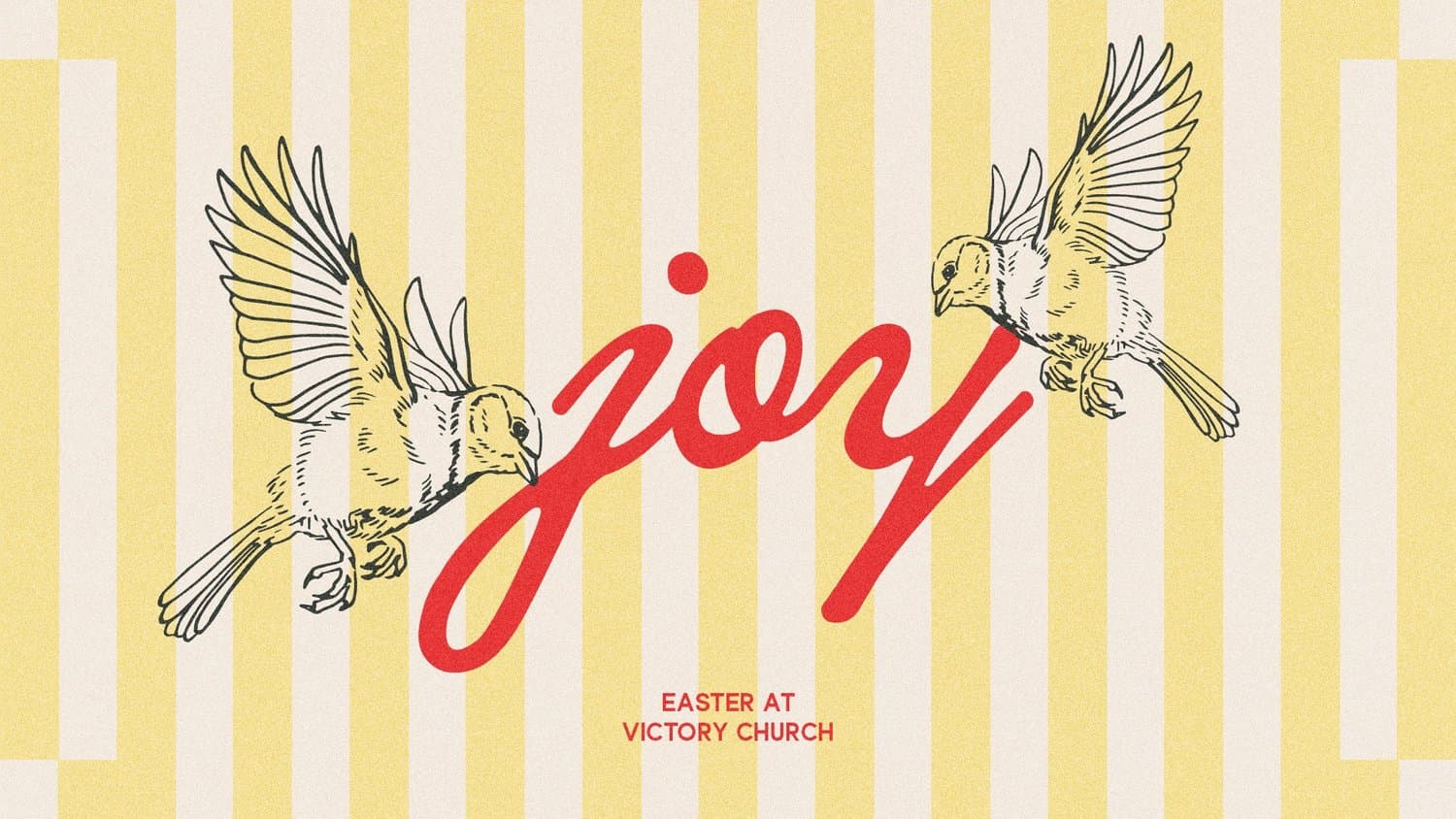
If you're tired of seeing the same Easter designs year after year, this direction is for you. An unexpected approach breaks the mold with surprising color combinations, unconventional layouts, or fresh takes on familiar symbols.
This style works beautifully for churches wanting to reach people who might have lost the excitement of Easter. It signals that your service will share the hope of Easter in new ways.
Use these keywords to help your designer achieve this look:
- Bold color choices
- Playful patterns
- Unconventional compositions
- Modern illustrations
- Playful typography
- Creative symbolism
5) Minimal
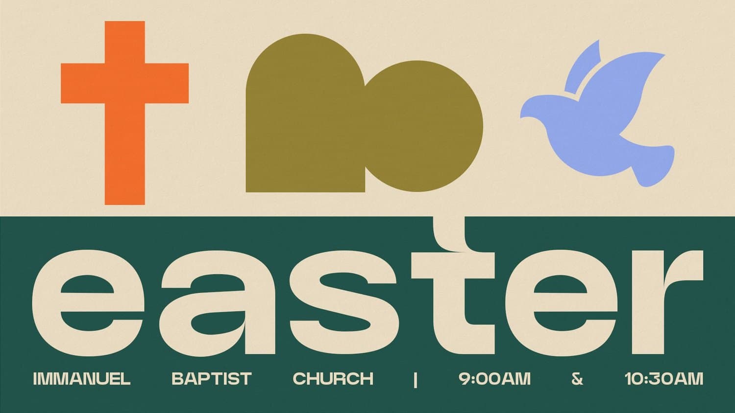
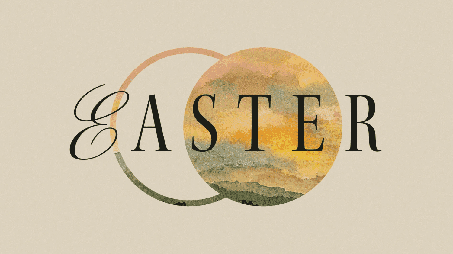
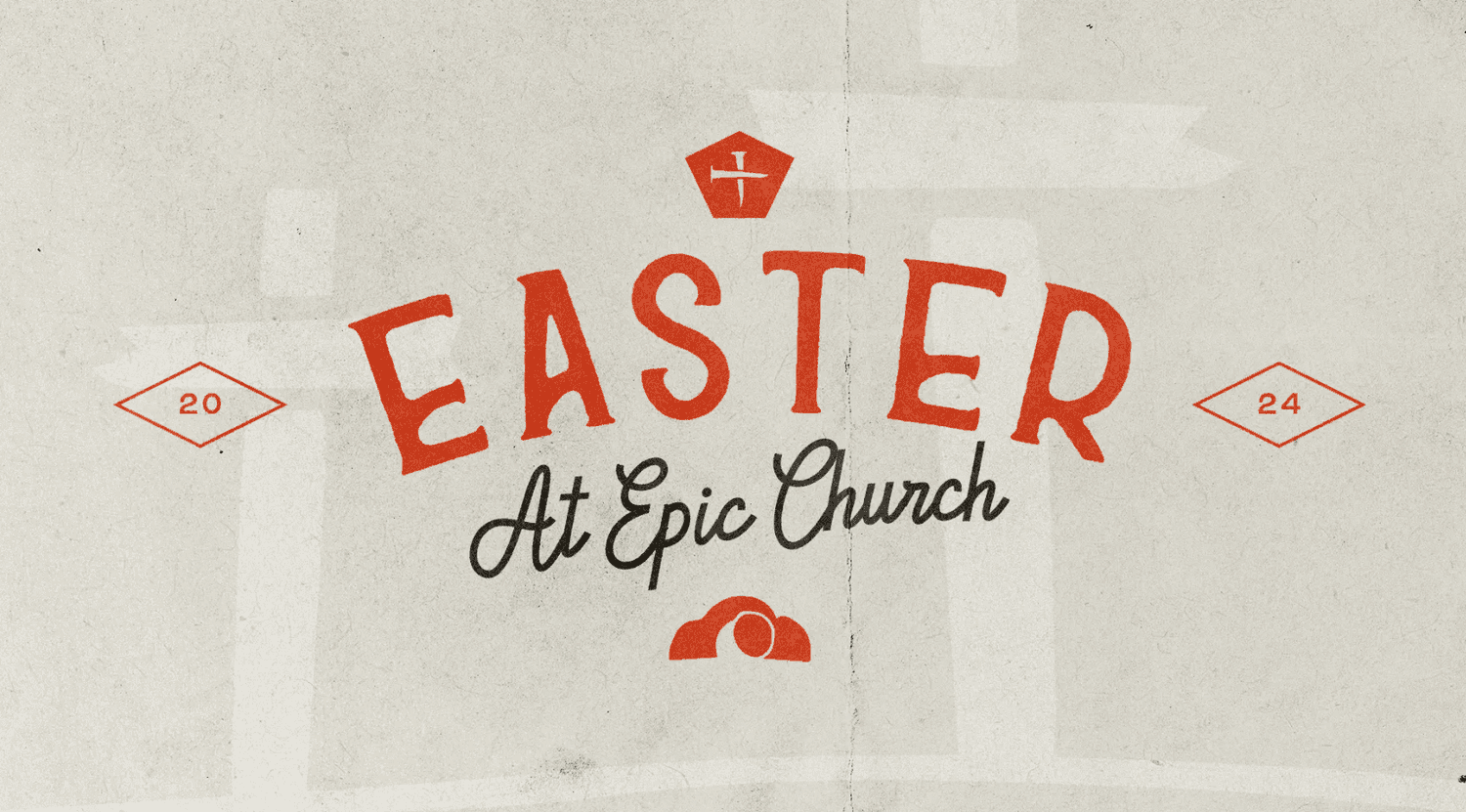
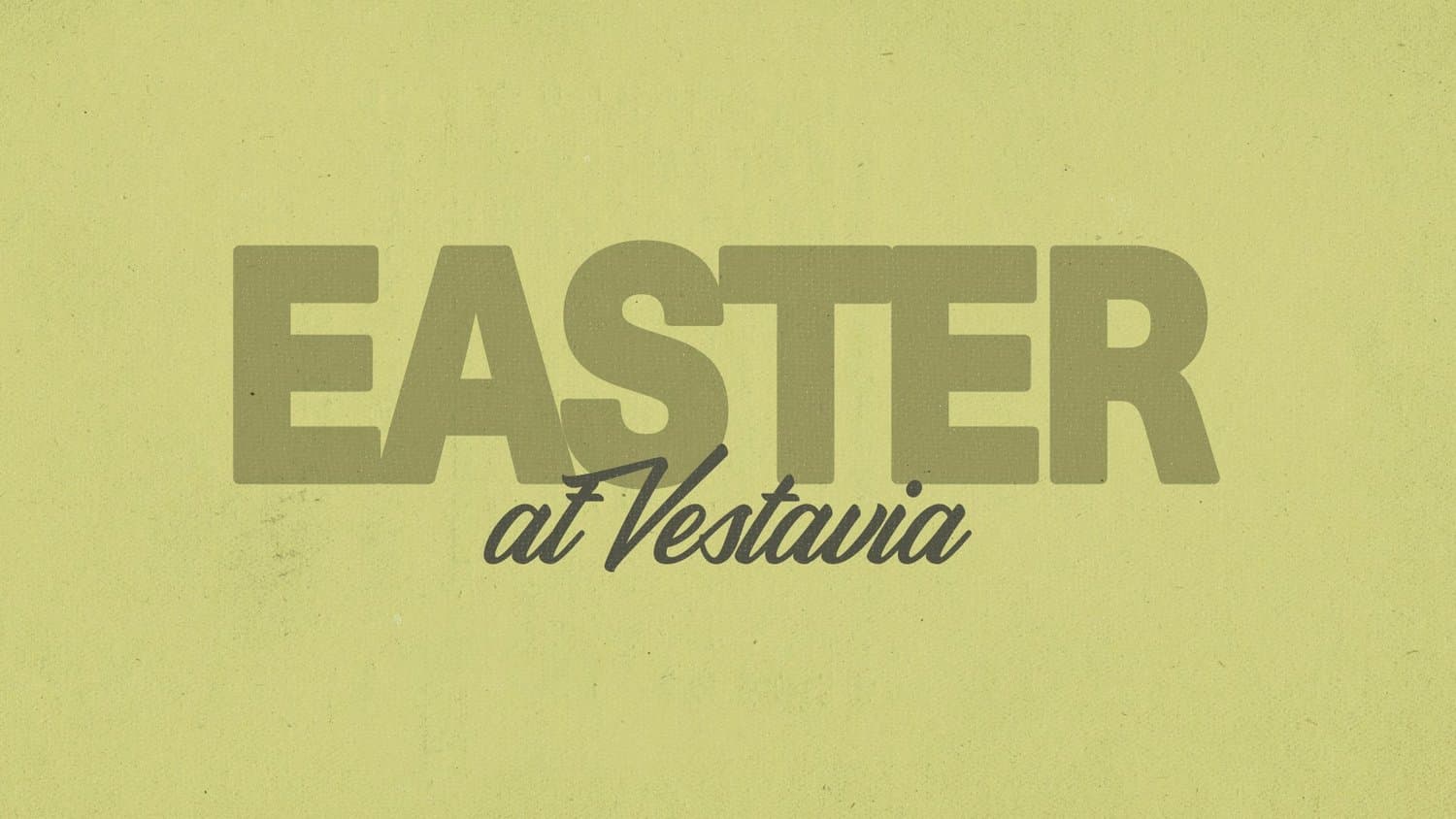
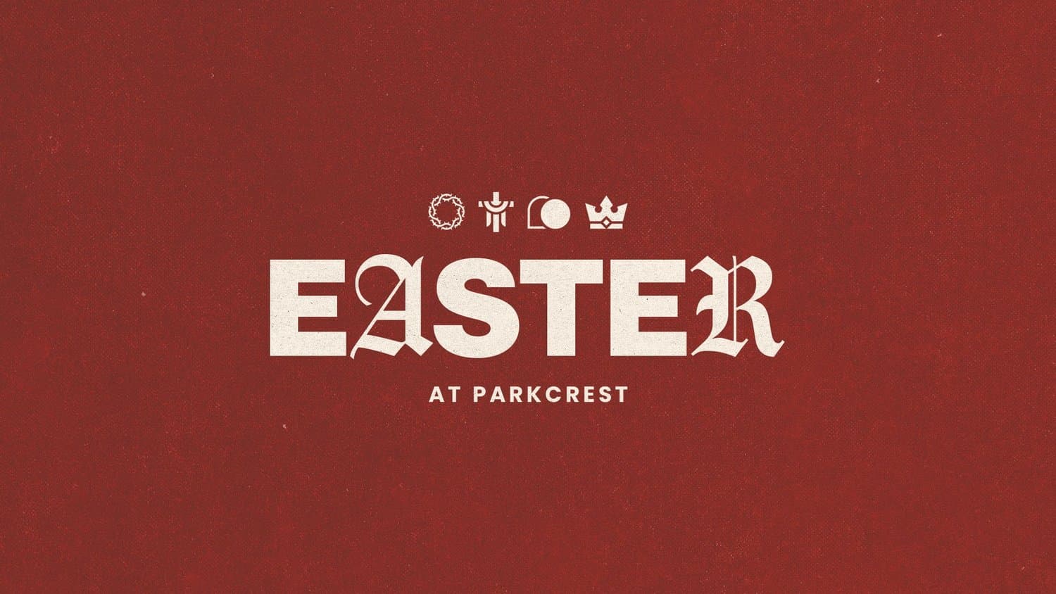
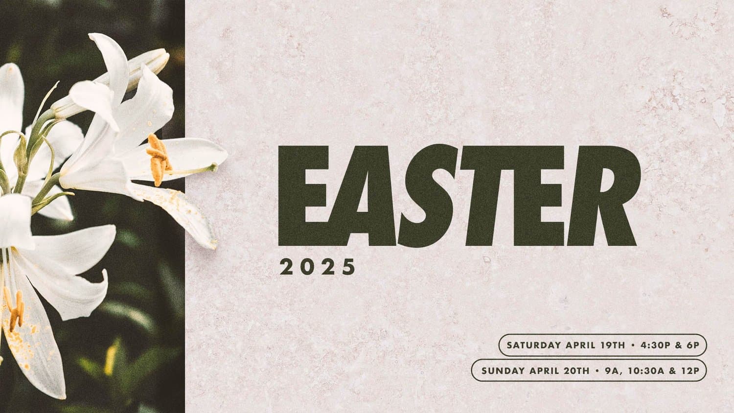
Year after year, we see churches gravitating toward minimal design, and it makes sense. In a world of constant noise and distraction, people are craving something that strips away the extras and gets back to what Easter is really about.
Clean, intentional design creates breathing room for your message to land with clarity and impact. Less visual clutter means more focus on the invitation itself.
Try these descriptions to get this style:
- White space
- Clean lines
- Clean typography
- Neutral color palette
- Simple compositions
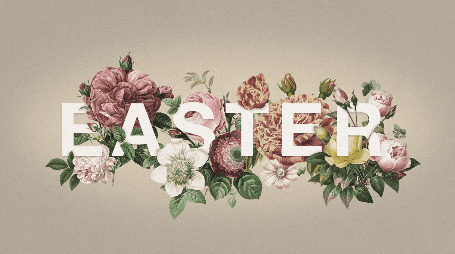
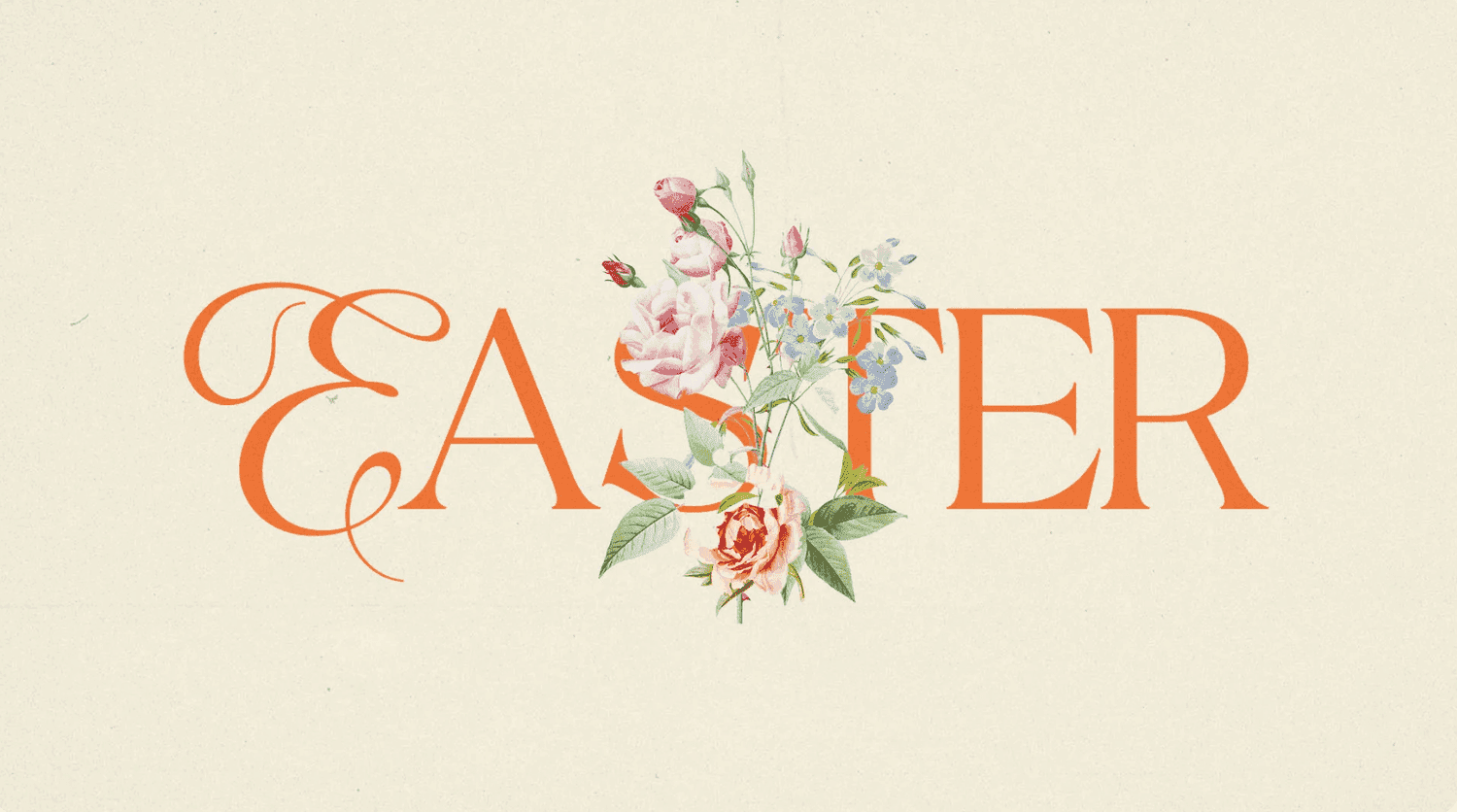
6) Traditional
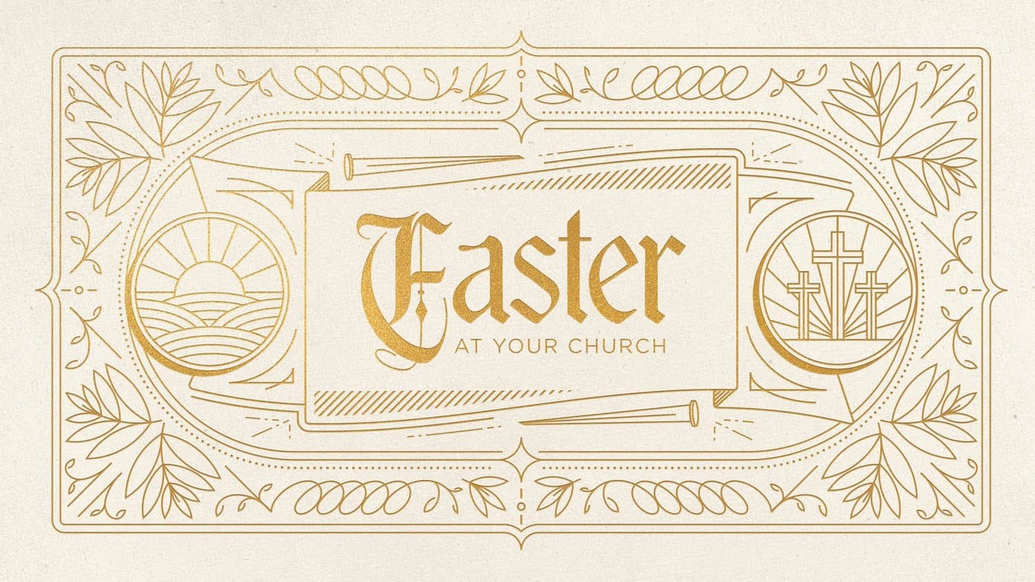
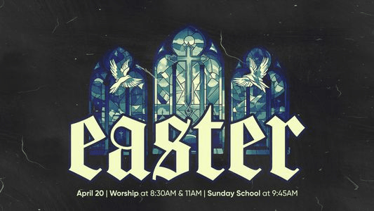
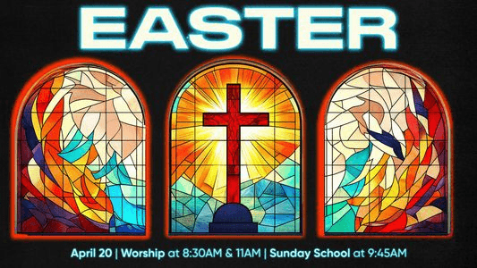
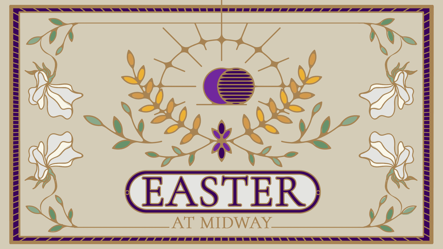
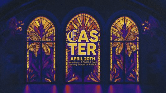
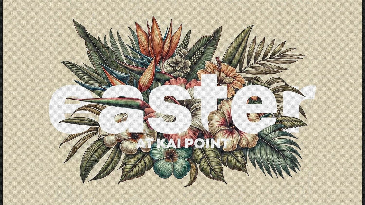
Easter is rooted in centuries of church history and sacred tradition. A traditional design approach honors that legacy by incorporating classic elements, liturgical colors, and timeless aesthetics that connect your celebration to the broader story of faith.
This style resonates especially well with churches that value historical connection and want their Easter graphics to reflect the reverence and richness of the season.
Share these keywords with your designer:
- Liturgical elements and colors
- Classic typography
- Cross imagery
- Stained glass elements
- Ornate details
- Historical references
7) Editorial
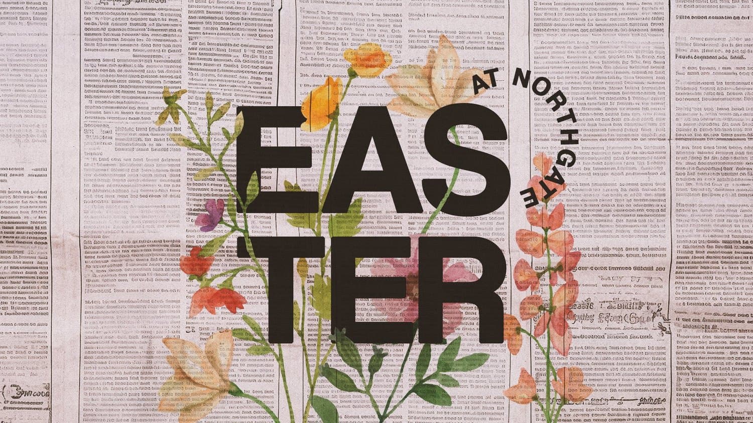
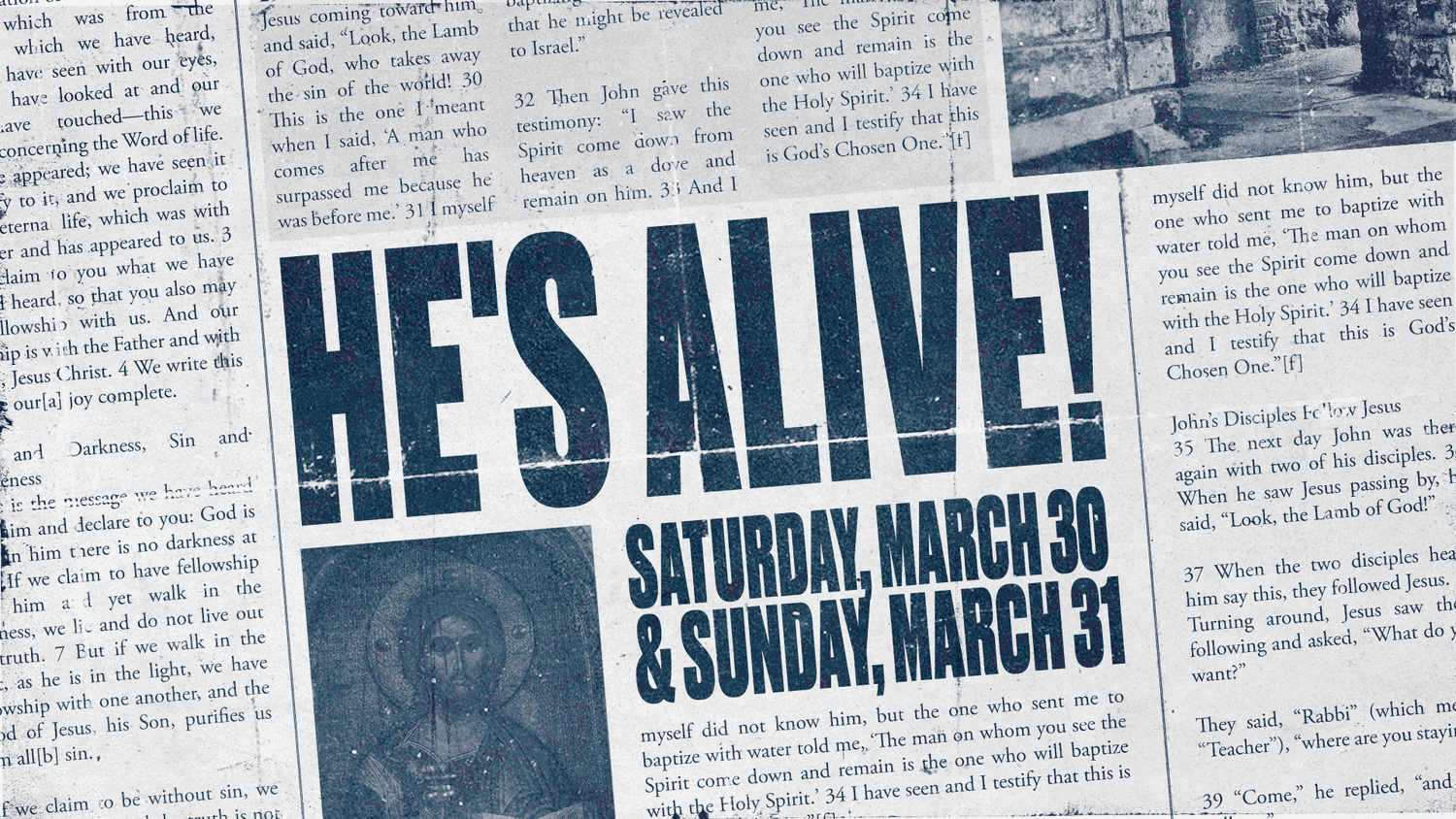
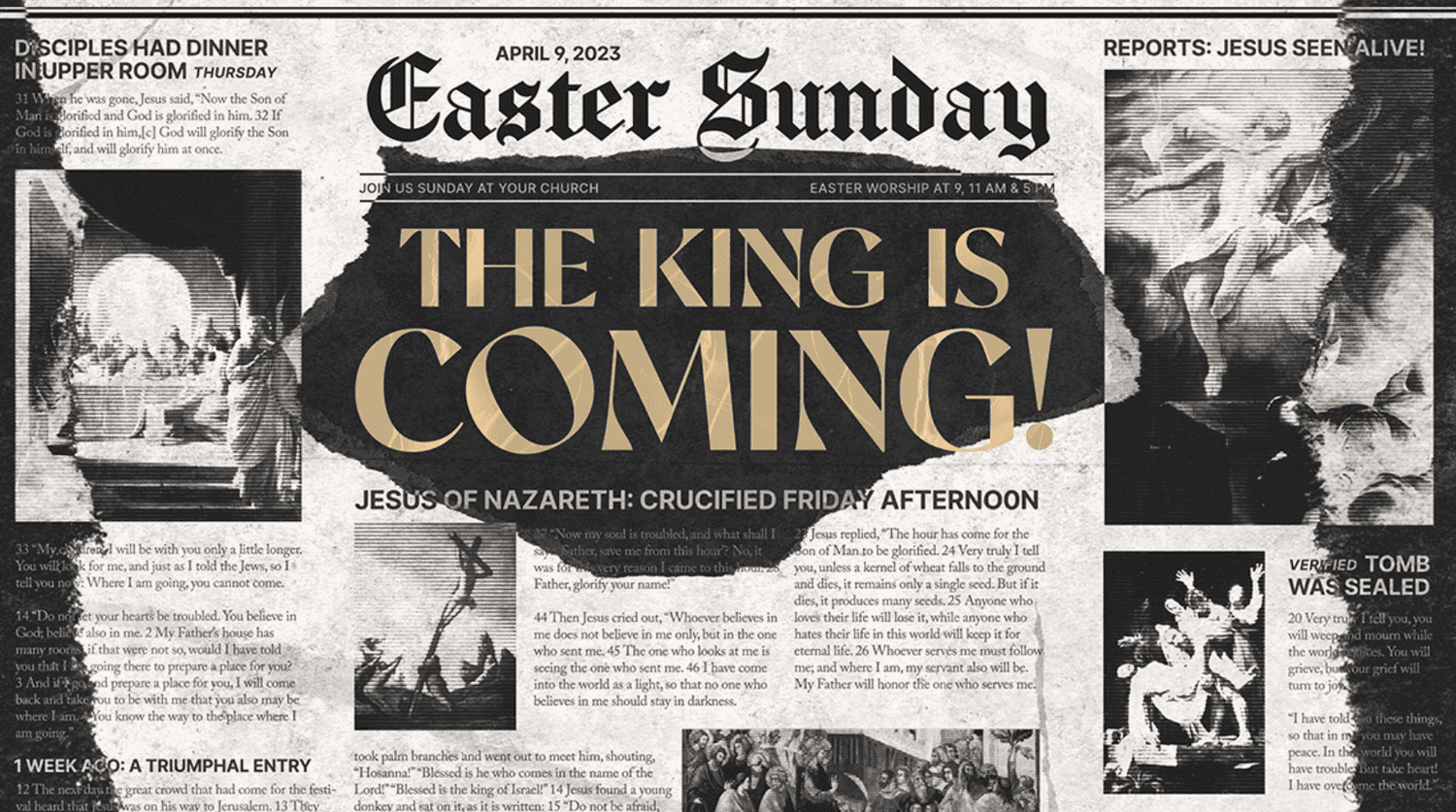
It’s unexpected, eye-catching, and just the beginning of the incredible story you’ll tell this Easter. Want to pursue this direction? Share these keywords with your designer:
- Scrapbook elements
- Newspaper layouts
- Mixed media
- Textural overlays
- Documentary style
8) Nature Inspired
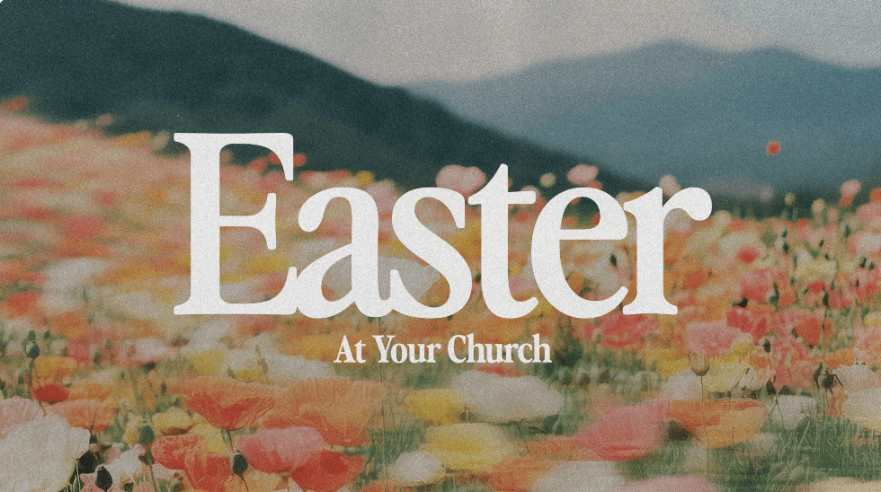
Take a look outside your window and you’ll see countless glimpses of God’s goodness through His creation. Pull this style into your Easter graphics to help your church visualize the story so they can connect deeper. Here are some helpful keywords for your designer:
- Earthy color palettes
- Natural textures
- Photo-driven
- Landscapes
9) Bright and Colorful

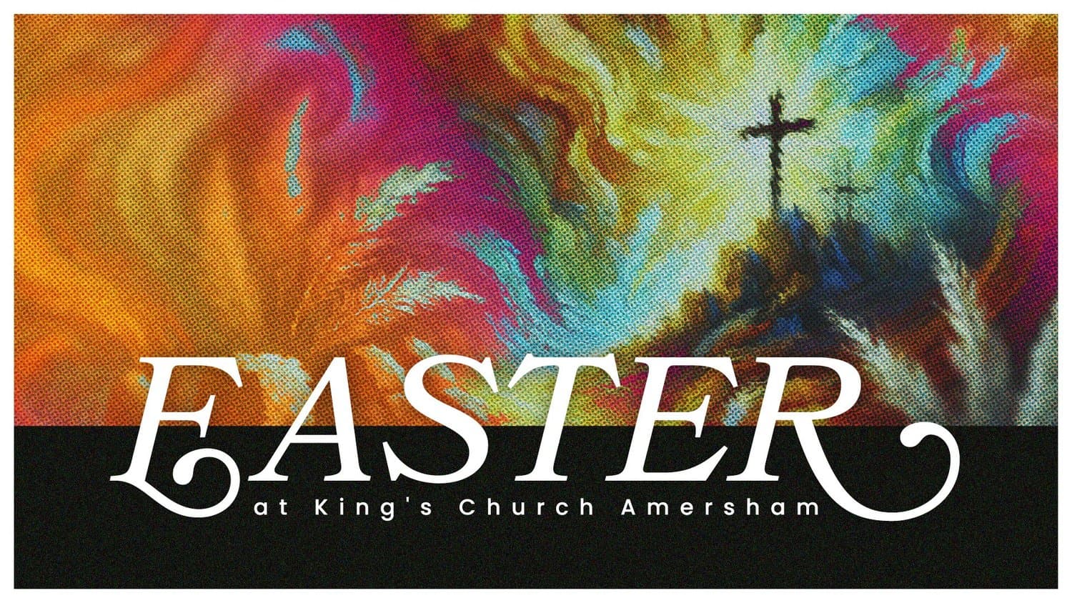

At the end of the day, Easter is a celebration, right? We can practically hear these graphics shouting for joy. Use these keywords to get your designer on the right track:
- Bold color choices
- Playful patterns
- Modern illustrations
- Energetic typography
- Cheerful imagery
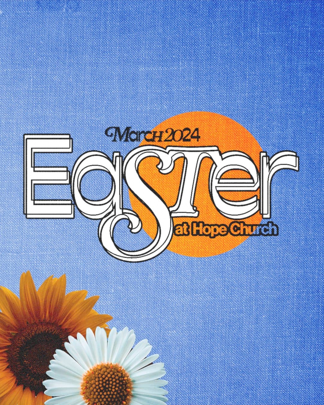
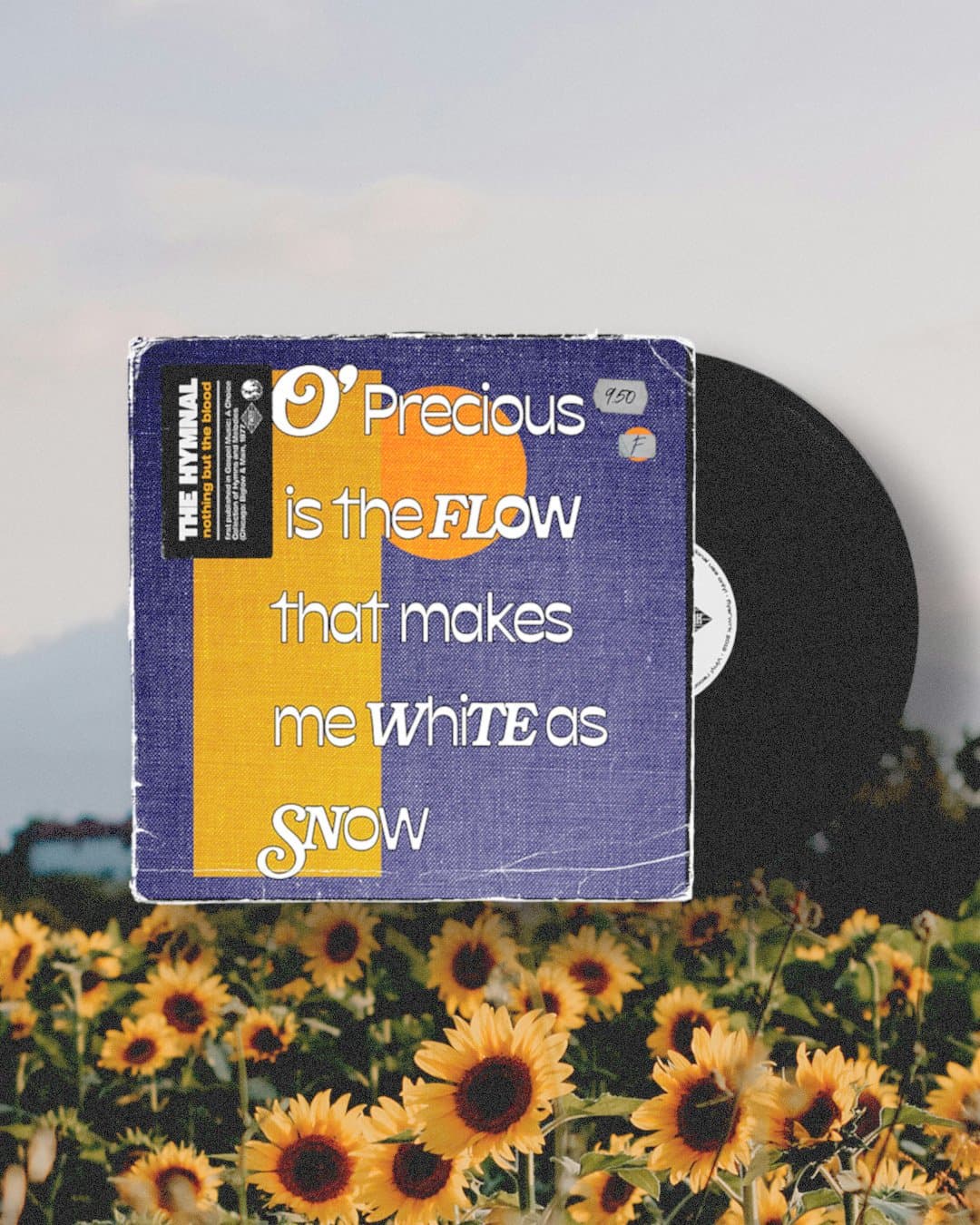
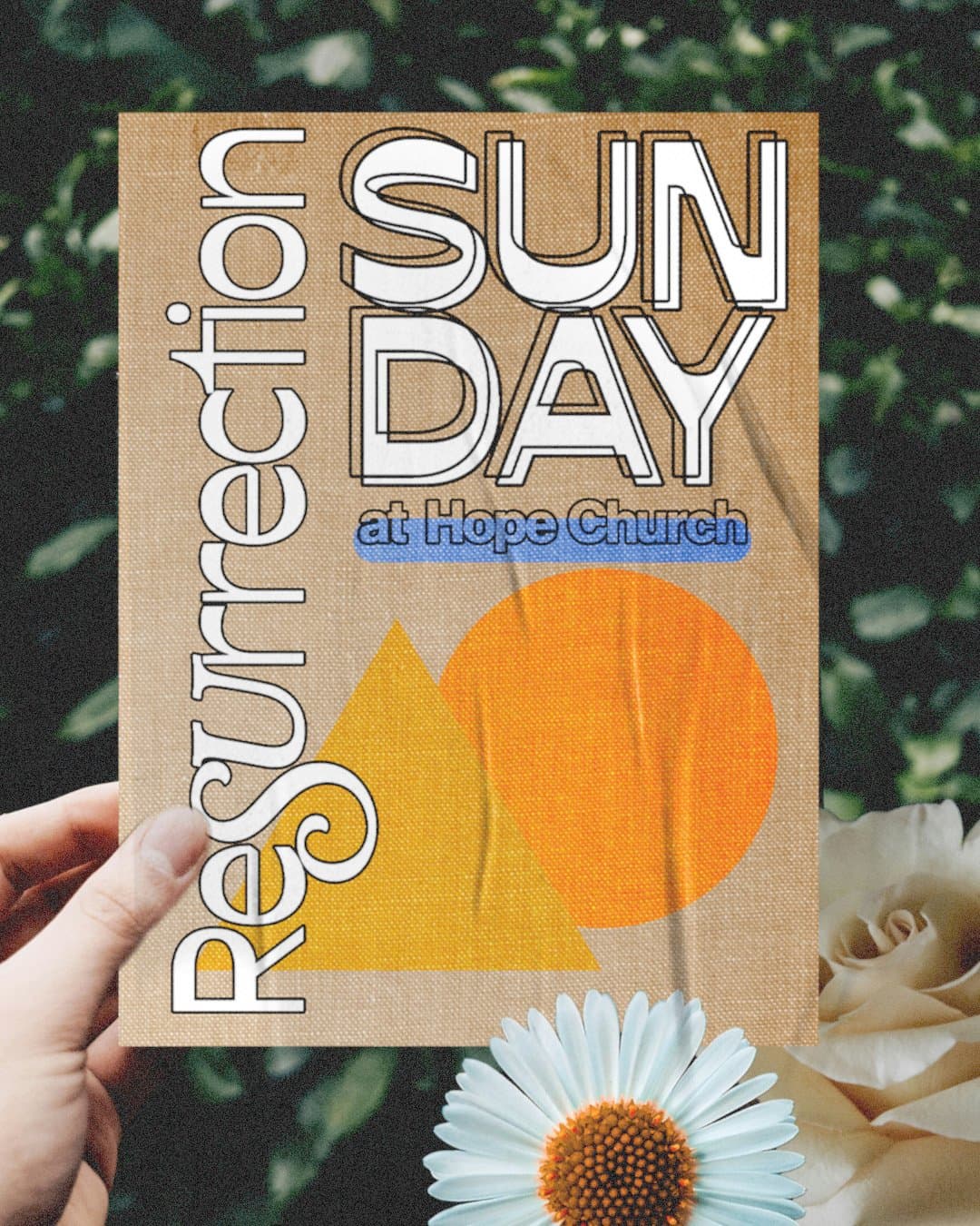
Design Inspiration
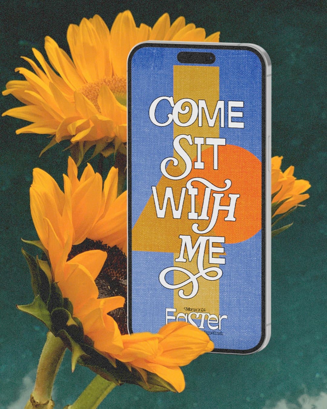
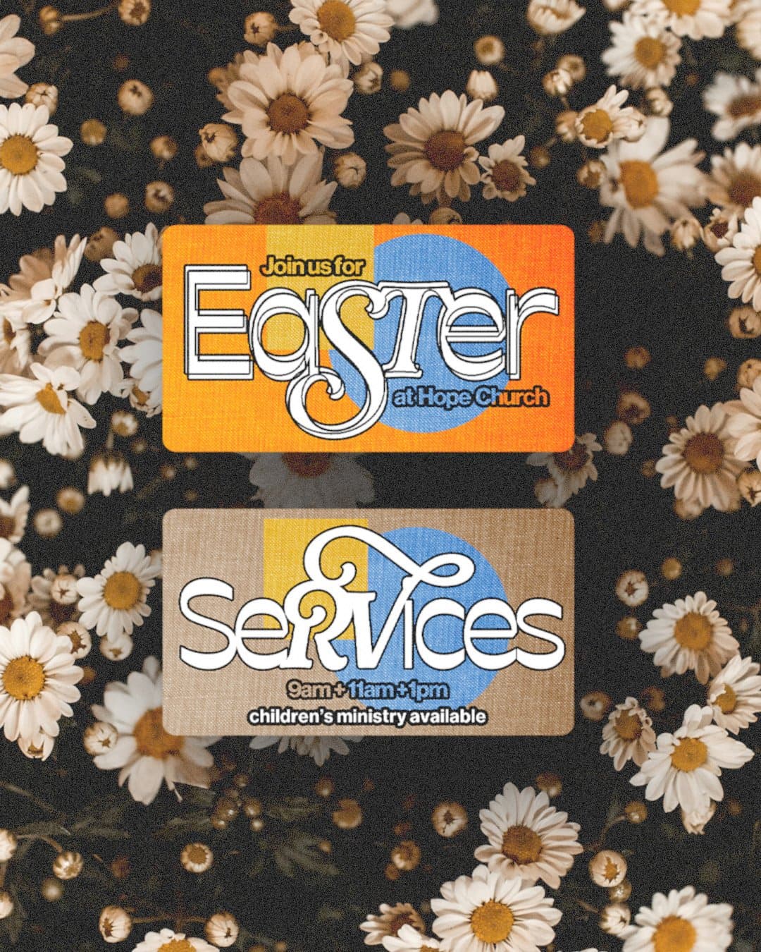
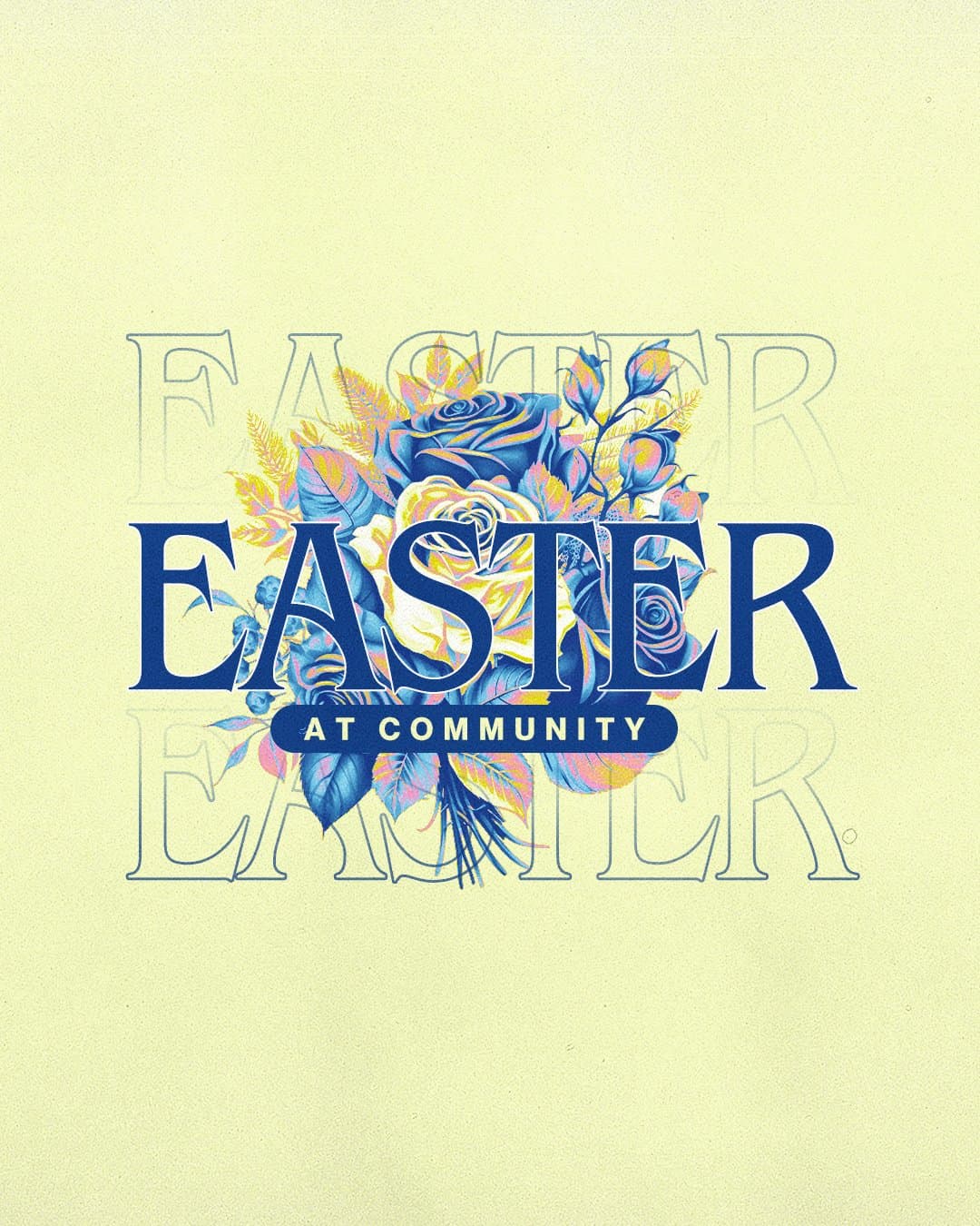
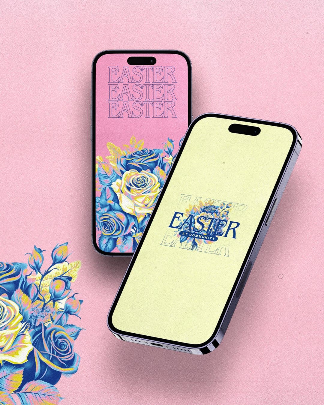
If You Feel Behind on Easter
Almost every church staffer has felt this way at some point, and it's normal. Take a breath, because you still have time to finish well.
Your media can invite people well, and God does the work in their hearts. So make it good, and set down the weight of outcomes that were never yours to carry.
Lock Your Visual Direction First
If your series graphics aren't final, finish those before anything else. Social posts, slides, signs and your landing page all move faster when you're building on a look that's already decided, because nothing has to be redone later.
Pick your direction today, even if it only takes a few minutes. The nine above are a good place to start if you need to see what's possible.
Protect Your Decisions Before Round Six
The revision loop usually eats more time than the design does. One tweak invites three opinions, and suddenly it's round six and the deadline is behind you. Try a simple method called Voice, Veto, Vote instead:
- Voice: everyone shares input during brainstorming, and every perspective is welcome.
- Veto: one or two key people, like your lead pastor and communications director, can cut anything that doesn't fit.
- Vote: the core team votes on everything left, and the majority wins so you can move forward.
Build the Invitation
Once the look is set, move to the part that gets people through the door. The goal is an invitation that makes someone think, "I want to be part of that."
Start with Easter social media. Show what Easter morning feels like at your church, with the energy and joy people will walk into, and answer the questions newcomers are asking: service times, childcare, what to expect, what to wear. Our Easter social media guide lays out a simple starting plan.
Then give those posts somewhere to land. When someone sees your post and clicks, your Easter landing page should answer their questions fast: when, where, what to expect, and what to do with their kids. One page and one clear button is plenty.
Promoting Easter With Paid Social Ads
A paid social ad works like a digital invitation card for your church. Even a small budget gives your Easter message a chance to reach neighbors who may be looking for a place to celebrate, and a well-placed post might be exactly the nudge someone needed.
Start With One Good Post
Keep it to one clear post with a hopeful message and one call to action. Say what makes your Easter special, whether that's a sunrise service, kids' activities or meaningful worship, and save the creative writing for the service itself.
Keep the graphic light on text, and consider photos or video from past Easters, since they add a human face people can connect with. Your one call to action might be an RSVP or an invitation to share the post.
Instead of: "Easter services this Sunday. See our website for details."
Try: "Celebrate Easter with us at [Church Name]. Everyone is welcome, and we'd love to save you a seat."
Set a Small Budget
Start small, with $20 to $50. If it helps, spread it out: about $10 a day over several days keeps your invitation in front of your neighbors for the whole stretch.
Aim Close to Home
Consider setting your ad to show to people within roughly a 20-mile radius of your church, since those are the neighbors most likely to walk through your doors on Easter morning.
Time It Well
A good rule of thumb is to start 14 to 21 days before Easter and run the ad for 7 to 10 days. That gives people time to see it and keeps it fresh.
If you want to go a step further, tier it with a different piece of creative at each stage:
- 30 to 40 days out: a broad, low-cost awareness post.
- 14 to 21 days out: an informative post with the details.
- 7 to 10 days out: your biggest share of the budget behind a fresh design.
Watch It and Share It
Keep an eye on reach, engagement and clicks while the ad runs, and adjust if something isn't landing. Then invite your people to share the post on their own pages, because people trust an invitation from a friend.
Modern and Meaningful Easter Design
Every church staffer lives in a tension at Easter. You want a look that feels approachable to a first-time guest, and you want it to carry the weight of the story. Take a breath, because you can do both.
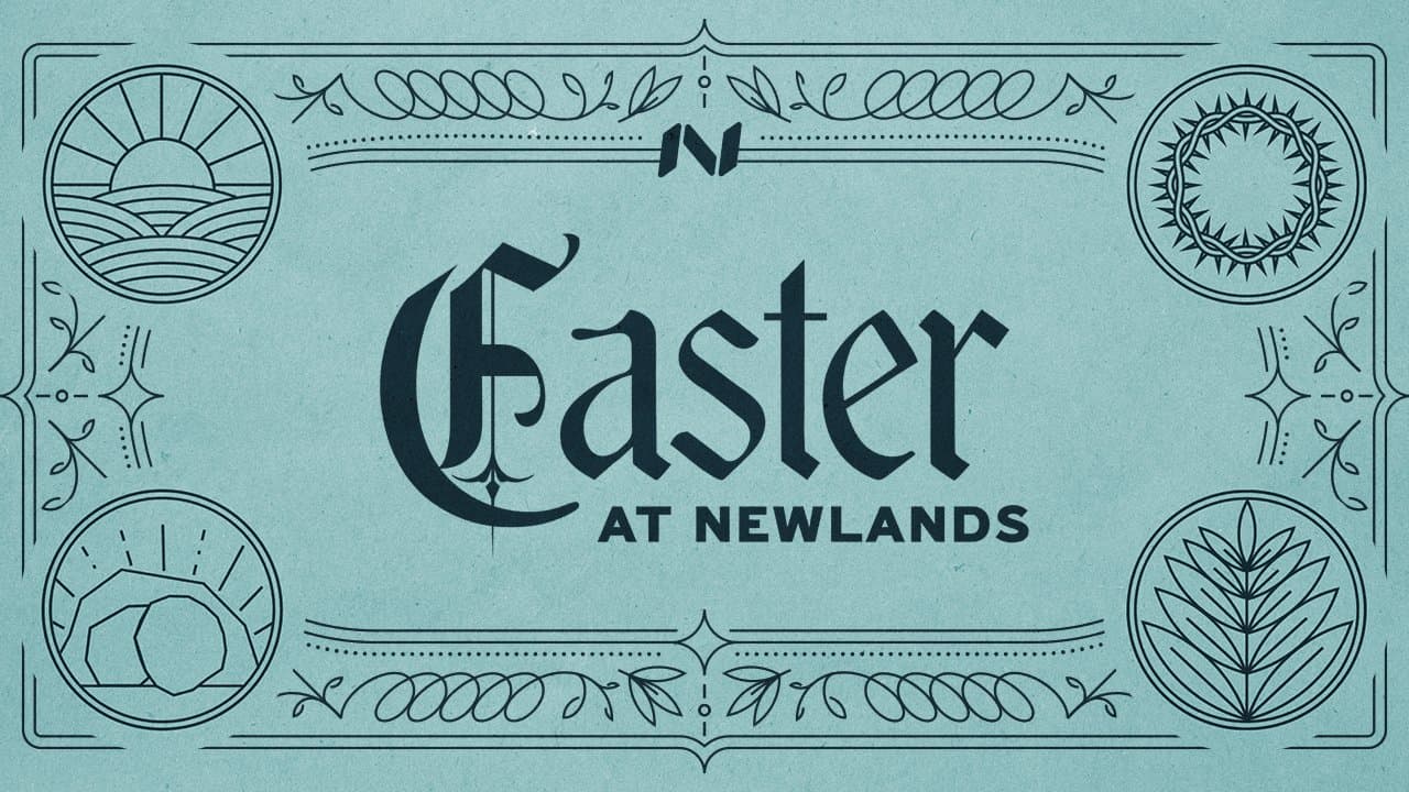
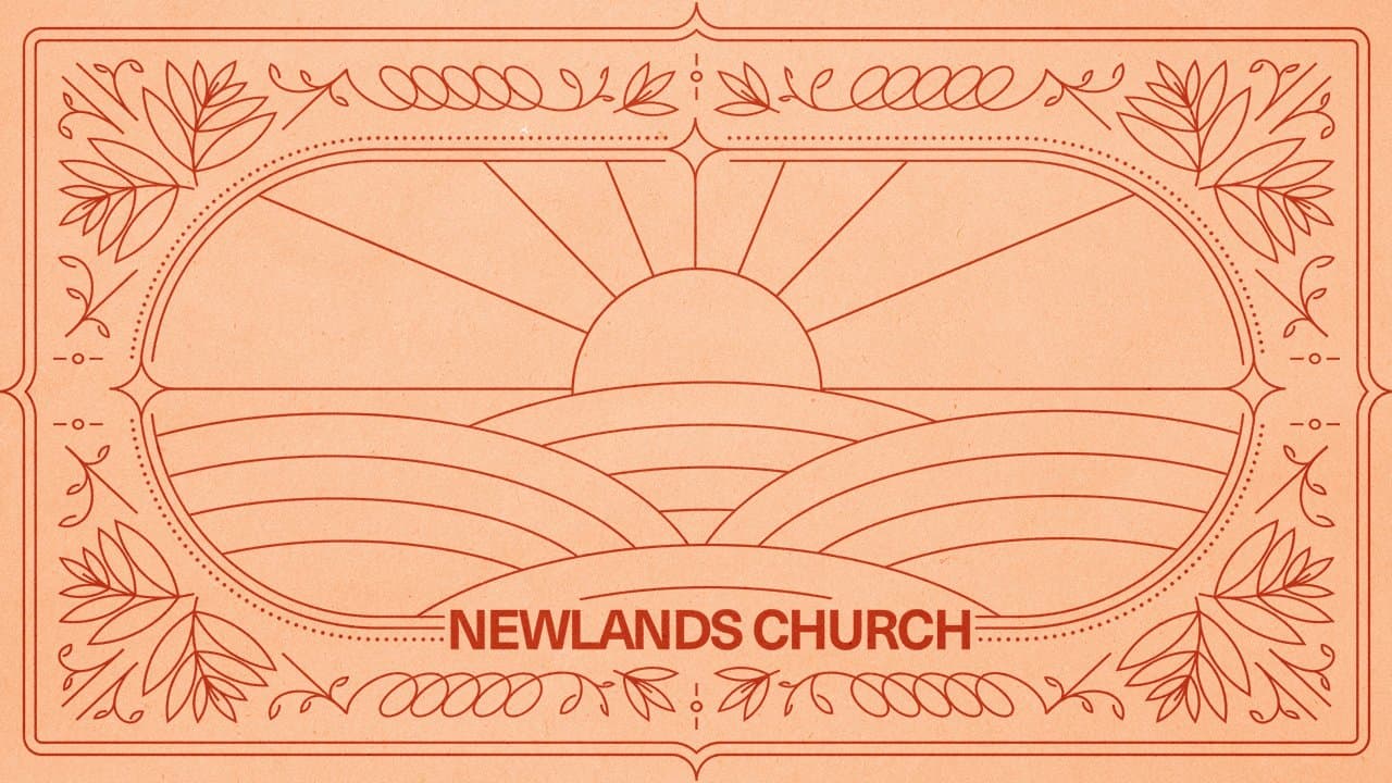
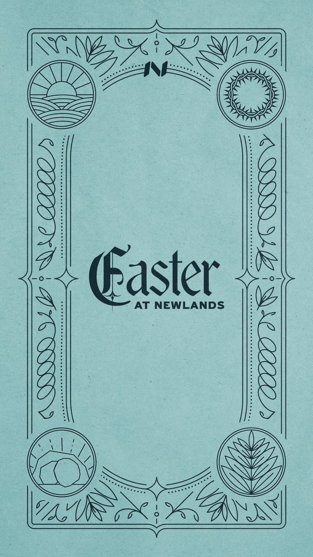
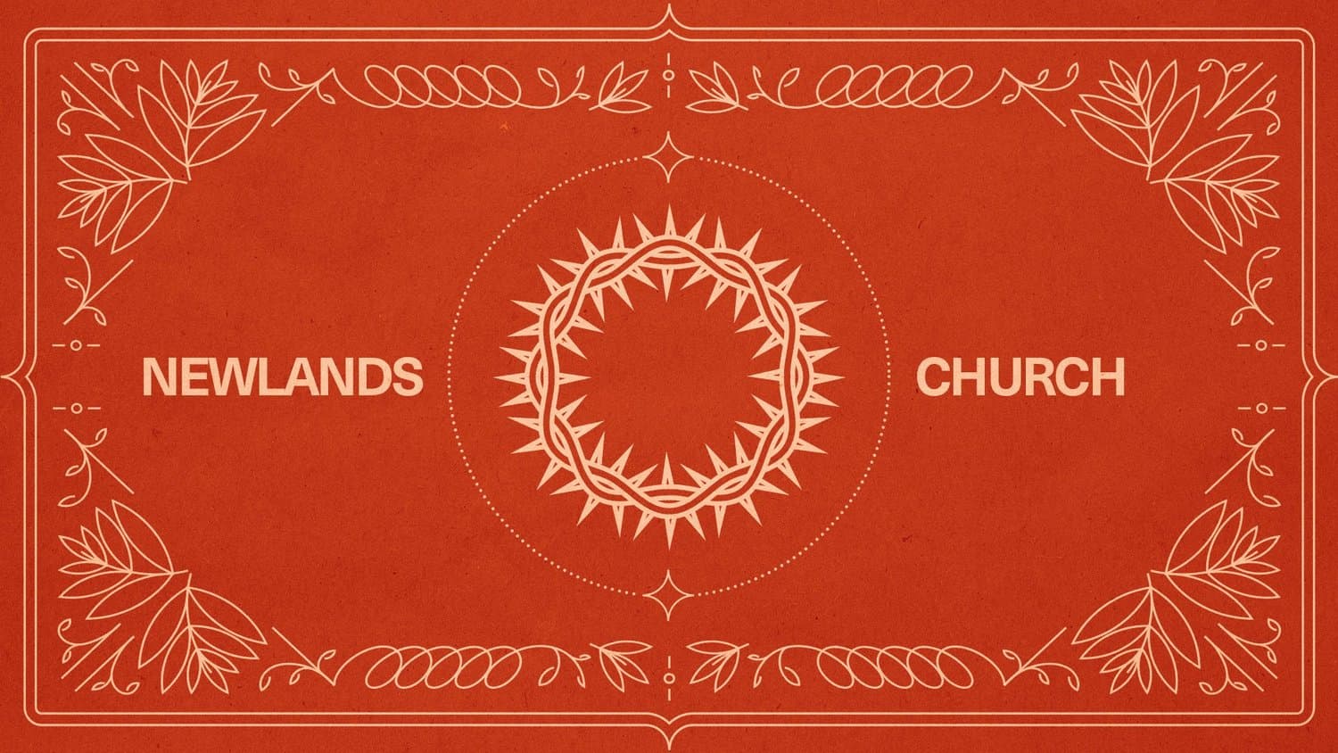
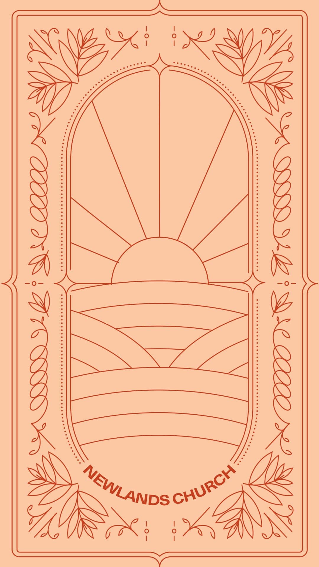
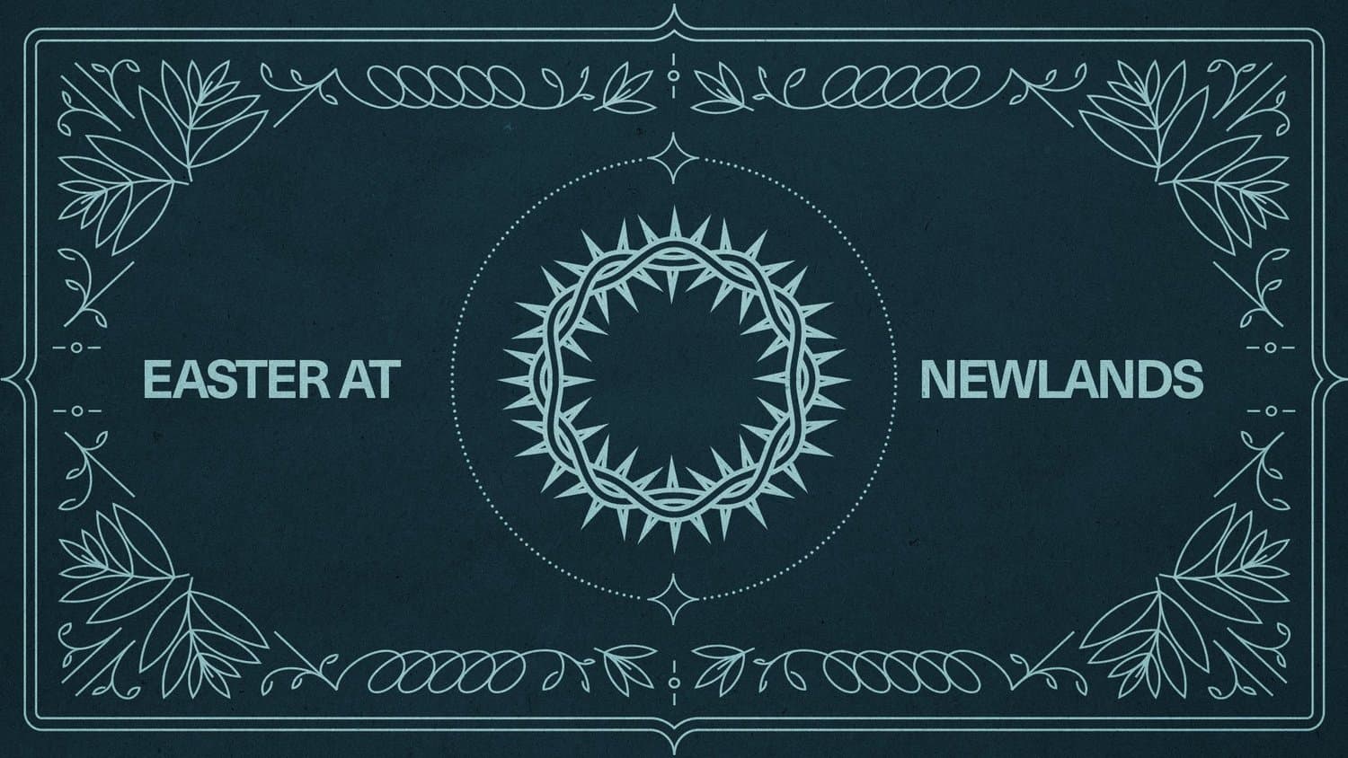
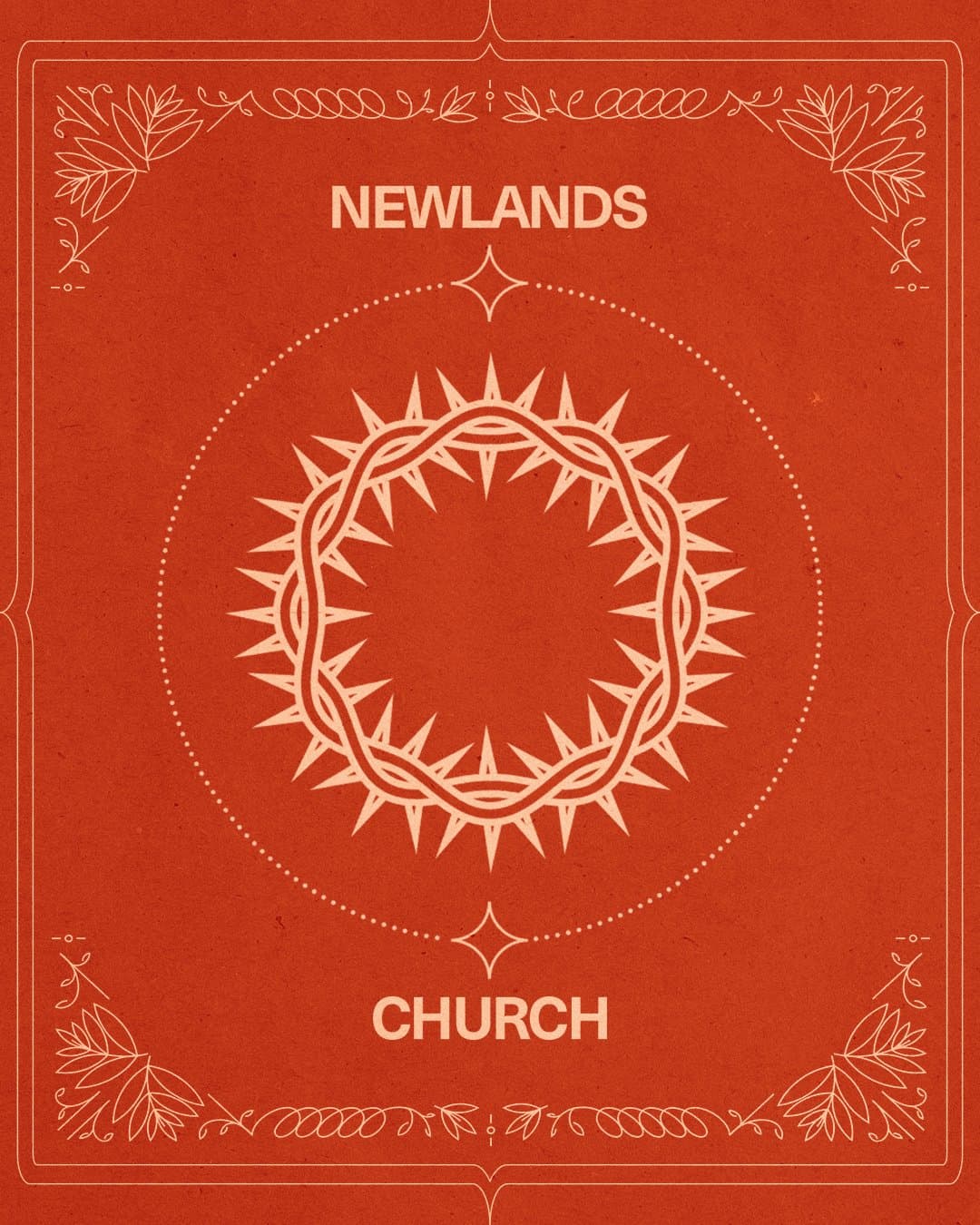
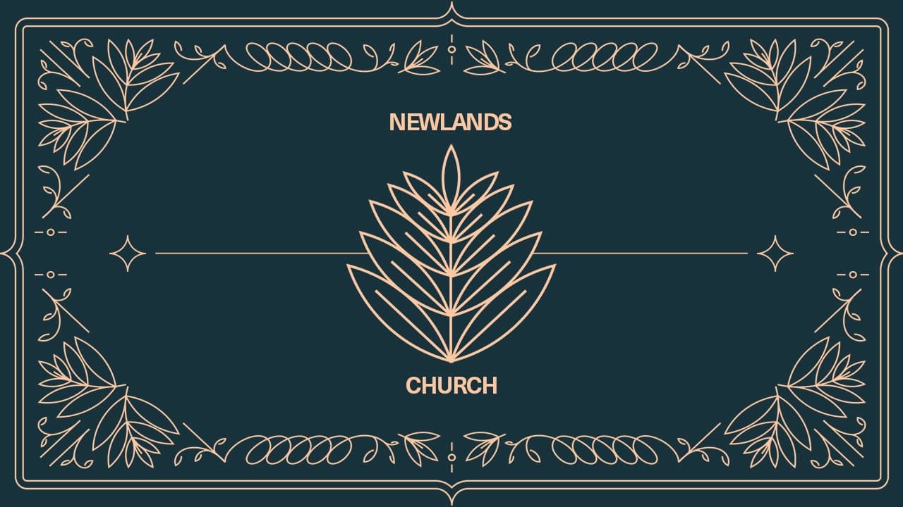
One church we partnered with came to us with exactly that idea: an Easter series that felt fresh and modern while still honoring the depth of what they were celebrating. Their goals were to engage churchgoers and people who don't attend, make Easter feel accessible, feel timeless but still current, and invite deeper connection.
Our designers built the set from three moves:
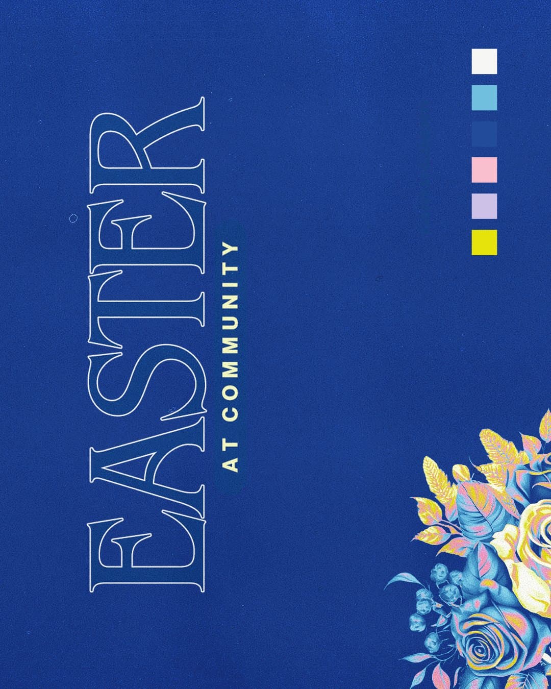
- Clean lines. Deco-inspired design and symmetry give the set a timeless, modern feel that nods to the history behind the story.
- A joyful but approachable color pairing. It adds a fresh feel to the elegance of those lines.
- Subtle symbolic imagery. Quiet iconography offers a glimpse into the Easter story without needing a long explanation.
Then we carried that one look to every sign, screen and space in the building.
You can borrow the method for your own look. Choose one approach for lines, one color pairing and one symbol, then repeat them everywhere. The images below show how that set came together.
Reminders for Your Team During Easter Week
Easter can feel like a sprint, but you're not alone in it. Seven reminders to carry into the week:
- Your work matters, because God put you in ministry and wants to use your gifts to help people meet Jesus.
- People matter more than numbers, so keep your eyes on the person in front of you and not the count of filled seats.
- Meet the need in front of you, whether it's a coffee spill, a held door or a last-minute slide change, because you never know what will help someone take a next step.
- How people feel matters, since guests will remember how they were treated long after they forget the coffee or the walk from the parking lot.
- You might not see the fruit by Sunday or Monday, and God is still working on hearts you may never get to watch.
- Rest when you can, even if it's only a sliver of time on Saturday or a long exhale on Monday.
- Easter is for you too, so slow down long enough to see the resurrection for yourself.
Final Thoughts
Easter comes around once a year, and you're carrying it alongside everything else your church does. Wherever your Easter plans stand today, you have more time than it feels like, and a clear order to work in.
If you'd rather hand the design off, our church graphic design team can take it off your plate so you can spend Easter week with your people. When you're ready, schedule a call and tell us what Easter looks like for your church, because the sooner we start, the more of it we can carry for you.
Want this handled for you?
Sermon series, events, social, print, and merch, designed by people who used to sit in your chair on a Thursday night.


Published by Church Media Squad on January 14, 2026.